Hummingbird Moth

In the summer I was admiring the out of control buddleia population in my garden, and wow, I couldn’t believe we had a hummingbird moth visit! They are so fast and stay perfectly still whilst feeding as their little wings whir like crazy, zipping all over the garden.

I used some tissue in the buddleias to give them a little more texture, and went a bit mental with the Brusho, but with the heavier stock 140lb watercolour paper but I think it looks great. I’m so happy with the painting that I’ve made him available to buy in my shop.

Forgive me for my lapse in posting, I have a more personal project coming up which I can’t wait to announce to you all in a couple of short weeks.

Deer Illustrations

Here are some quick deer illustrations in which tissue features heavily, it’s the usual tissue (Crêpe) paper adhered with Bindex to the watercolour paper which can create these muted, softer tones. I really enjoy using tissue paper, you can achieve some really interesting results depending various factors like wetness, size and how folded or flat the tissue is.

Mystery Toad

I have a notorious section in my studio named the ‘crap pile’, which is where not worthy paintings go straight to the local recycling facilities. Occasionally my mum will visit and save pieces from such a fate. This was one of them.

When you’re so close and spend so much time drawing, transferring, redrawing, inking and then watercolouring you can get so frustrated with the outcome - you just can’t look at it anymore and it has a stay in the famous pile, maybe indefinitely …

This toad made it out of there, I cleaned him up, unbuckled him as the paper was extremely buckled from all the water I threw at him, (I’ll share this technique in future posts) and he now sits flat and beautiful in my shop ready for his new home!

He was made from watercolour and ink with some white pigment, he’s so old I didn’t even get to sprinkle some Brusho on him, a rarity these days!

toad-pose-2.jpg

Meerkats and ‘Semple’ Lions

I was commissioned a very small meerkat painting, and I painted a meerkat in the same pose on different papers, they both look quite different which is interesting. I also picked up Stuart Semples watercolour pan set - and WOW! They really are the colouriest colours!

satsuma-5.png

I was so used to fighting with the dusty pans of Winsor and Newton and resigned myself to using them but Stuart Semple’s watercolour set is almost jell like, really easy to work with and gives such juicy, vibrant colours. I painted these simple but bombastic lions in them. I love Semple’s ethics around selling art materials, his colours are so affordable, he aims to fight against art elitism, how could I not support that with my purchase?

Not sponsored – I just love them!

Relief Inks On Yupo

I’ve longed and pined for a print press, I thought it was the only way I could make lovely work like my ‘Dutchess’ series prints again, wonderful horsies that seem to come so naturally even though it was my first ever experience of printmaking.

I wanted this feeling back so after much experimenting with oils and other inks on Yupo paper, I have a technique which mimics the look of those prints.

I used Indian inks and permanent pen to act as the ‘burr’ of my lovely doggo Nemo, drawn straight onto the yupo, I then slathered on relief inks and removed ink using rags and white spirit and dried the whole thing using a hair dryer.

It’s not the same thing I know, but I thought it was interesting to try out, I used white gouache to lighten a few areas, and I probably won’t do that again when I try this in future.

The Swift and the Fox

fox-2-2019.jpg

I’m really pleased with how my swift came out, the drawing was so simple and I worried I wouldn’t be able to make it look interesting, but with the help of Brusho I much prefer the swift to my fox image. I think because the image of the fox was so much larger (320mm × 410mm), it makes you a little more cautious, which restricts how mad you want to go with the paint. The fox was also made with Brusho and watercolour on 100lb paper.

Inky Kissy Pigeons and Fox

Sometimes paintings just don’t work out - I lose interest and don’t want to redo even with my fantastic Light Pad. I’m going to make of habit of taking posting inks before they get painted. My kissy wood pigeons unfortunately didn’t work out, but my fox is in progress.

The Seagull and the Swallow

The struggle for good white ink continues, a toothpastey nightmare. On the Seagull I used Pebeo Colorex a French ink and for the swallow just Winsor & Newton white gouache, since my Dr. Ph. Martin’s ink dried up through neglect - and I found it difficult to swallow the price since it doesn’t seem to be very shelf stable.

The search for good white ink seems endless! These two birds in addition to sad white pigment were made from Brusho, watercolour and ink with a smidge of charcoal on the gull on 100lb Montval Canson watercolour paper.

March Magpies

March was the month of the magpies according to my garden activity, so I painted a few taking obvious liberties with colour and people eyes, the Brusho came out again! My favourite one is the bluey magpie as I messed with him the least and it’s just a really pretty image in person.

Scrappy Insects

On odd scraps of watercolour paper I decided to paint a few simple insects, mostly in Brusho. As Brusho is pigmented colour dust it doesn’t take very much to make your eyes hurt, in a good way. I’ve used Montval Canson 100lb paper here, it’s pretty thin so buckling and creases sadly is a thing, but I found you can just massage most of them out with your fingers if you have a spare half an hour — it’s a brilliant practice paper otherwise.

ladybird-depth-march-2019.jpg

Charcoal & Pastel Badger

2013’s Blue Badger attempt using watercolour and Indian Ink only.

I’ve always struggled with badgers, as I felt there wasn’t anything interesting I could do colour-wise with them, but I braved the badger again, this time armed pastels and charcoal alongside my watercolour and Brusho underpainting.

The last and only time I created a badger piece was in 2013, when I had a bit of a problem with circles …

Luckily 2013’s badger found a home so it wasn’t all bad, and I still think he’s interesting to compare against, I guess now I have an orange problem - but it is a nice colour!

Pastel Pigeons

I haven’t played with pastels much, I usually only use them to dust over insect paintings and never really took them seriously.

But I recently brought them out after feeling in a bit of a rut and discovered I really enjoy them! I particularly like the sculptural aspect of them, scoring the paper erratically but also knowing you can remove the colour instantly with a dry paintbrush or rubber. I really love pigeons, they are my favourite animal, so I thought they could spur me onto make something interesting.

Tiny Watercolours

flamingo-depth.jpg

These are tiny little watercolours I’ve done on bits of otherwise unusable watercolour paper. So glad I kept the odds and sods about to paint on, the big head problem is especially noticeable when working on such a small scale which gives me a laugh.

Charcoal Squirrel

squirrel-depth-dec-18.jpg

Another squirrel with a slight charcoal twist, I liked the fuzziness, especially on the snowy textured watercolour paper which I only use when I’m feeling a bit fancy. I especially love the eyes again, I do spend a lot of time on eyes. The eyes of a painting alone can easily take me 3 hours, probably isn’t all that necessary but I feel like it needs to look right as it is the heart of every painting I do. This squirrel is now available my shop.

Watercolour Beavers

I’ve been working on a project which requires, a large amount of beavers! These are all watercolour and brusho with my usual mix of mediums. My favourite is clearly the first one, but I painted several not knowing which one will be chosen.

The Indian ink style was the one which got selected, and I will post later to not ruin the surprise of how it will look in full watercolour and animated for an exciting Rewilding Project by Ecologist Rob Lewis.

Tiny Tanuki Statue & Wildlife Inks

I wanted to make tiny simple paintings I can do of an evening as I have a few creative things I am juggling at the moment, this one is around 13 × 8cm, in just watercolour and ink.

This is a painting inspired by traditional tanuki statues from Japan, along with some animal friends who are also very small, I will also paint these and post.

Sparrowish Paintings

My wrist is feeling better, so I tinkered about in my tiny watercolour pad and made a couple of sparrow inspired paintings, since the birds are always messing about in the garden squabbling and being clowns. I finally found a use for that useless, bin-able watercolour ground which was marketed as the end to all watercolour mistakes. Its gritty texture I used to add fluff to the face of these bird paintings, bit of an experiment, I still think it’s a rubbish product.

(No More) Suffering for My Art

stupidity.jpg

Look at this. This is how I’ve severely damaged my wrist, to the point where I cannot even use a pencil or type this out without pain and discomfort.

This is stupid. I use this method to transfer my images onto watercolour paper, without having to directly draw on the watercolour paper – because mistakes do happen!

I flip the original drawing over, tape it to the sides of the watercolour paper, draw around the picture so I know the boundaries of where I need to aggressively press with a fine point. And yeah, just go nuts furiously on the back to transfer a flipped, fainter image of your original drawing.

This method ruins your original drawing, it's only good for a couple of goes before the paper starts to rip and disintegrate.

Original drawing, if you look closely you can see the dark transfer halo beginning to show through

Awkward flipped version using the stupid transfer method

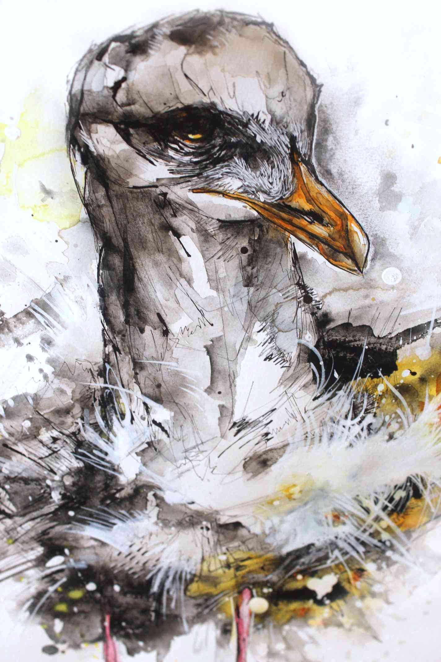
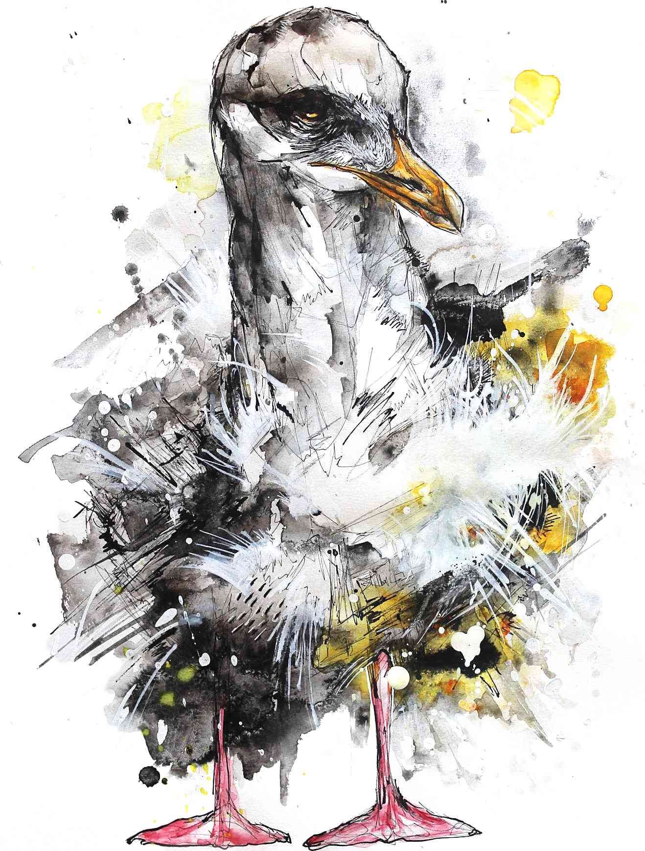
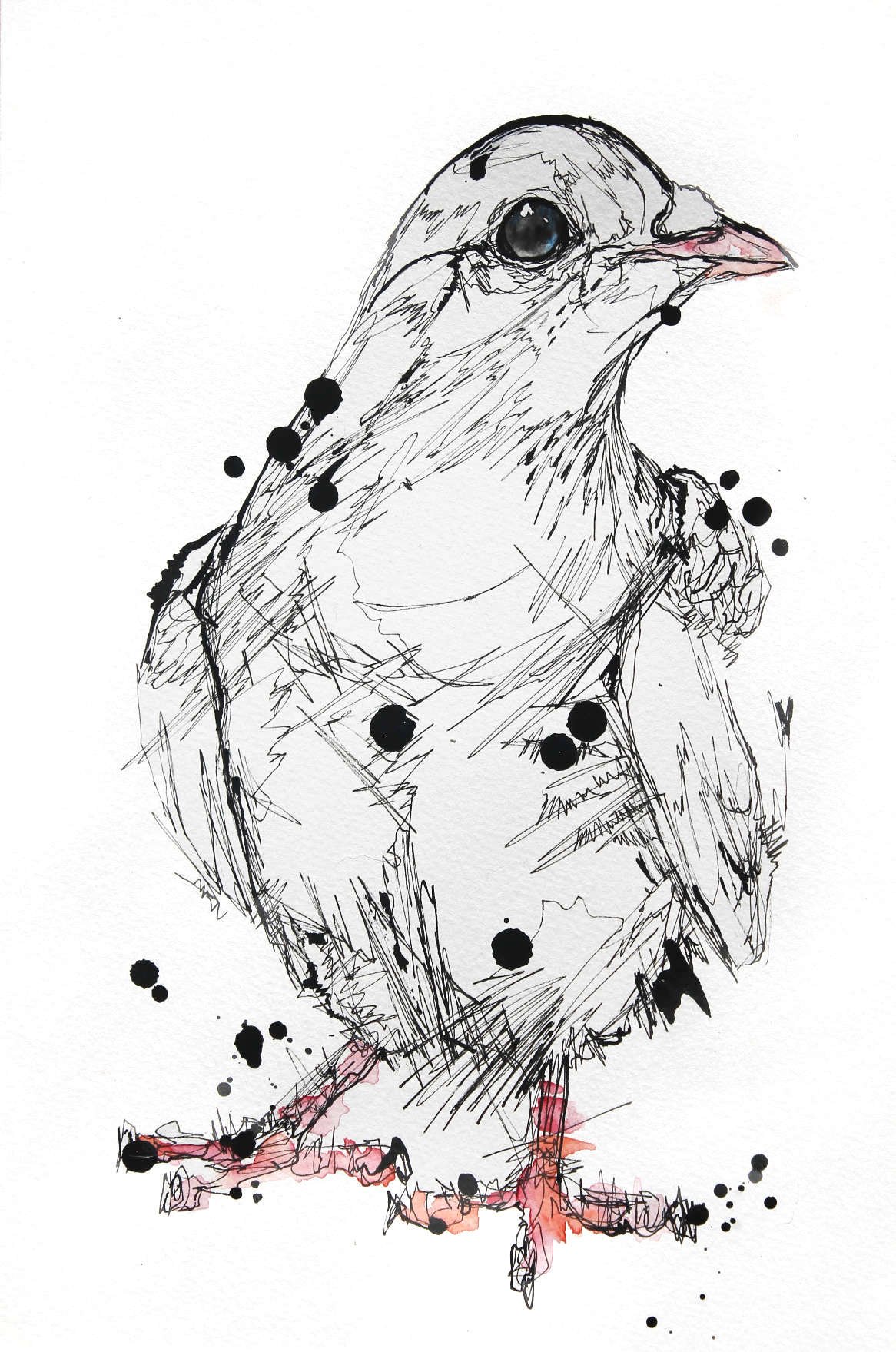
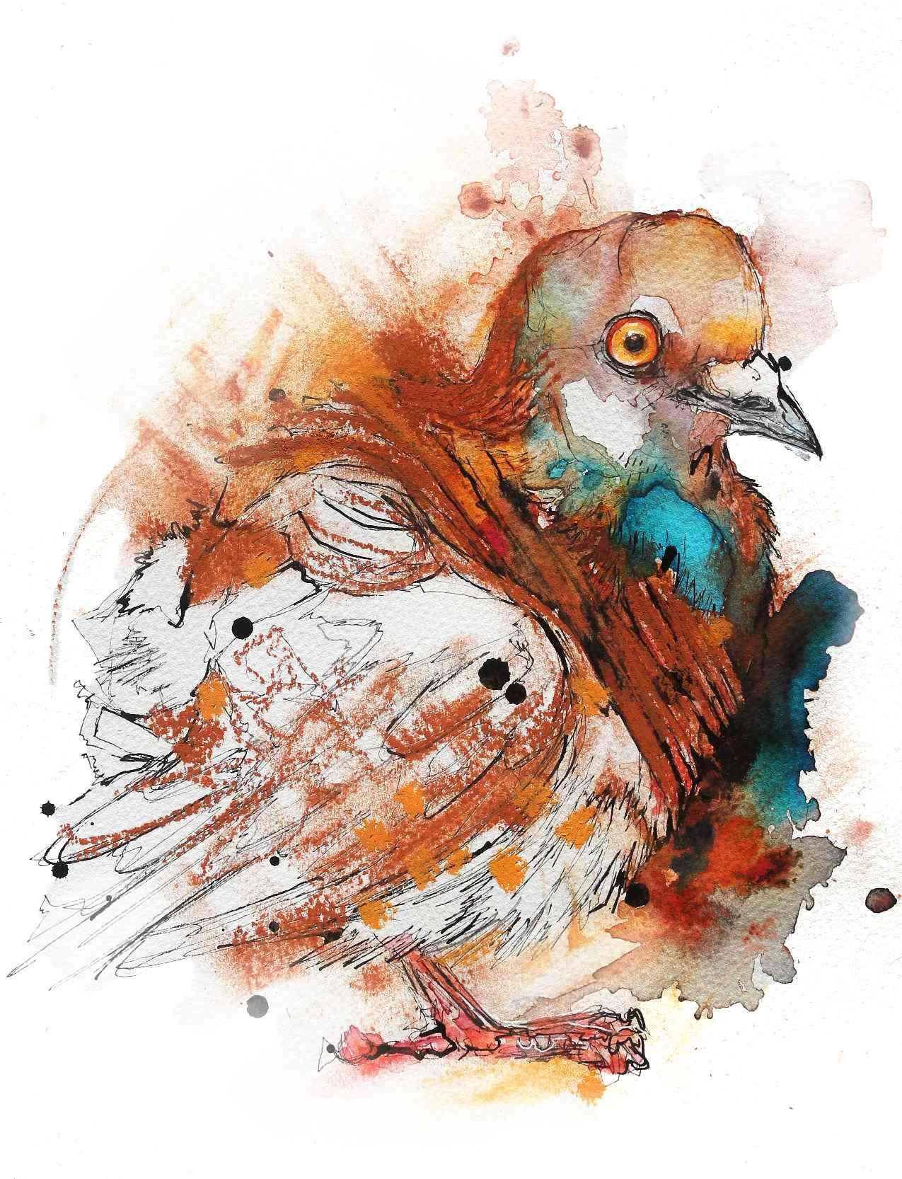
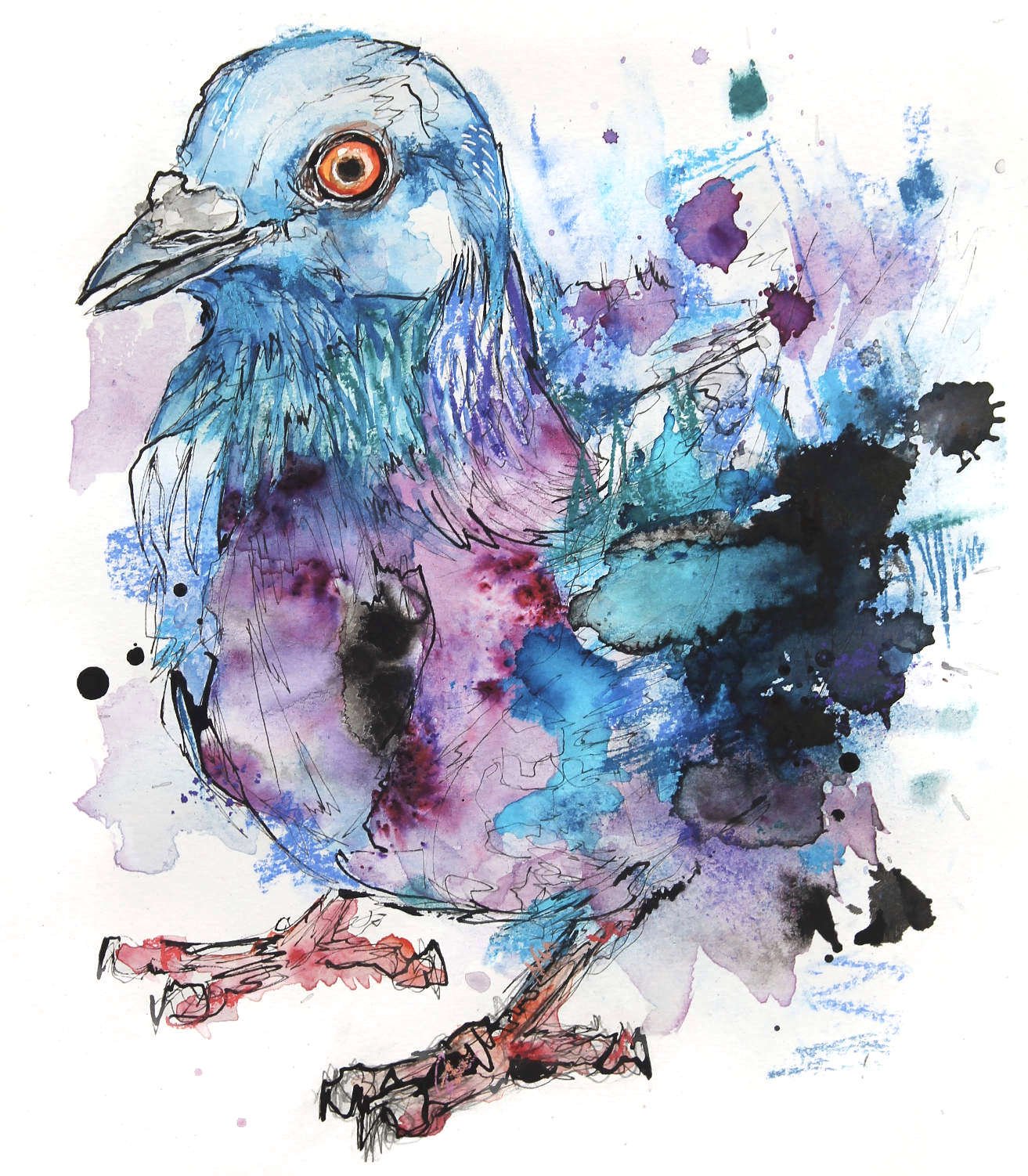
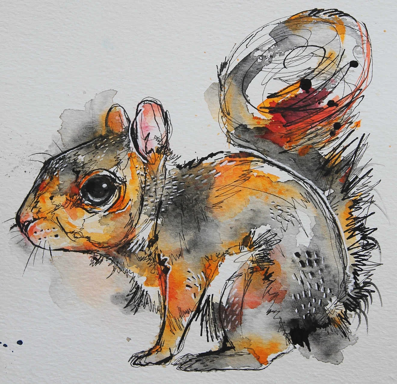
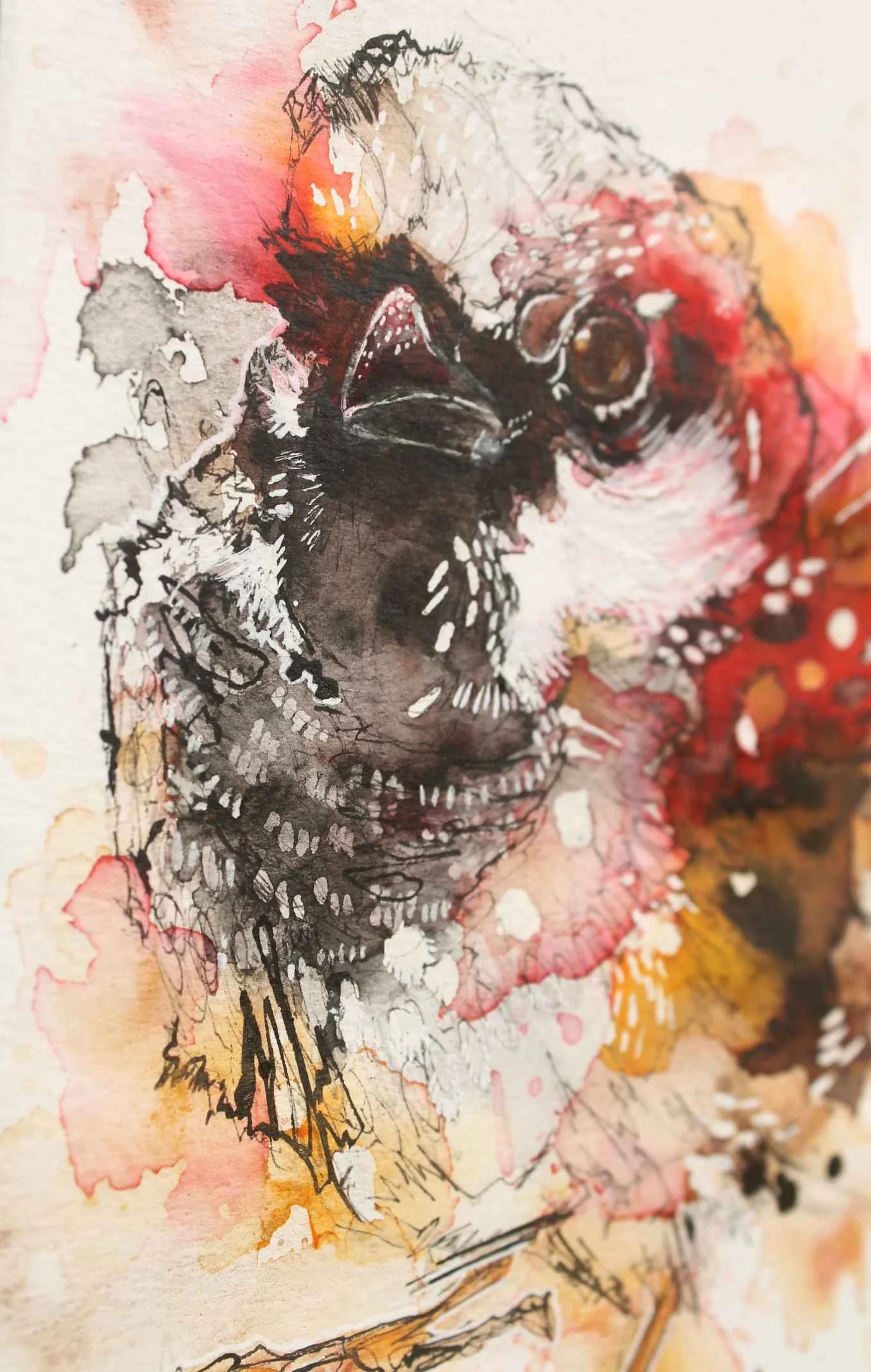
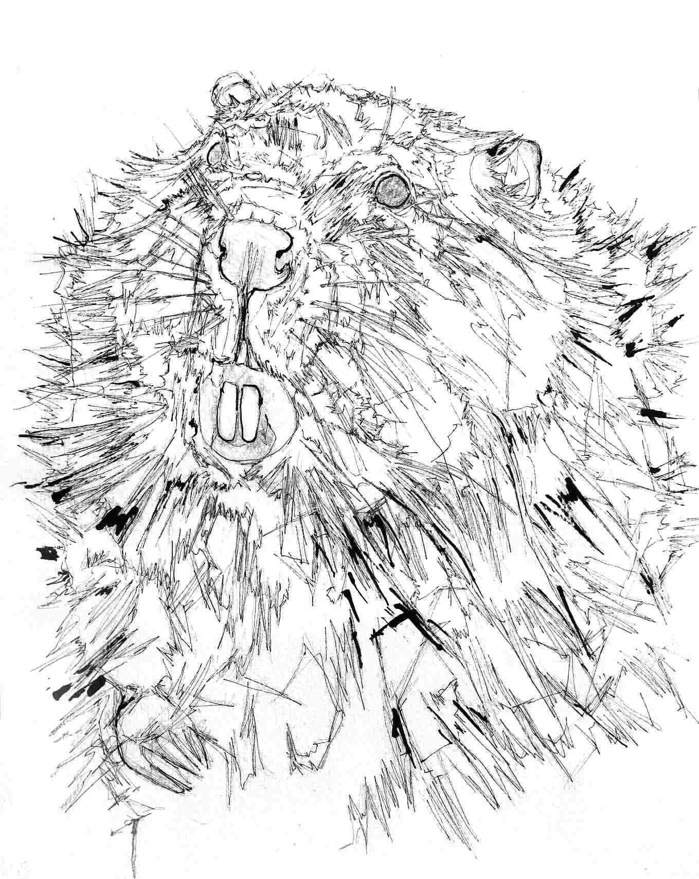
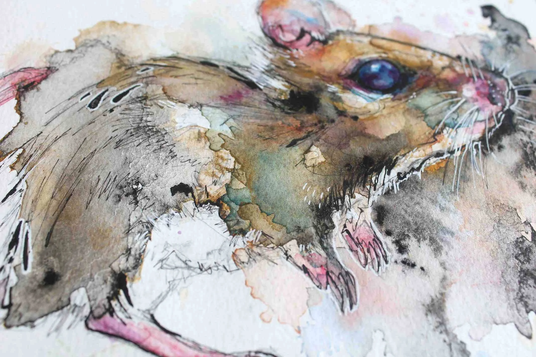
You, probably like I, have seen this technique all over art blogs and it’s fairly popular, even though is takes a huge amount of time. You can’t see what you’re doing, you’re wasting the lead in your  drawing pencils AND the image is flipped so you just have to pray that you can make it look ‘right’, which isn’t easy, which you then have to spend more time rectifying - if you can … AND you can really hurt yourself as you have to apply a ton of pressure to squeeze every bit of detail off of the drawing paper onto the watercolour paper. 

What’s the alternative? Well there’s transfer paper, but that’s not so good which is why I don’t use it.

You’re still having to use quite a bit of pressure, and it is clunky. There’s no way can you get lines of different thicknesses, which leaves you having to draw many of the finer details in later. Not to mention you are working directly over your original drawing, retracing the lines which spoils the original.

Also it can be mucky if you’ve accidentally leant on your work in the wrong way, big black patches of impossible to remove carbon/transfer muck can appear on your watercolour paper along with your now chunky drawing. Also you are applying as much pressure as you can - because transferring sometimes doesn’t work. You’ll only know if you tentatively peel back the layers, an area at a time or remove them altogether after you’ve finished with your fingers and toes crossed.

How should I transfer an image if I don’t want to directly work on the watercolour paper?

I do have a table, I promise! It was just a mess, so the floor it is ...

USE A LIGHT PAD! I’ve just bought my Huion Light Pad (not sponsored!), and it was inexpensive, easy and one of the better brands. You lay your original drawing face up on the light pad, overlay your watercolour paper on top of the original drawing also face up, turn the switch and alter the level of illumination and you should see your drawing appearing through the watercolour paper.

Using the light pad on a very bright spring day, image still clear through 100lb watercolour paper.

The only caveat is that if you want to get a stronger image appearing on the watercolour paper you’ll have to be in a darker room or at night if you still haven’t sorted out any window dressings ... You can use it in the day but the details won’t come through as easily.

This method isn’t perfect and I’m not going to pretend your drawing is super high definition - the glare of the box in the dark can be a bit much if you’re using it on a high illumination setting. But you’re not messing up your wrist or ruining your original drawings which means you can trace over and over again - tweaking your drawing, making them better, make easy compositions with other drawings, it is brilliant.

Don’t be cheap or stupid - like I was, there are better alternatives to image transfer and using a light pad has really injected a huge amount of joy into an arduous task. You still might have to go back and redraw some of the finer details but at least you don’t have a crippled up wrist.

Please send your prayers and thoughts to my wrist, I’ll update soon once I’m fully healed!

Cold vs Hot Press Mice

A couple of quick paintings experimenting between the two popular types of watercolour paper. The hot pressed version of my mouse is the one where I went white pen crazy - looks really ugly. The cold pressed mouse I had a little more interest in, I used Indian ink more which always does interesting things when watered down.