Brown and Barn Owls

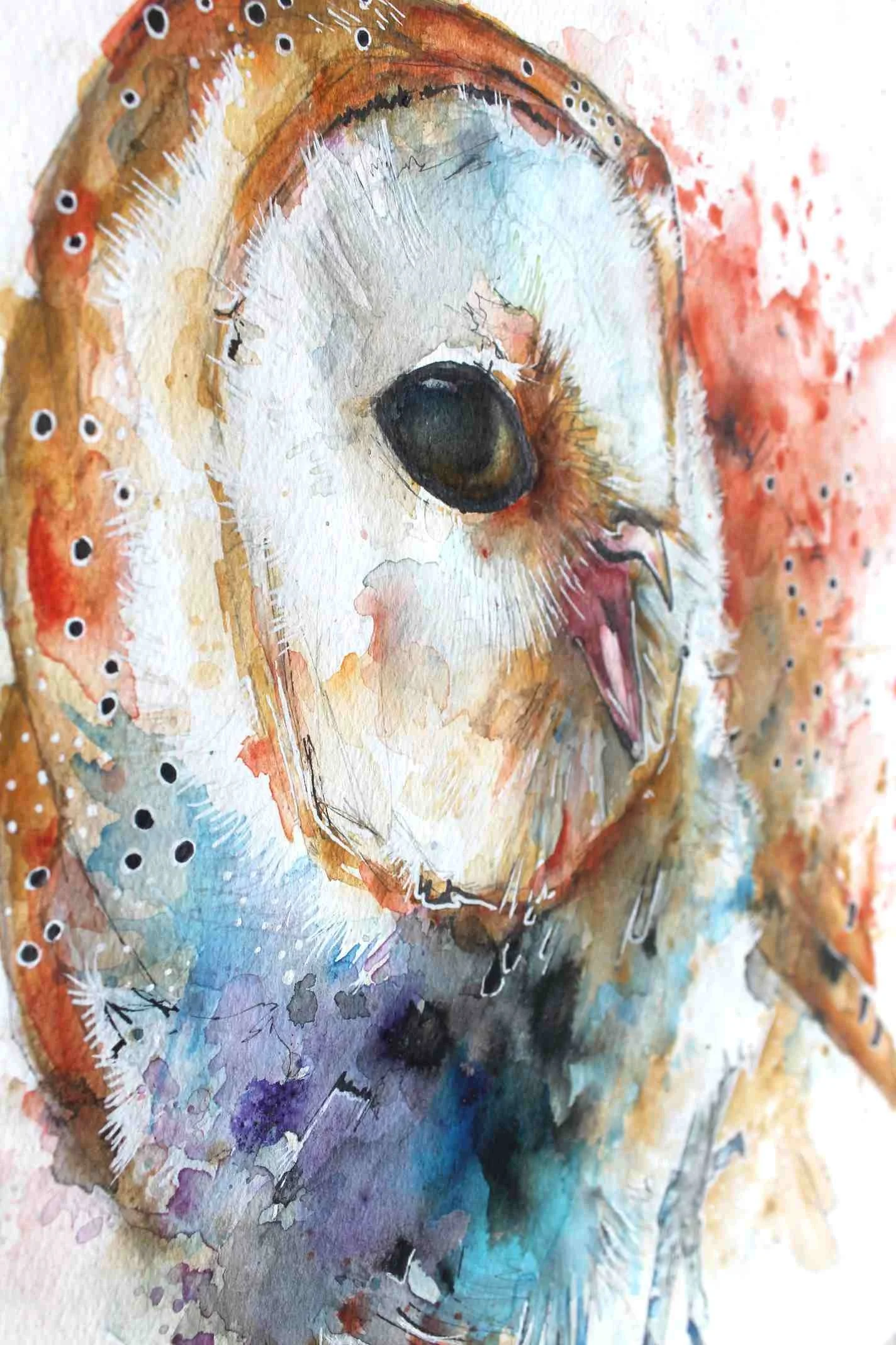
On the way to a half way decent barn owl painting, I thought I’d show you the dud I made for a laugh of course, I know a few of my visitors enjoy that kind of thing. You’d think by now I’d be a watercolour whizz, not the case sadly. I do like the drawing of the brown owl though, shame I lost interest but it happens.

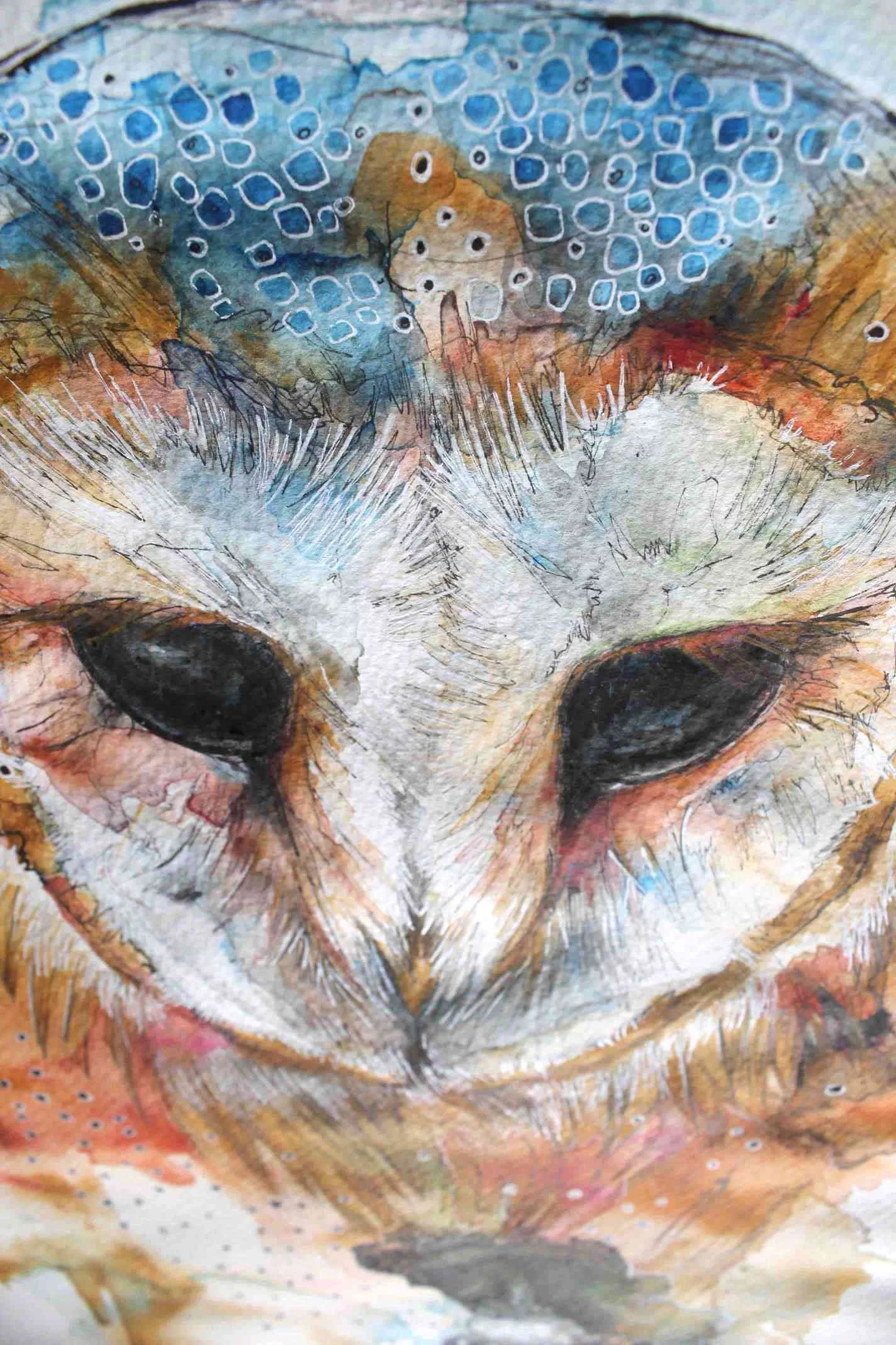
The barn owl I made was just thin layers of watery watercolour built up over days. It’s a real shame that the glue perished on my watercolour block, hence all that nasty paper buckling, which should not have happened! Looks like this guy is going to live under a very heavy box for a few months.

Red Jumping Spider

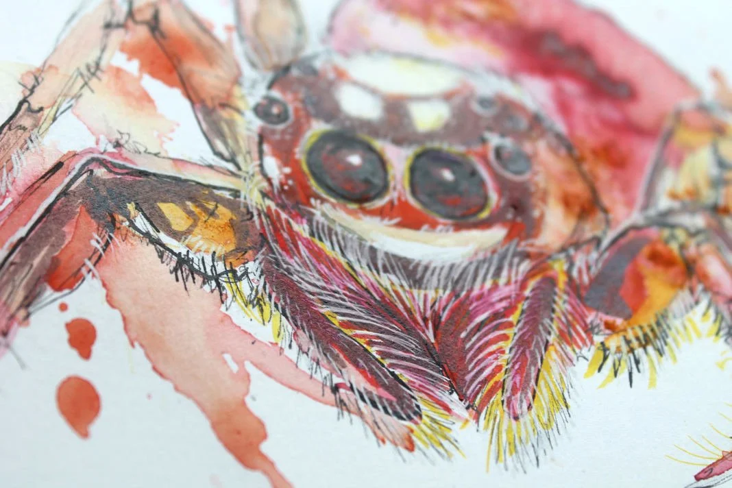
I’ve turned my hand to hot pressed watercolour paper for a change. I bought this tiny paper which I thought would be excellent to paint little insects on!

The cloud on his abdomen is so beautiful and I achieved that effect using my trusty Brusho pigments and a little bit of water manipulation. I especially love his eyes, which is always the feature I concentrate on the most with every painting I do — maybe the take away is if I spent as much time on every area, I’d have much better paintings.

Forgive the masking tape, but it was all I needed to ensure the paper didn’t buckle too much.

Kangaroo with Watercolour Tubes

My old drawing from 2013

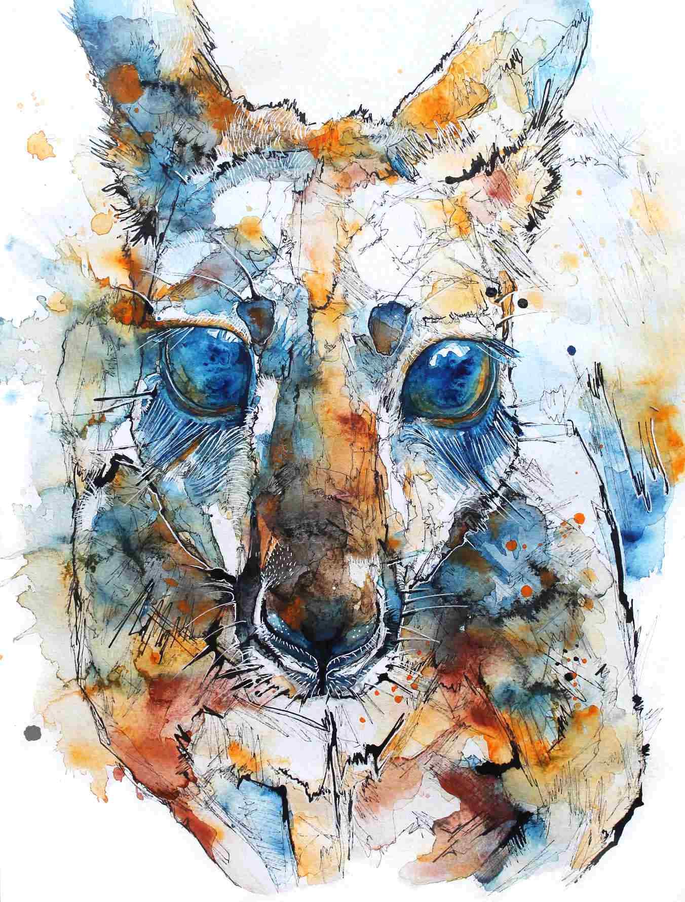
I painted this guy in response to a drawing I was super proud of at the time, I even contacted the photographer who snapped the reference photo, to show them like some toddler and hmm … they never got back to me.

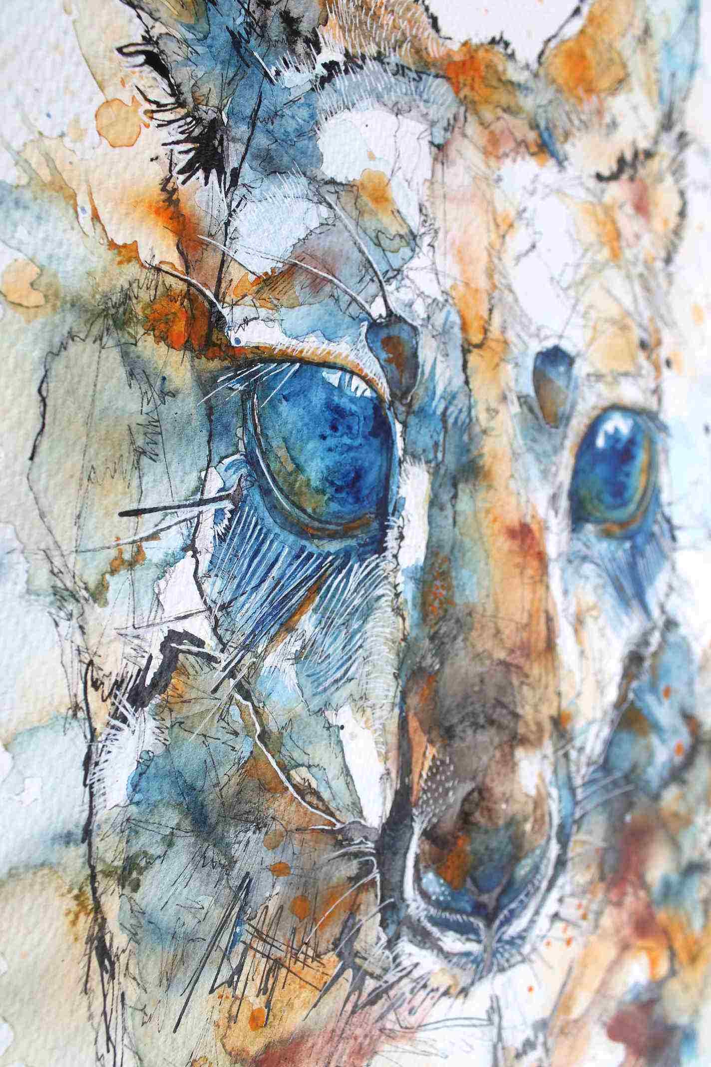
Oh dear, I guess they weren’t impressed, and I never drew another kangaroo, how laughably tragic. Anyway, this painting is okay, nothing special, but with a bit of a twist, I switched from pans to watercolour tubes and I love the rich colours! I didn’t overwork the eyes as I thought they were simple and beautiful.

Tissue Issues

I’m falling into a paralysing anti posting person, as I feel I have to impress people who come to my site … which is sad as this website is my warts and all journal to track my progress. I’ve semi gotten over it so here we are, three fails for us all to learn from. Tissue paper is featured heavily, I love the texture and the weird things it does when adhering it to watercolour paper using Bindex and I wanted to see which areas it worked best in.

I found a face full of tissue can be gross, I often start ripping away at the paper as sometimes the tissue gets cloggy and makes the colours look pebbledashy which doesn’t look nice. Also I’ve been really throwing around the masking fluid, and it doesn’t look good applied in small areas, I think it may look better used extremely finely or in large areas, like my fox!

Rabbit Bust

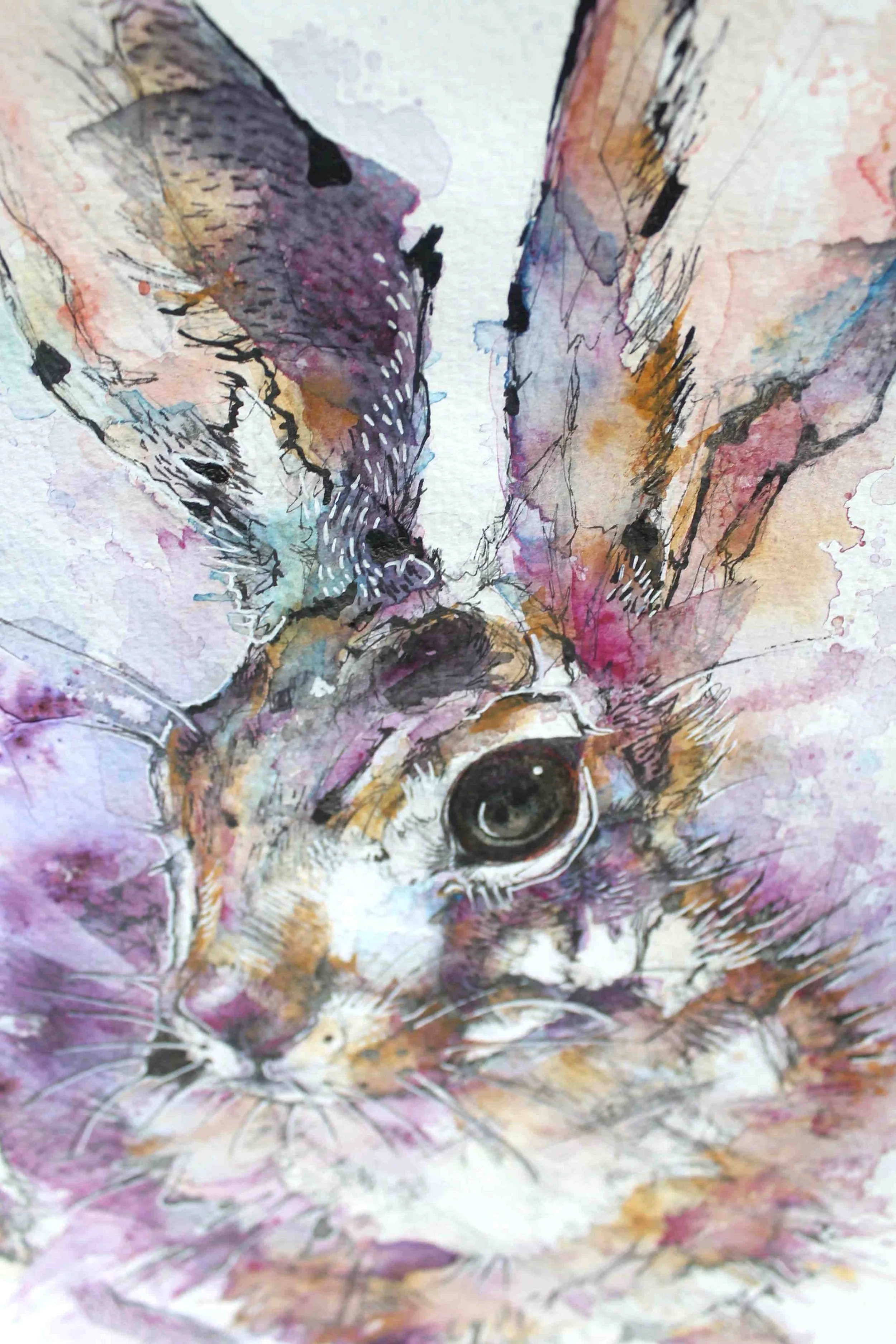
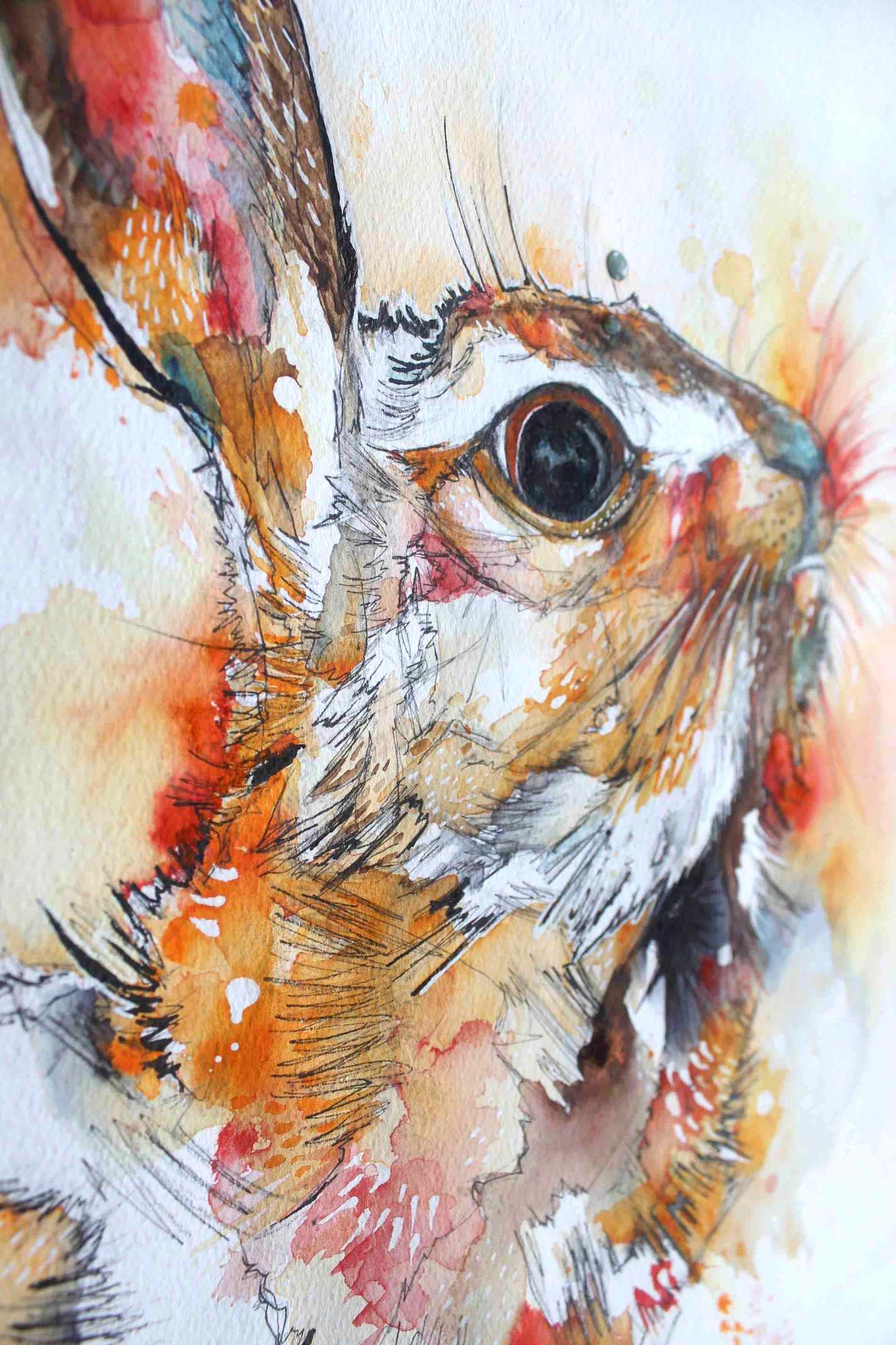
I really love rabbits and hares and I think I want to focus more on painting them. I relate to their flighty, gentle nature which is why I think I’m more drawn to them.

Technically as a drawing I don’t think I’ve nailed it as a composition, and unfortunately my camera has failed to capture the warm colours after over a hundred pictures, eh — technology! But the colours are really lovely in person (you’ll just have to take my word for it).

I painted this 14 × 10" rabbit bust in mainly just watercolour with a sprinkling of Brusho here and there with of course the Indian ink and white pen additions.

Horrible Hedgehogs

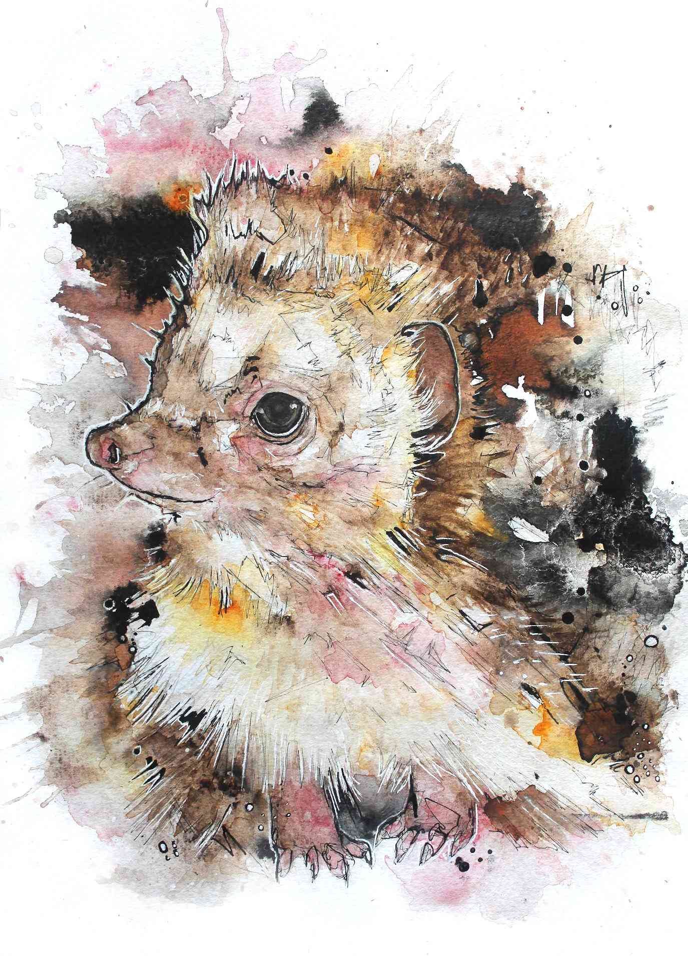
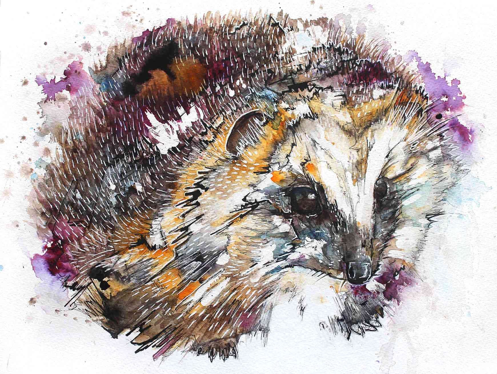
I don’t think hedgehogs are horrible! I just don’t like how these paintings came out. I reluctantly post them as my one disappointment in the whole art blog/website sphere is that there’s never any middle ground, or examples of the stepping stones it took to eventually make great art.

Not here —  I don’t have that filter. I’ll embarrass myself as much as possible to show the true side of art, that it is hard and you’re going to make mistakes over and over.

So these hedgehogs I made using my trusty Brusho pigment and watercolours.

One thing I really did like was how the Indian ink has that crackly puddle effect when I added too much water.

Hedgehog in Progress

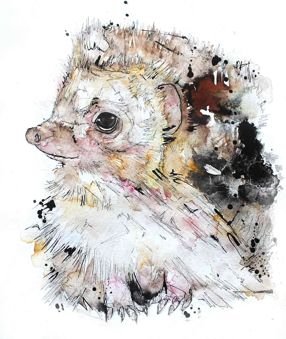
This young British hedgehog I am painting in contrast to a hedgehog I created in the past.

I painted the old hedgehog in 2013/14 for a online magazine which looked promising at the time, but sadly didn’t take off.

It makes me laugh how much more ill considered my work was, what’s with all the black dots and weird bars?

Anyway, my recent attempt says goodbye to eccentric colours in favour of a more natural hedgehog colouration. I am using Brusho and watercolour to create my softer, snufflier hedgehog, I shall post him again when he is complete!

Barn Owl 2017

This A3 owl was created on Vidalon Canson watercolour paper which has sadly been discontinued - I’ve finally found a paper I love … then they cancel the line. Such is life!

I wasn’t too happy with the water buckling you can make out on the right hand side, I think it’s best to stick with glued pads if like me are too scared to tape the paper to a board and hope you can cut straight.

This barn owl was created with an old piece I sold a while back in mind. I wanted to recreate a flowery whimsical feel without directly painting flowers into the puddles of colour.

It looks like I’ve learned to stop the colour madness a bit earlier, though I was tempted to just keep applying more flecks and pools of watercolour I’m glad I stopped when I did. The colours I used were mainly Brusho pigment and watercolour, with white pen and Indian ink touches.


Big Cat Contrast

Another compare and contrast from the past! I don’t have too many examples of artwork from the past unfortunately, but the pictures I do have are gold.

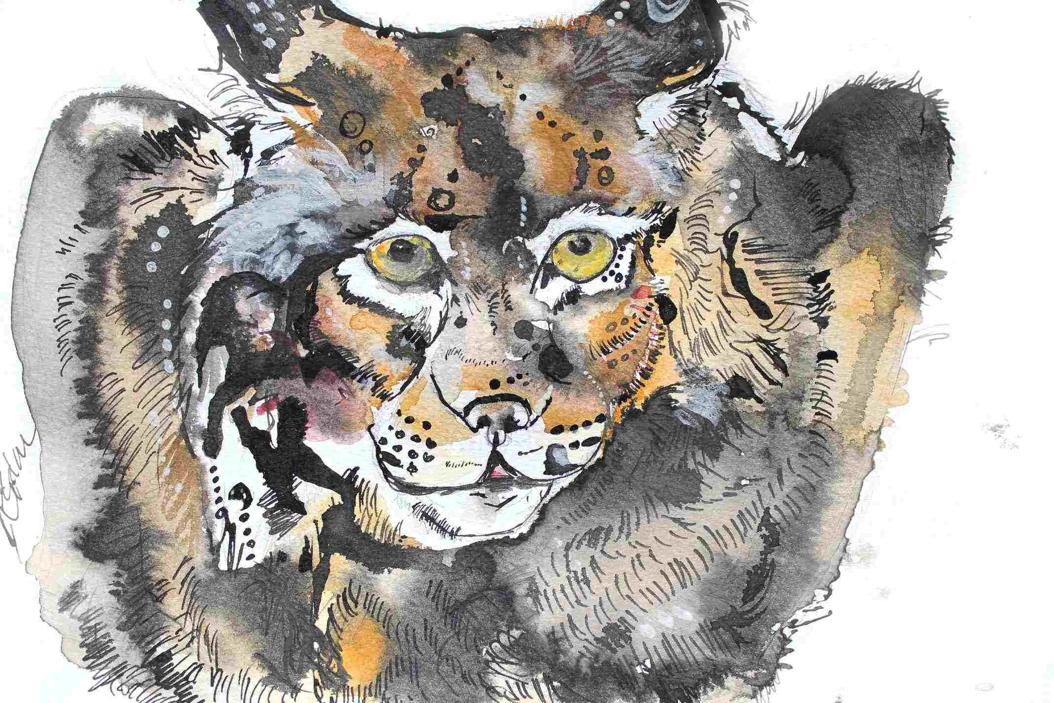
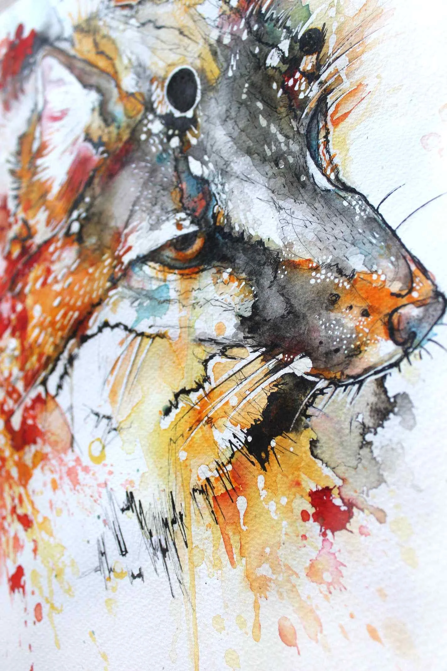
Embarrassingly again, the lynx I painted was created in 2012. I was 21 when I made work like this after my art education, you really can leave art school without any skills!

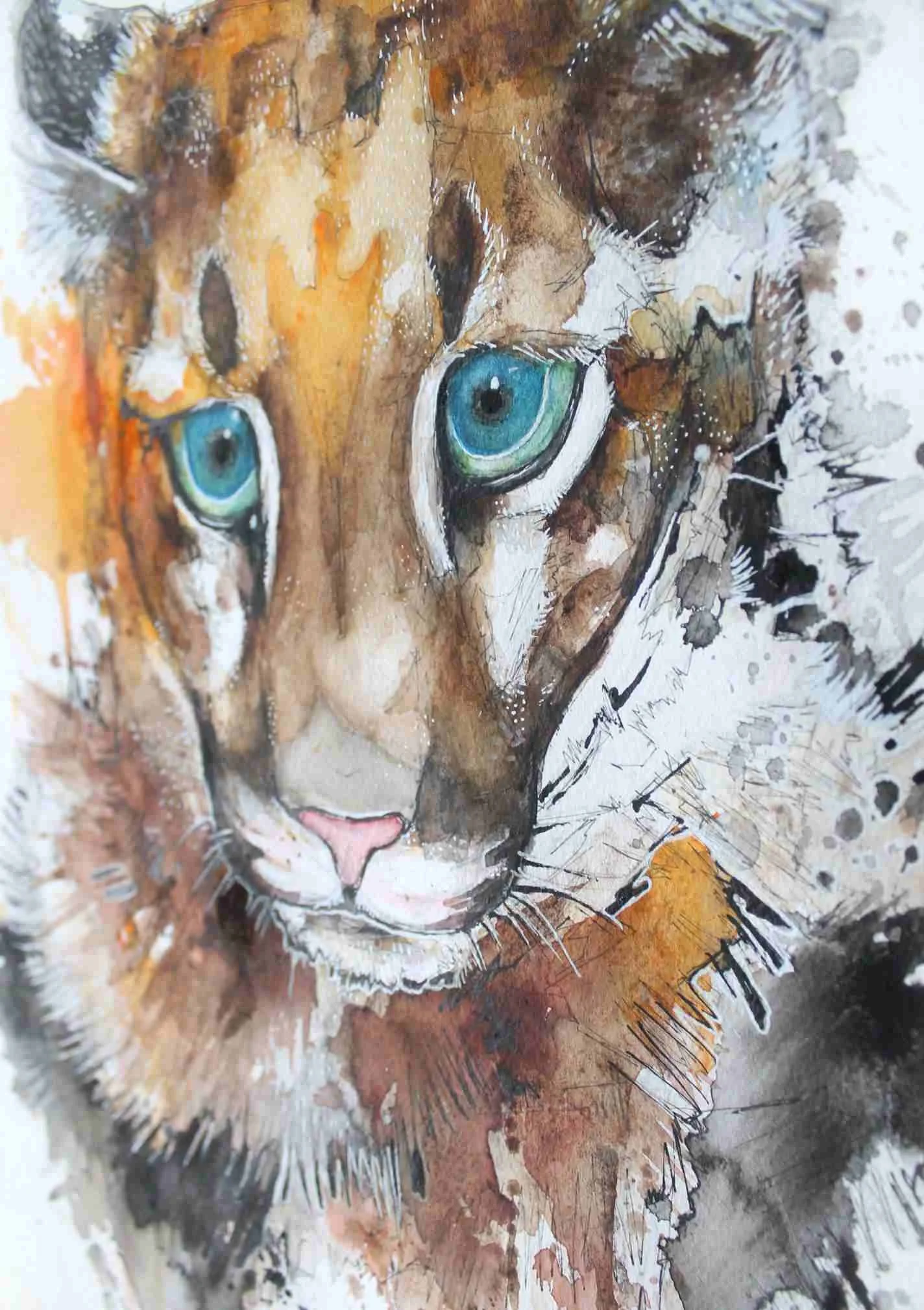
The puma I painted was using exactly the same materials as the lynx, except with a better understanding of watercolour practice —  although not amazing, it’s still very enlightening to see how progress can be made under self direction.

Harebrained

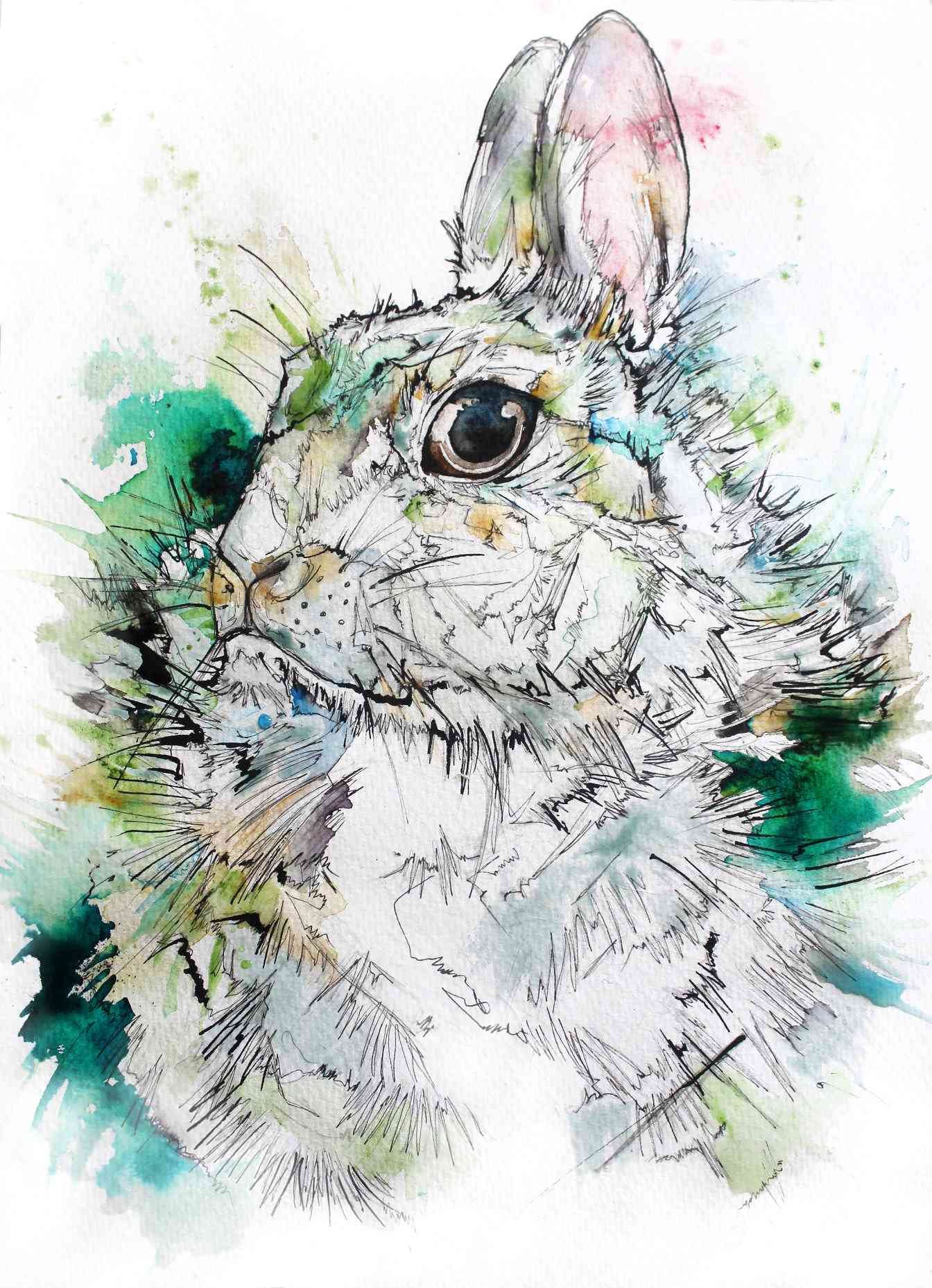
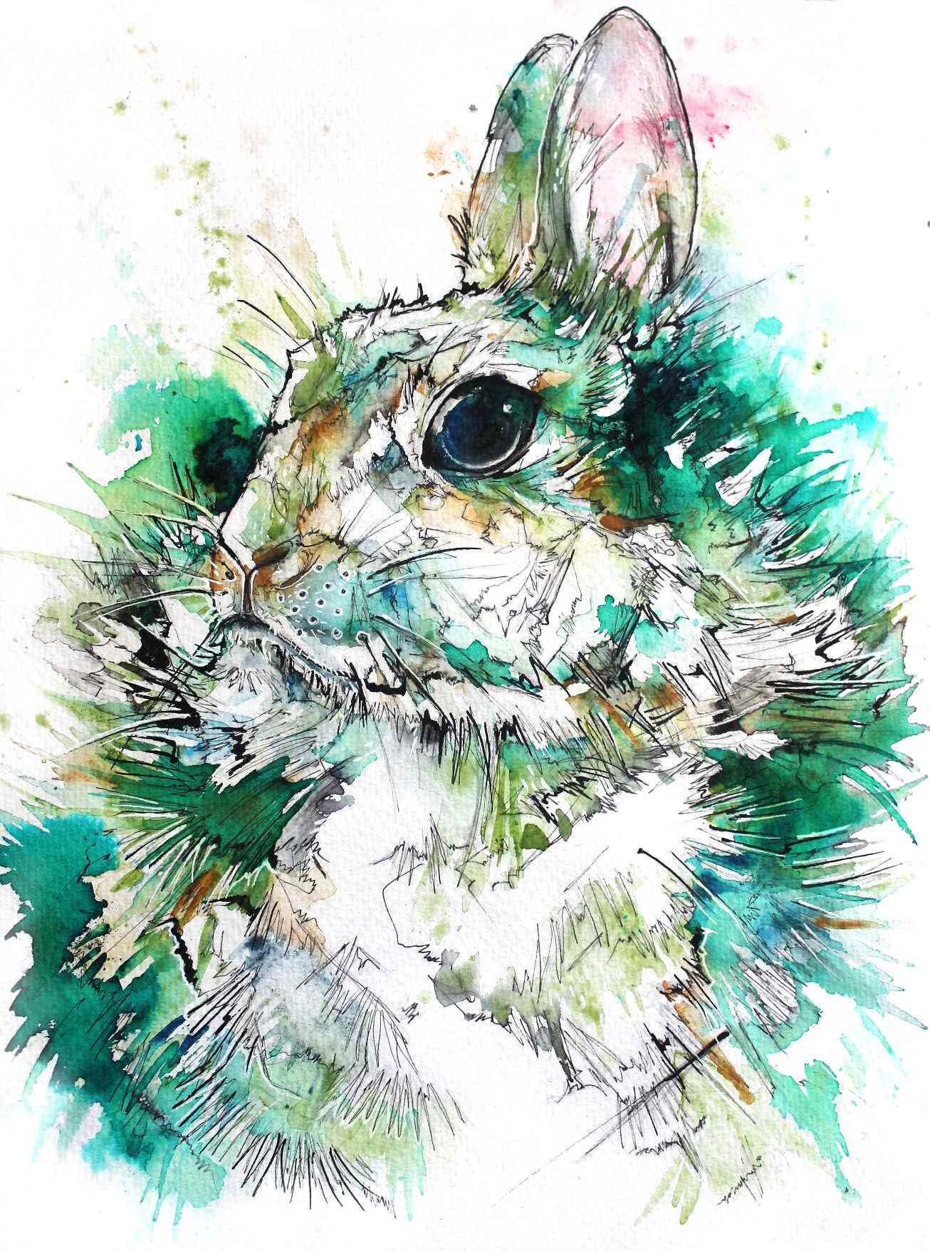
Going wild with the colour palette I’ve painted a green chunky rabbit and a fiery hare. I was aiming to focus on muted colours with a few bright eye catching highlights, but my patience got the better of me and I reached for the Brusho pigment too early, to the benefit of the hare but sadly to the detriment of the rabbit piece.

These A3 pair were created in watercolour, Indian ink, masking fluid, pen and Brusho. 

Jaguar

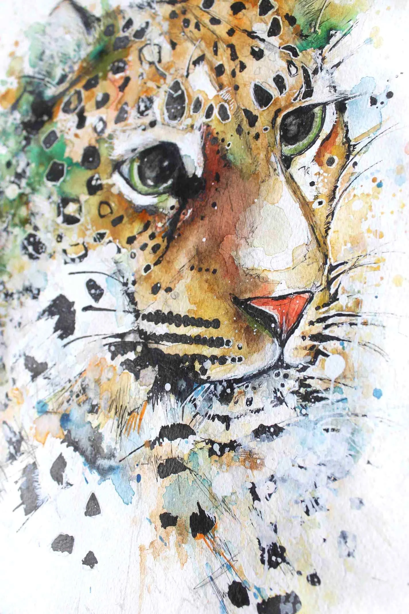
I wanted to create more of a greeny piece, and as I’m not too hot on felines I thought I’d practice painting a Jaguar. I’m not happy with the results (again!), but there are certain elements I like, the big eyes in particular.

I also wanted to create this jaguar in response to the jaguar attempt five years ago when I just started out with watercolour in 2012.

The novice jaguar was painted using the same brand and materials I use today. Though painful and embarrassing to post —  interesting to see how much improvement I’ve made since the start of my website. I hope other budding creatives reflect on this and take heart!

Grey Fox

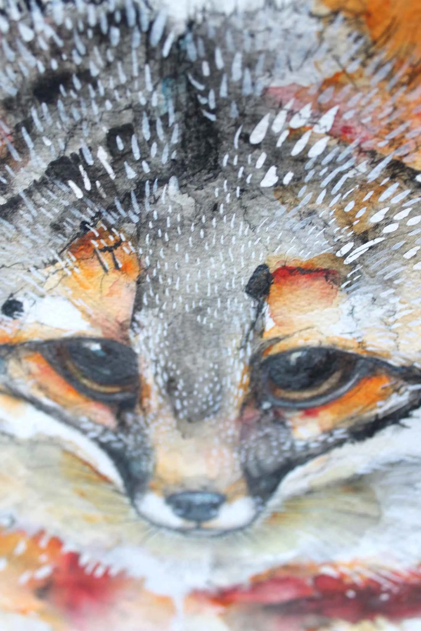
I’m not happy with any of these grey fox paintings but again, they were colourful enough that they would make a nice addition to the site. Grey foxes are found in the Americas and are like our red foxes carnivorous and nocturnal, but unlike red foxes are agile tree climbers!

These foxes were painted on cold pressed watercolour paper and in Brusho, watercolour and ink.

Simple Squirrel

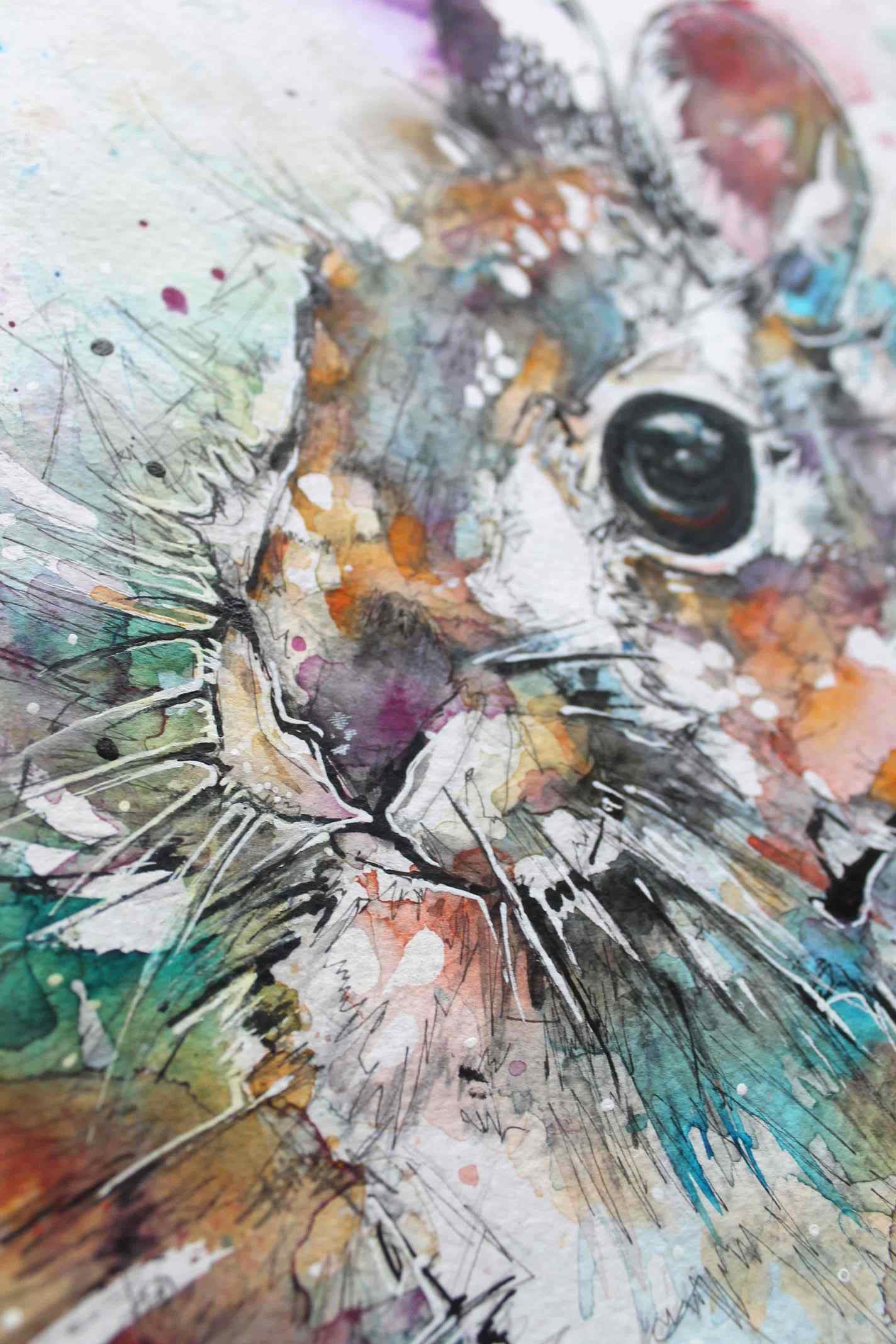
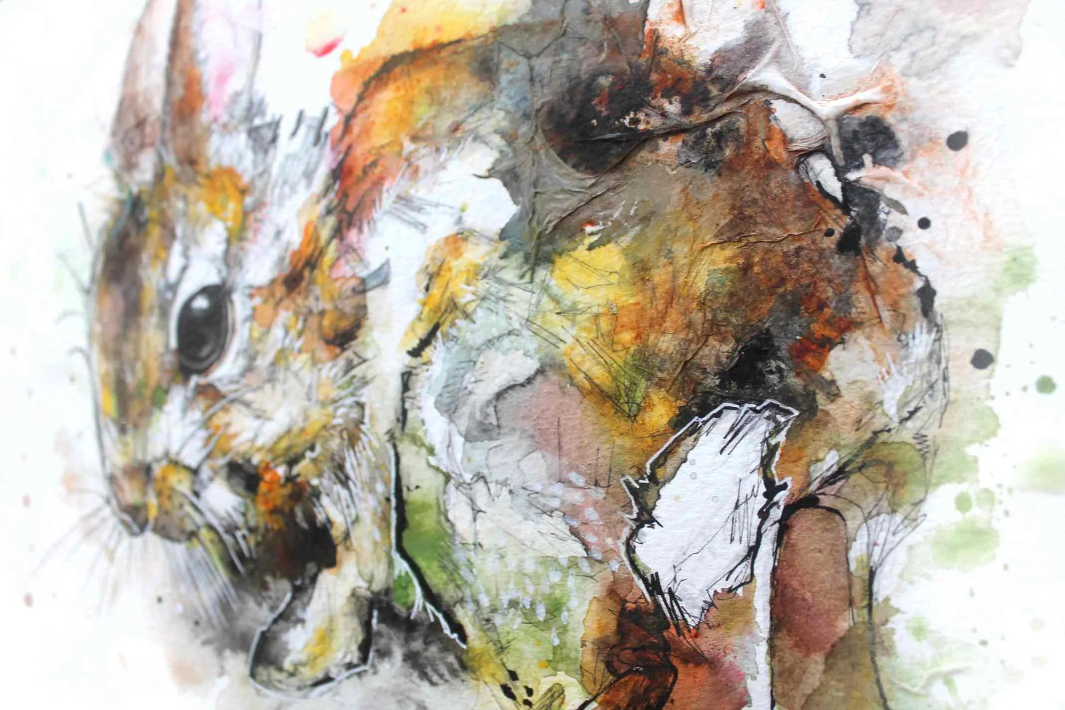
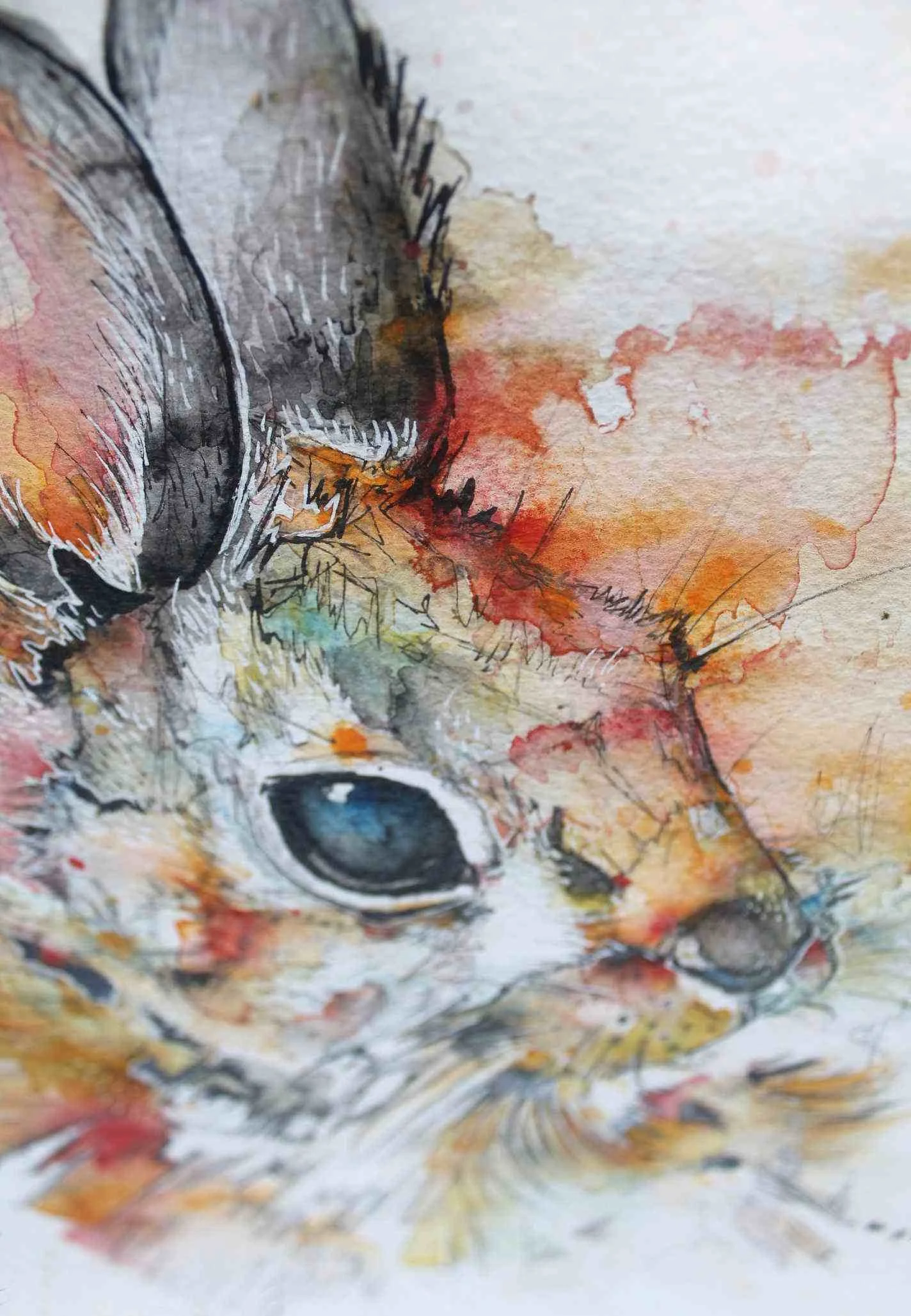
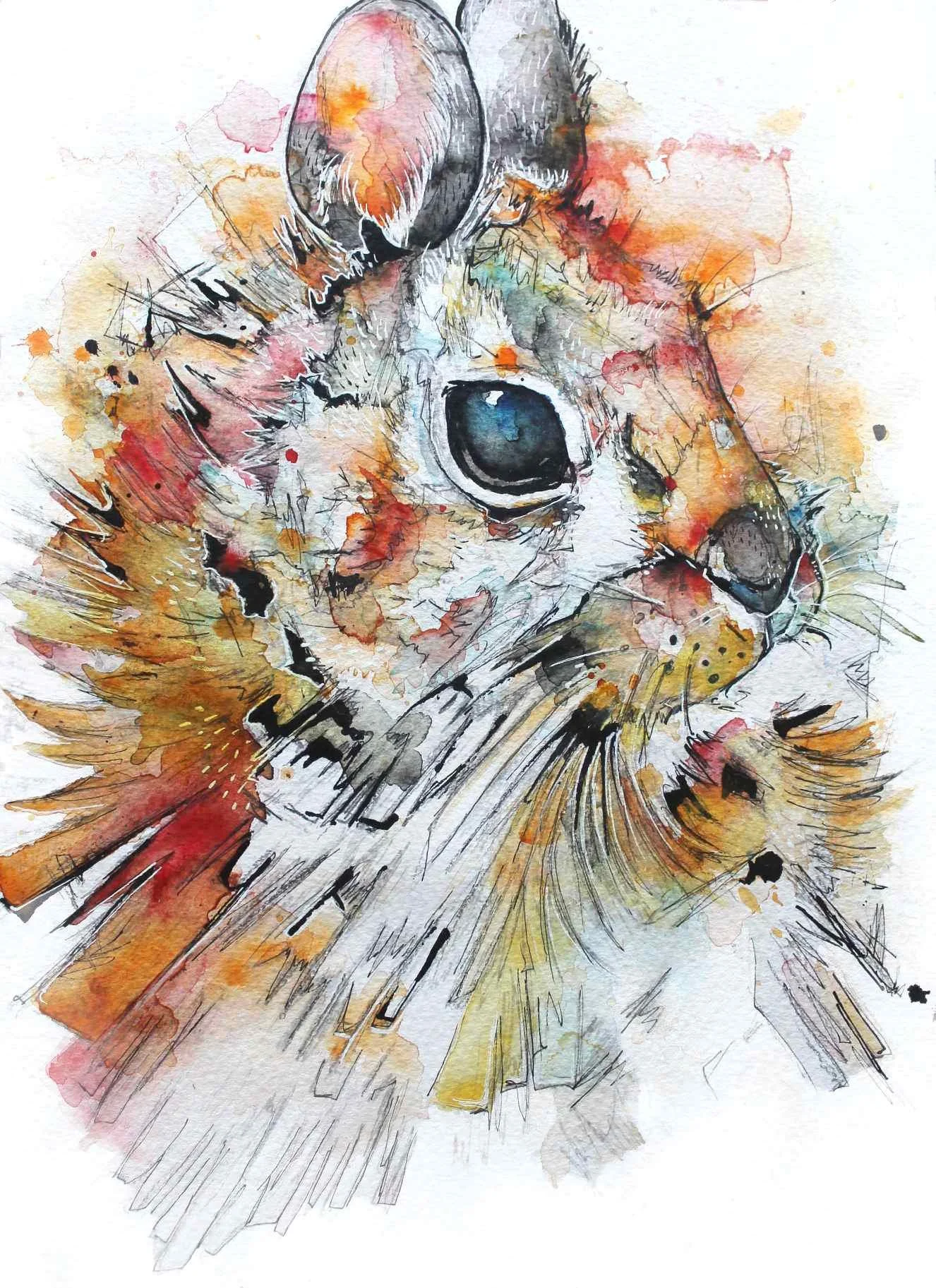
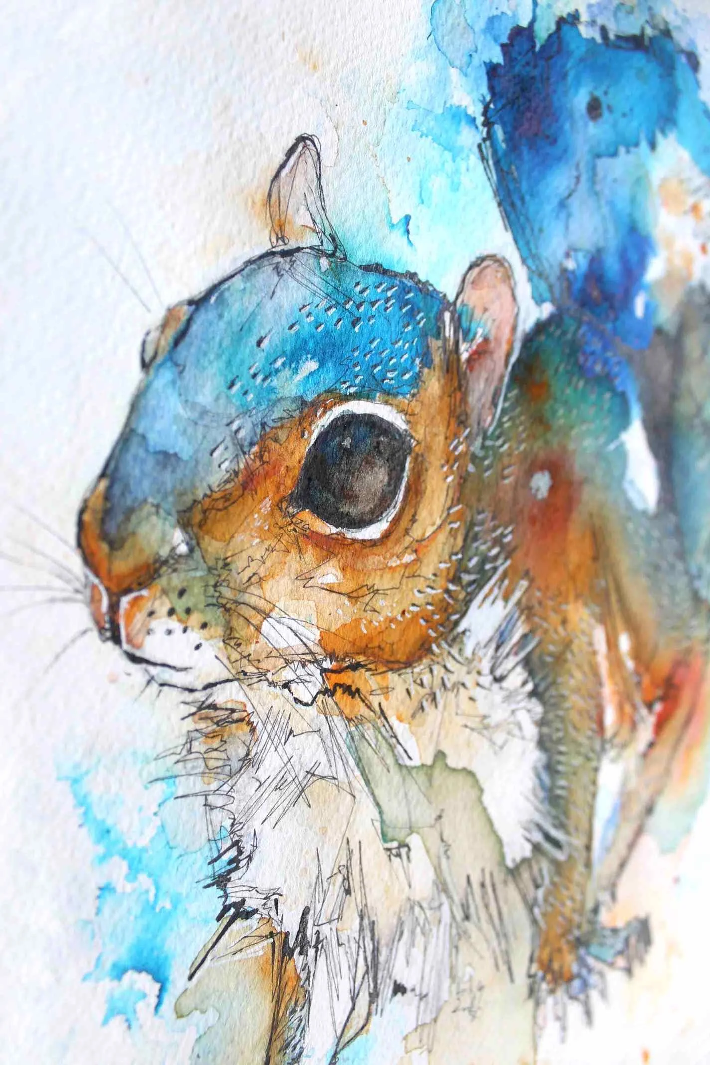
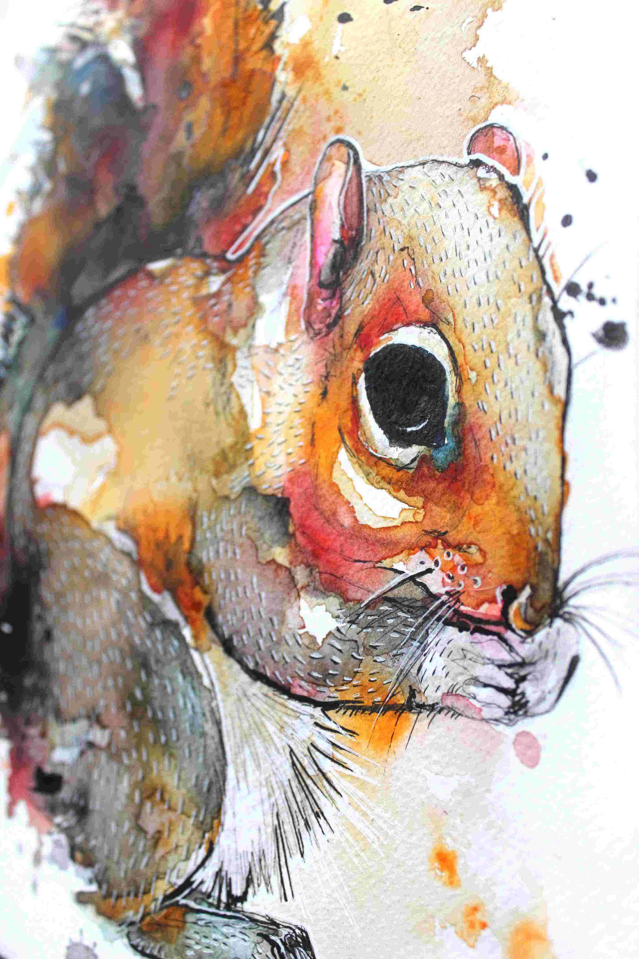
A simple Brusho, watercolour and ink painting just sneaking in before the first month of 2017 is over! This squirrel was part of a trio of squirrels I created for a commission. I’m quite happy with this one, I concentrated on my favourite colour to use  —  orange! Because grey squirrels feature orange so why not abuse it?

This little guy wasn’t chosen and another squirrel I painted was rehomed instead, this piece now is available in my shop to purchase!

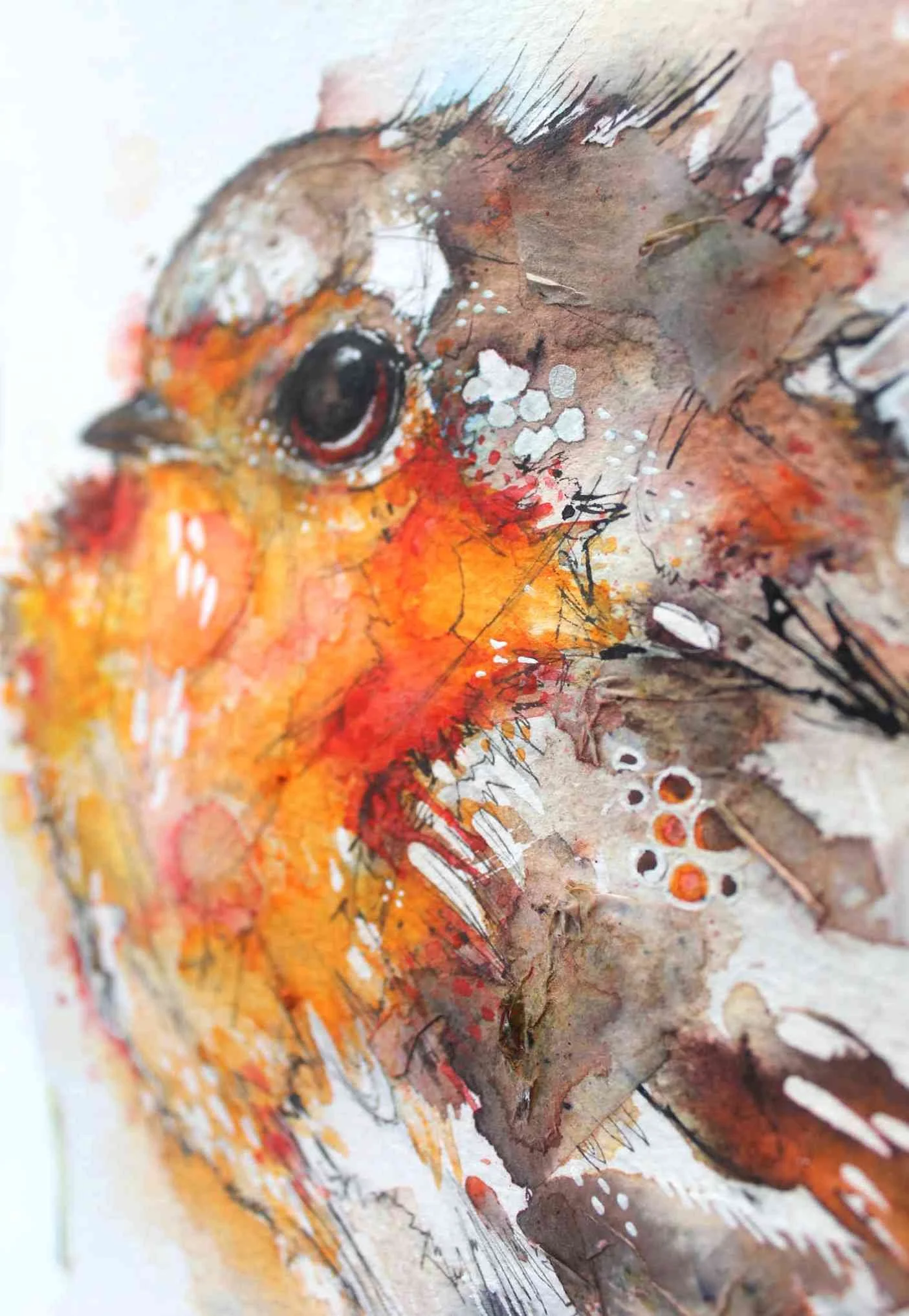
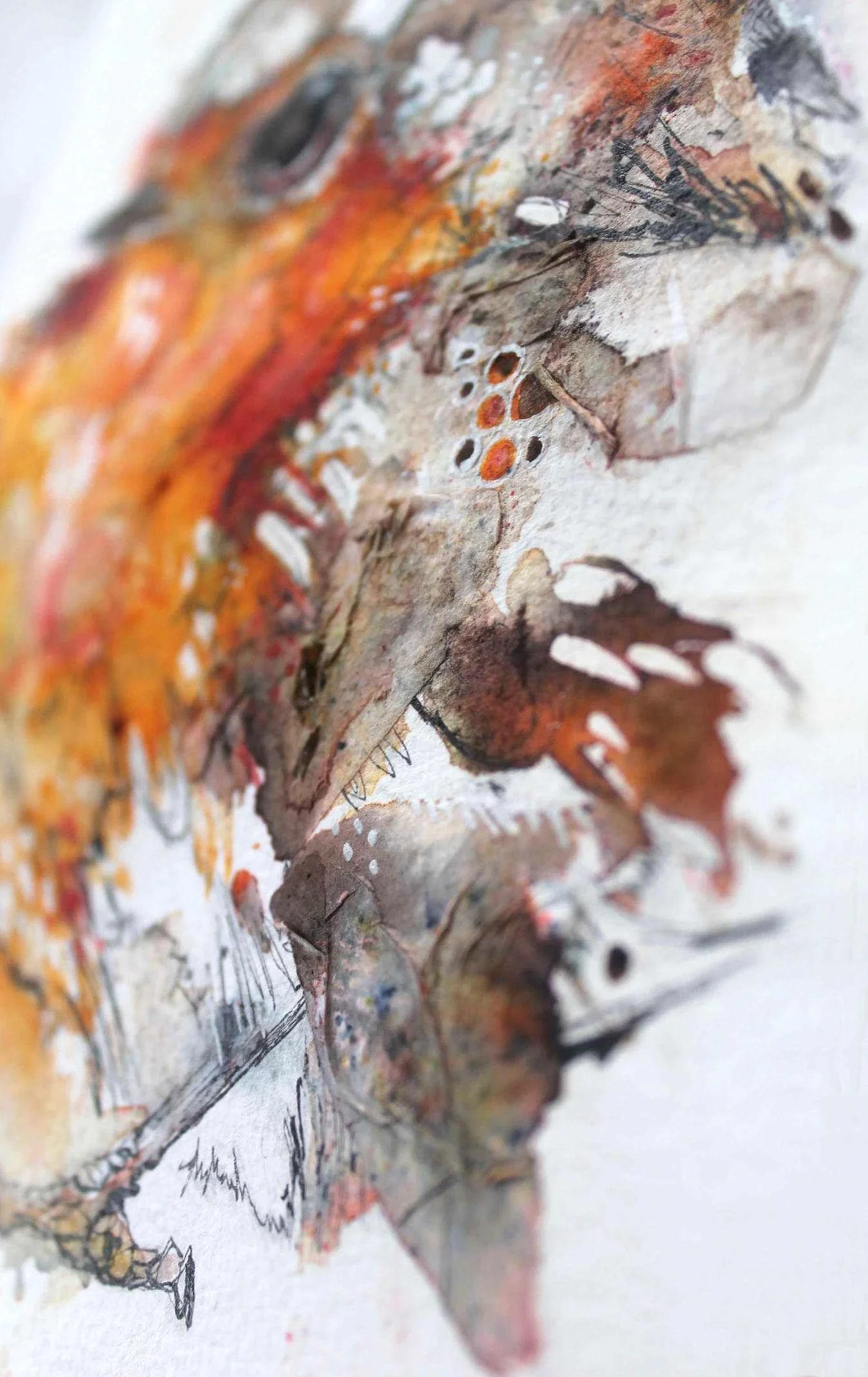
Tissue Tufted Robin

I’ve been experimenting with watercolour ground, gesso, bindex and tissue paper, and I found that watercolour ground is mostly terrible but the combination of tissue paper and bindex gives some very interesting textures to a painting.

I glued on the tissue paper with the bindex over an inked picture, I let it dry then painted on the surface using watercolour paint and Brusho. The paint which has absorbed into the tissue dries as a dull hazy blur, which I really like!

This little A5 robin can be found in my shop and consists of masking fluid, tissue paper, Brusho, fineliner and Indian ink.

Flora Rabbit & Ask Laura

I’ve had quite a few enquiries from other budding artists generally asking about the creative process and any tips I could offer. I’m more than happy to oblige, sharing arty knowledge helps us all develop and progress!

I made this bushy green rabbit (on Bockingford rough watercolour block) in homage to a similar rabbit painting I created back in 2013, I wanted to really graft a lush environment onto an animal. In my recent piece I wanted be be less literal, Brusho pigment was the star of the show, providing me with rich greeny goodness.

My 2013 ‘Flora Rabbit’ in watercolour and ink.

I broke down my process visually, so you can get a good handle on how a piece comes together and I also wanted to summarise and address a few of the questions I have sent to me:

Victoria asks: Do you pen or paint first, and why?

I’ve always found it more comfortable and natural to pen first and paint second, it gives me a structure to work from, one which I cannot easily manipulate which means design and drawing quality is very important.

Bridin asks: How exactly do you use ink and watercolour when you are making work?

After establishing a drawing in pen and Indian ink, I apply faint layers of watercolour slowly and build them up when dry. After I’m happy with the applied colour, I identify areas I want to highlight and draw attention to by making large puddles or flecks of water on the paper which I then inject with strong ink colour.

Charlotte-Rose asks: What tools/mediums do you use?

I have found that watercolour, Brusho pigment, ink and Indian ink are my favoured media at the moment, something about the spontaneity and the risk of these mediums really appeal. I use paintbrushes, spray bottles, pipettes, straws and ink quills in my artwork, sometimes I may use a ruler to scrape off some pastel dust onto a piece if it’s screaming for a dusting  —  particularly if my work features insects.
Q: What is your best advice?

As boring as it might sound, don’t stress, be patient and PRACTICE! I can’t really save anyone any time. As long as you are enjoying the process, over time you’ll definitely improve, unimaginably so if you put the time and effort in.

The aim of my website was to share the progress of my artwork through the years with all the naivety and embarrassment to help illustrate to other budding artists that no one is great overnight — we all start rather crap.

Every mistake is a lesson, it used to take me 5-7 terrible pieces to make one I was somewhat happy with. But with three years of practice and perseverance I’ve been able to produce work of a reasonable and even good quality without wasting a single sheet of watercolour paper.

(And in spite of me religiously telling my art teachers at college I couldn’t paint!)

Mischievous Raccoon

Raccoons are found more commonly in North America, but thanks to deliberate introductions and escapees can also be found in places such as Japan and even Europe!

Common raccoons are black, grey and white from a distance, but I really ran with the browns and yellows which also exist in the raccoons fluffy coat, but I’ve manipulated the colours in photo editing software and produced a monochrome version.

I still prefer the original, I’ve painted my finger tips with white, brown and grey ink and pressed them into the painting to keep that thieving, sticky, grubby raccoon stereotype alive, as they are excellent opportunists!