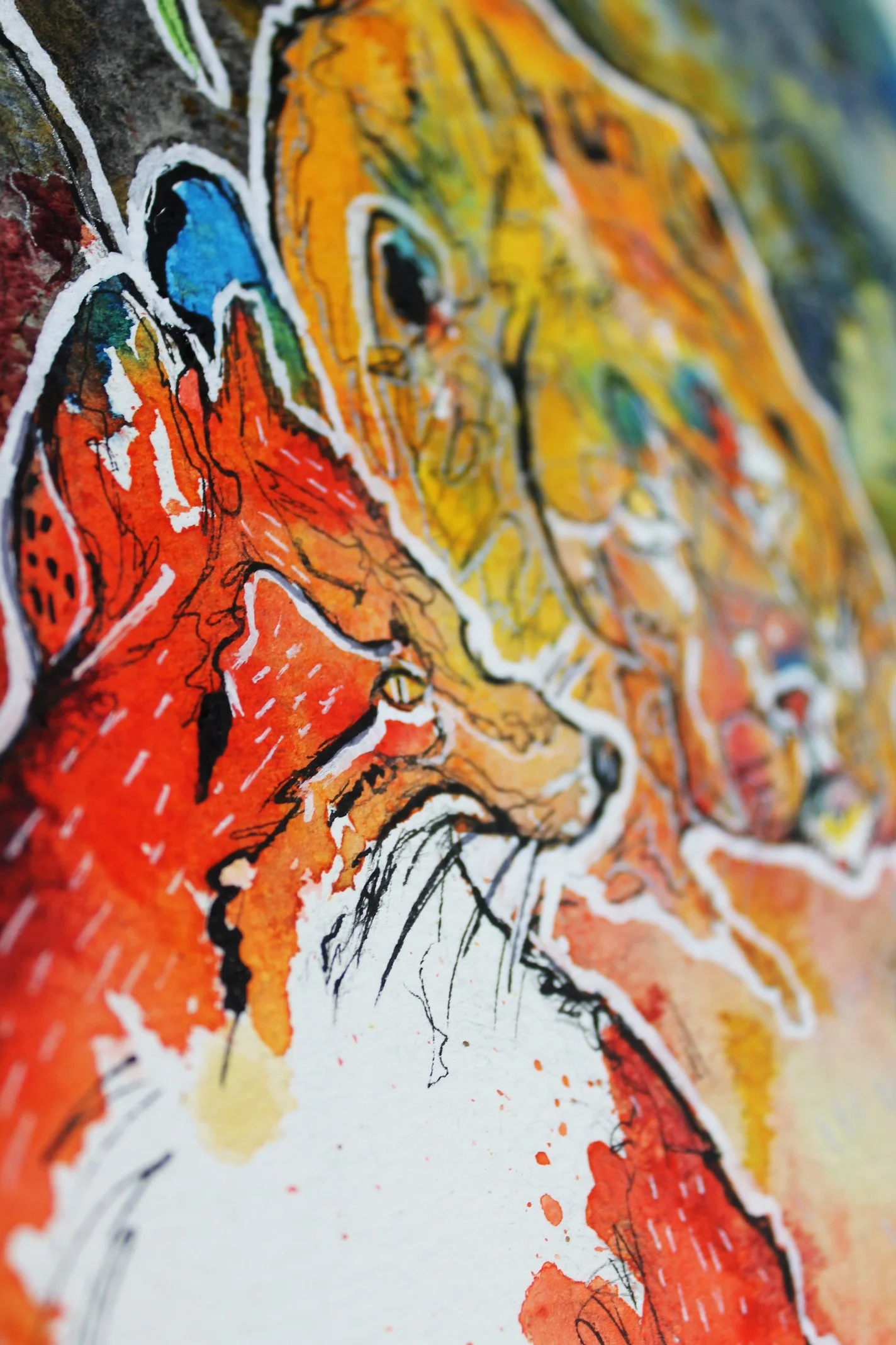
After a long wait, I chose the old lion fable to illustrate. But I yet again fail to do the fable justice. My over complicated design idea and fondness for that white line has overwhelmed the image and left it looking not so great. I used some computer added shading to put the two characters in a little more context, but I do it every time, I just over do it!
The old lion’s head rested on the path leading into his cave, the faint tracks of the doomed animals in the soil and the fox’s reluctant stance — I cobbled this image together using the same materials, watercolour, pigment, ink and coffee.
I need to get in more practice on simpler subject matter before conquering another Aesop so it may be sometime before I have a collection I am happy with, but hopefully it will be worth it. I like the lion’s face though, I’m pleased with him!
“A Lion, enfeebled by age and no longer able to procure food for himself by force, determined to do so by cunning. Betaking himself to a cave, he lay down inside and feigned to be sick: and whenever any of the other animals entered to inquire after his health, he sprang upon them and devoured them. Many lost their lives in this way, till one day a Fox called at the cave, and, having a suspicion of the truth, addressed the Lion from outside instead of going in, and asked him how he did. He replied that he was in a very bad way: ‘But,’ said he, ‘why do you stand outside? Pray come in.’ ‘I should have done so,’ answered the Fox, ‘if I hadn’t noticed that all the footprints point towards the cave and none the other way.’”
