ODDKNESS
Laura Corbettis
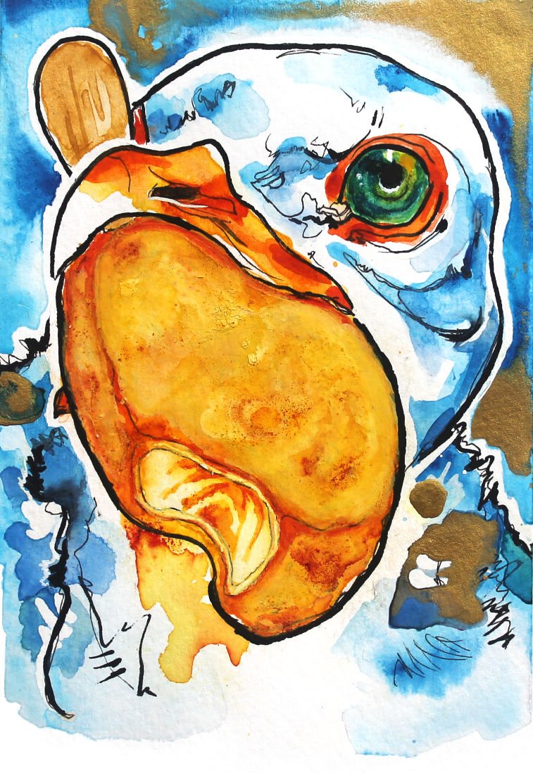
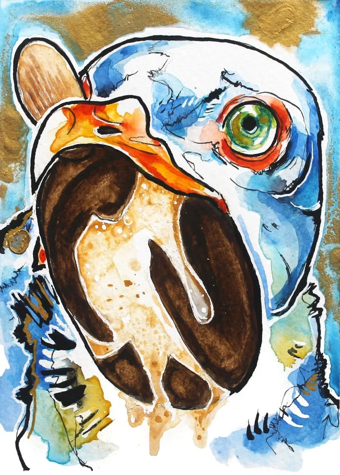
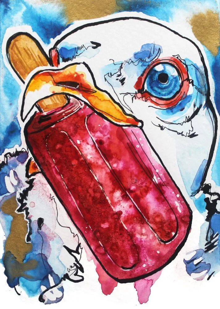
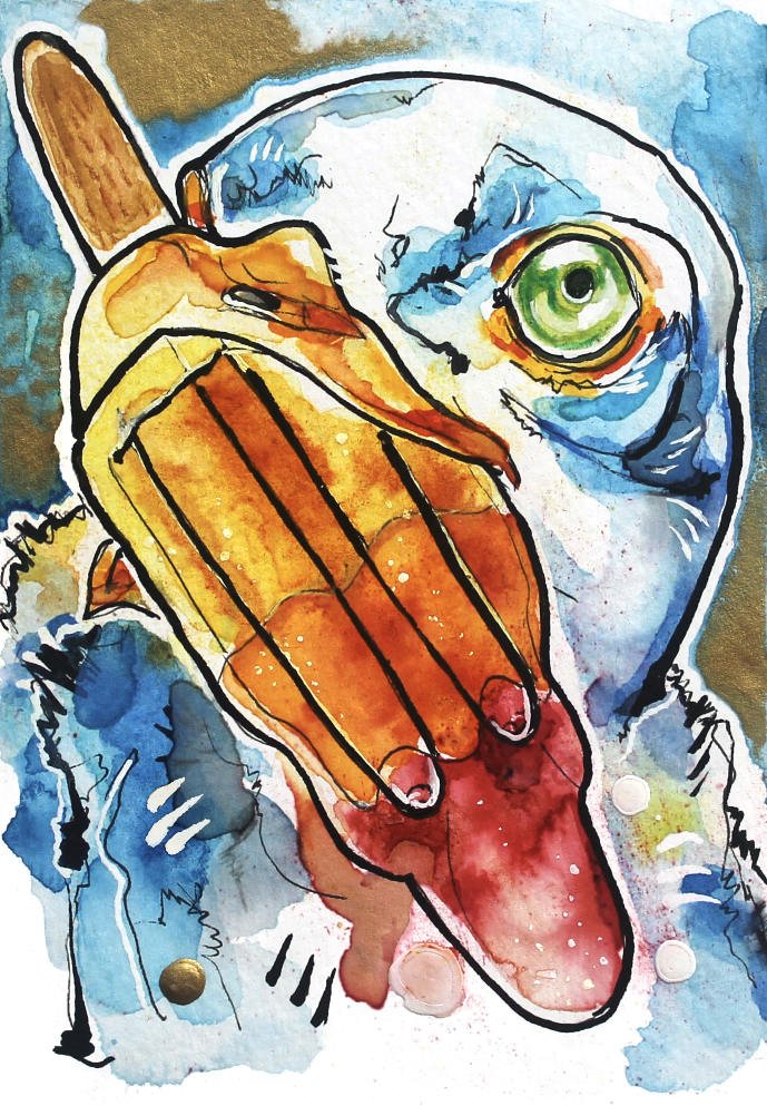
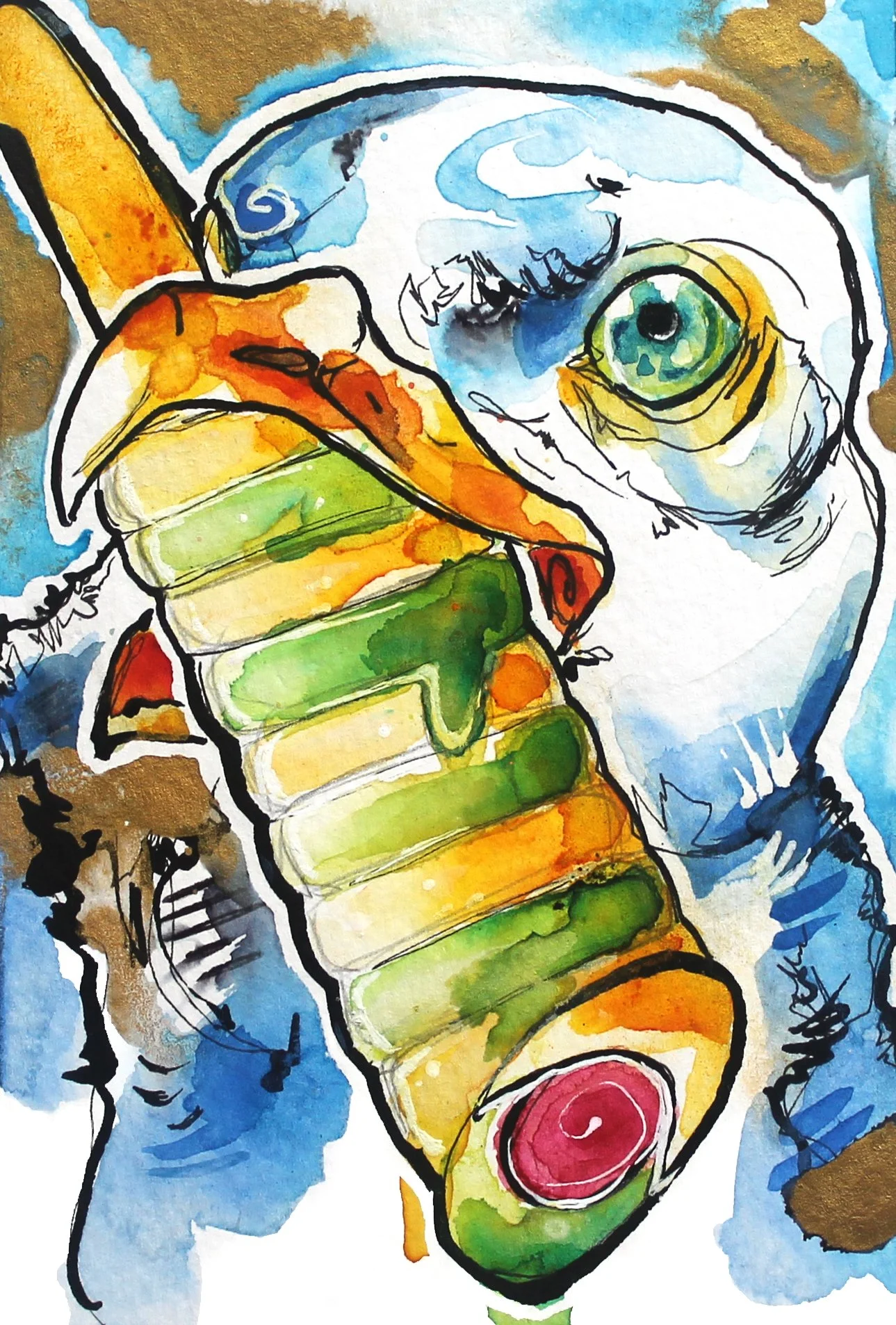
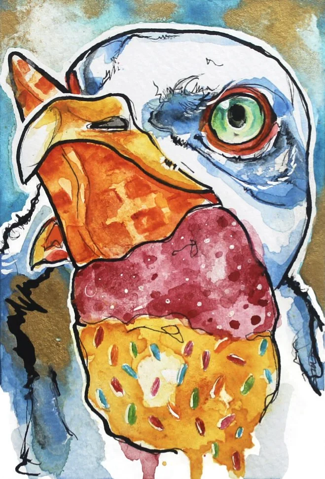
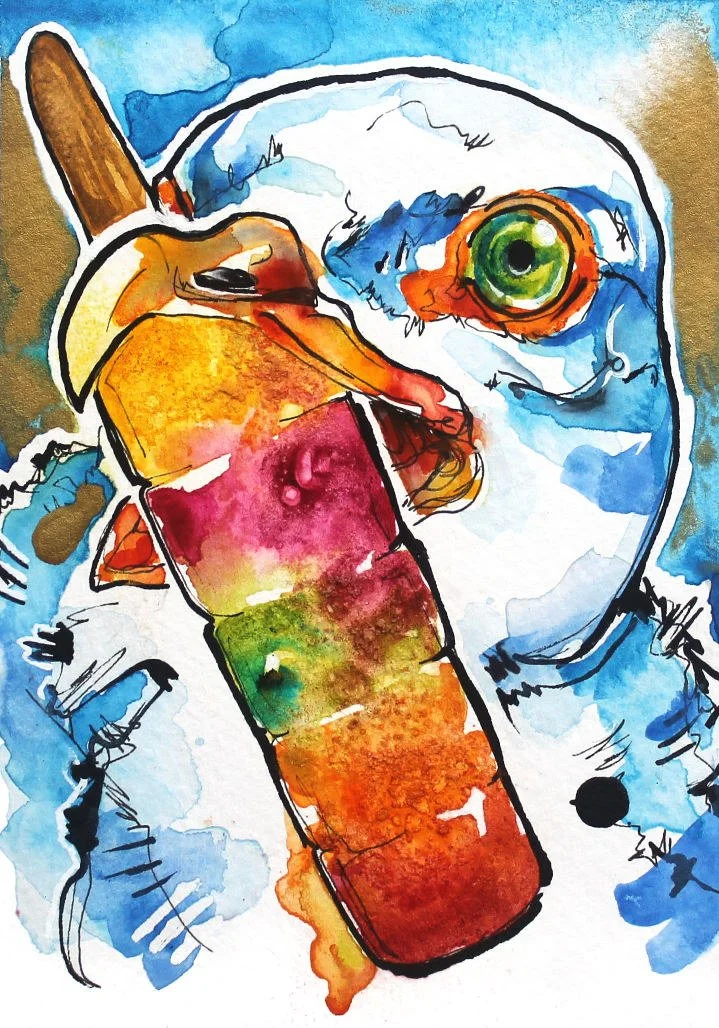
Let’s all be gullfriends
GULLS
BEACHCOMBING
BLOG
ME...