Grey Fox

I’m not happy with any of these grey fox paintings but again, they were colourful enough that they would make a nice addition to the site. Grey foxes are found in the Americas and are like our red foxes carnivorous and nocturnal, but unlike red foxes are agile tree climbers!

These foxes were painted on cold pressed watercolour paper and in Brusho, watercolour and ink.

Simple Squirrel

A simple Brusho, watercolour and ink painting just sneaking in before the first month of 2017 is over! This squirrel was part of a trio of squirrels I created for a commission. I’m quite happy with this one, I concentrated on my favourite colour to use  —  orange! Because grey squirrels feature orange so why not abuse it?

This little guy wasn’t chosen and another squirrel I painted was rehomed instead, this piece now is available in my shop to purchase!

Tissue Tufted Robin

I’ve been experimenting with watercolour ground, gesso, bindex and tissue paper, and I found that watercolour ground is mostly terrible but the combination of tissue paper and bindex gives some very interesting textures to a painting.

I glued on the tissue paper with the bindex over an inked picture, I let it dry then painted on the surface using watercolour paint and Brusho. The paint which has absorbed into the tissue dries as a dull hazy blur, which I really like!

This little A5 robin can be found in my shop and consists of masking fluid, tissue paper, Brusho, fineliner and Indian ink.

Flora Rabbit & Ask Laura

I’ve had quite a few enquiries from other budding artists generally asking about the creative process and any tips I could offer. I’m more than happy to oblige, sharing arty knowledge helps us all develop and progress!

I made this bushy green rabbit (on Bockingford rough watercolour block) in homage to a similar rabbit painting I created back in 2013, I wanted to really graft a lush environment onto an animal. In my recent piece I wanted be be less literal, Brusho pigment was the star of the show, providing me with rich greeny goodness.

My 2013 ‘Flora Rabbit’ in watercolour and ink.

I broke down my process visually, so you can get a good handle on how a piece comes together and I also wanted to summarise and address a few of the questions I have sent to me:

Victoria asks: Do you pen or paint first, and why?

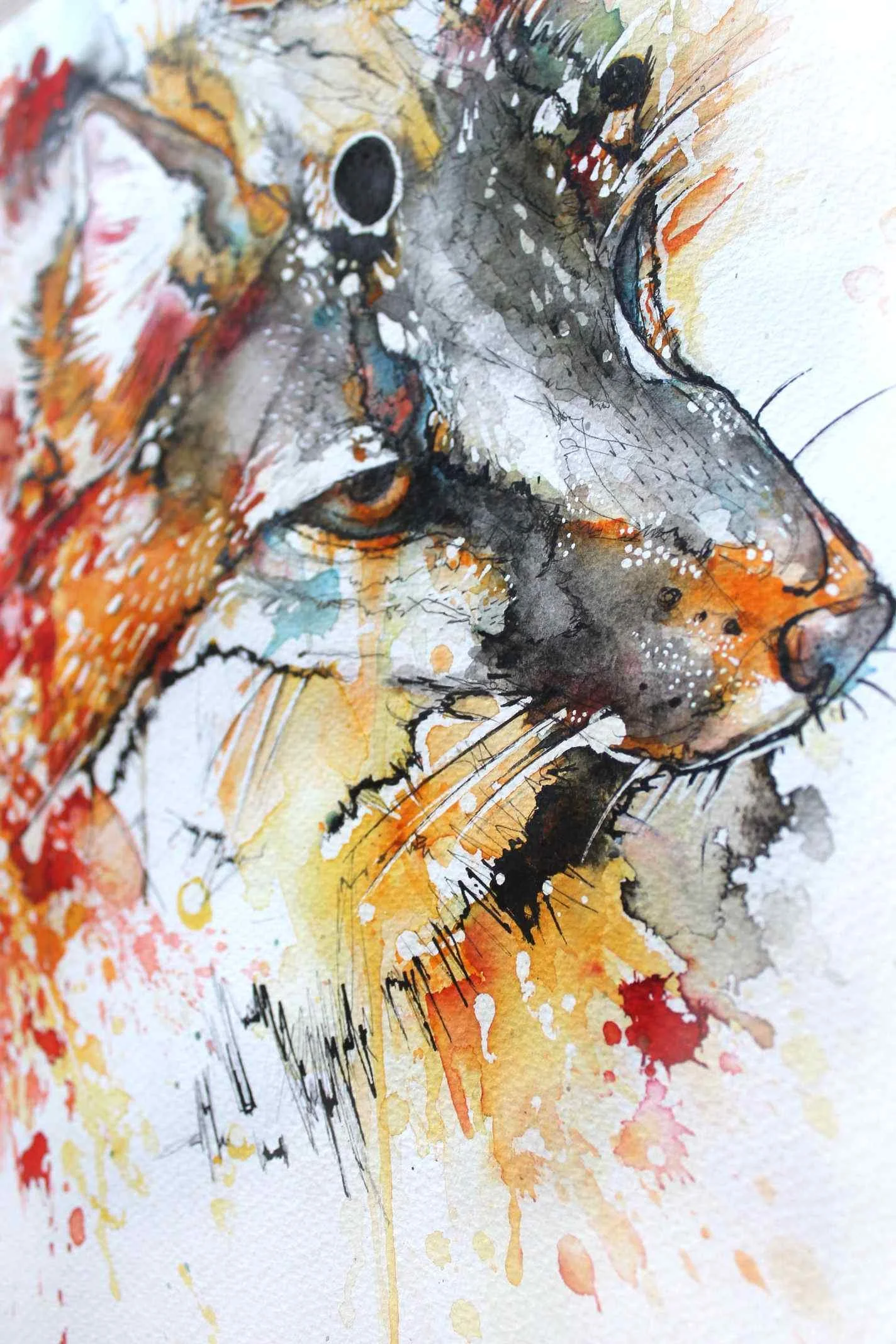
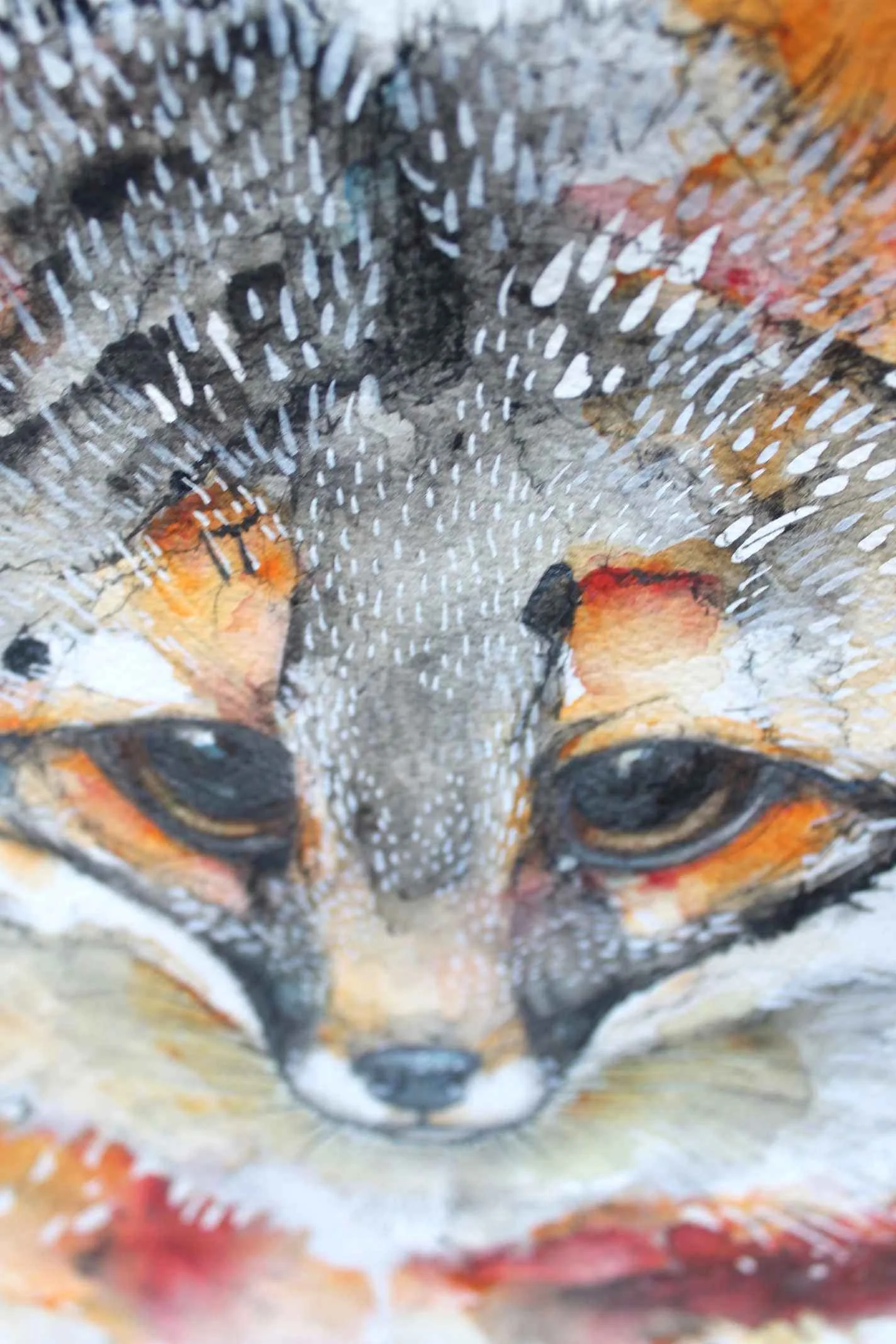
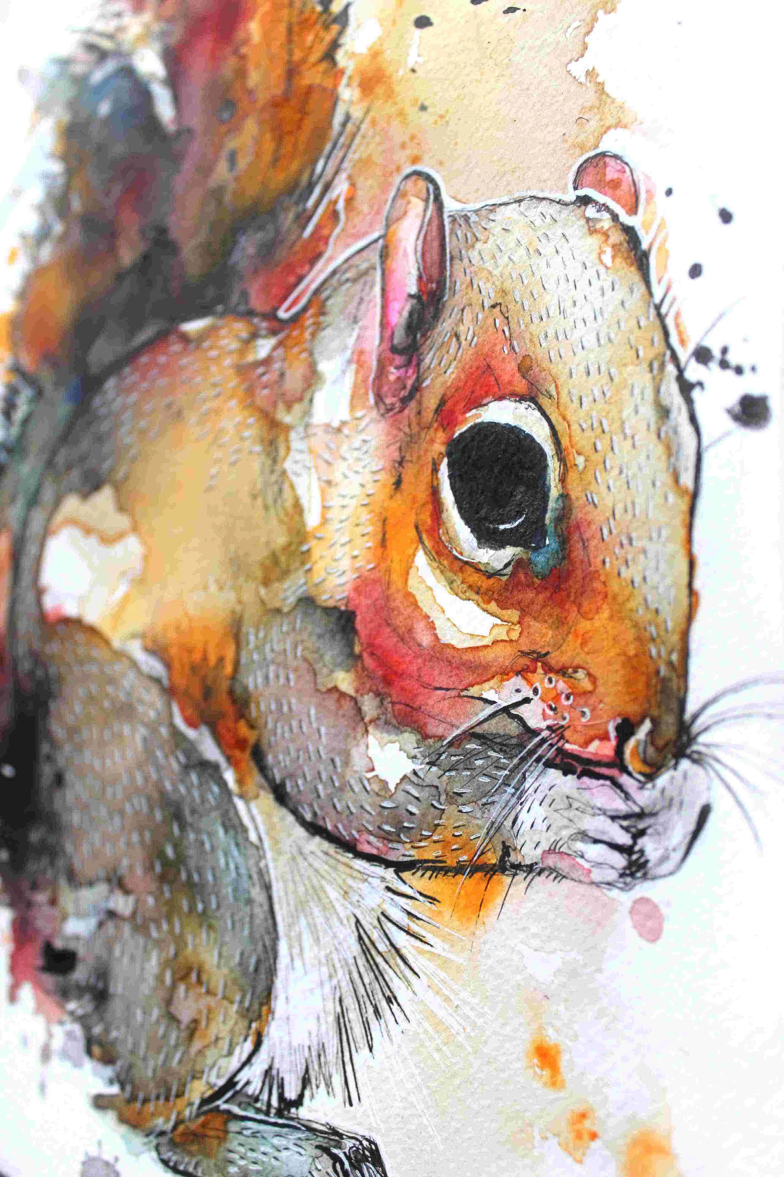
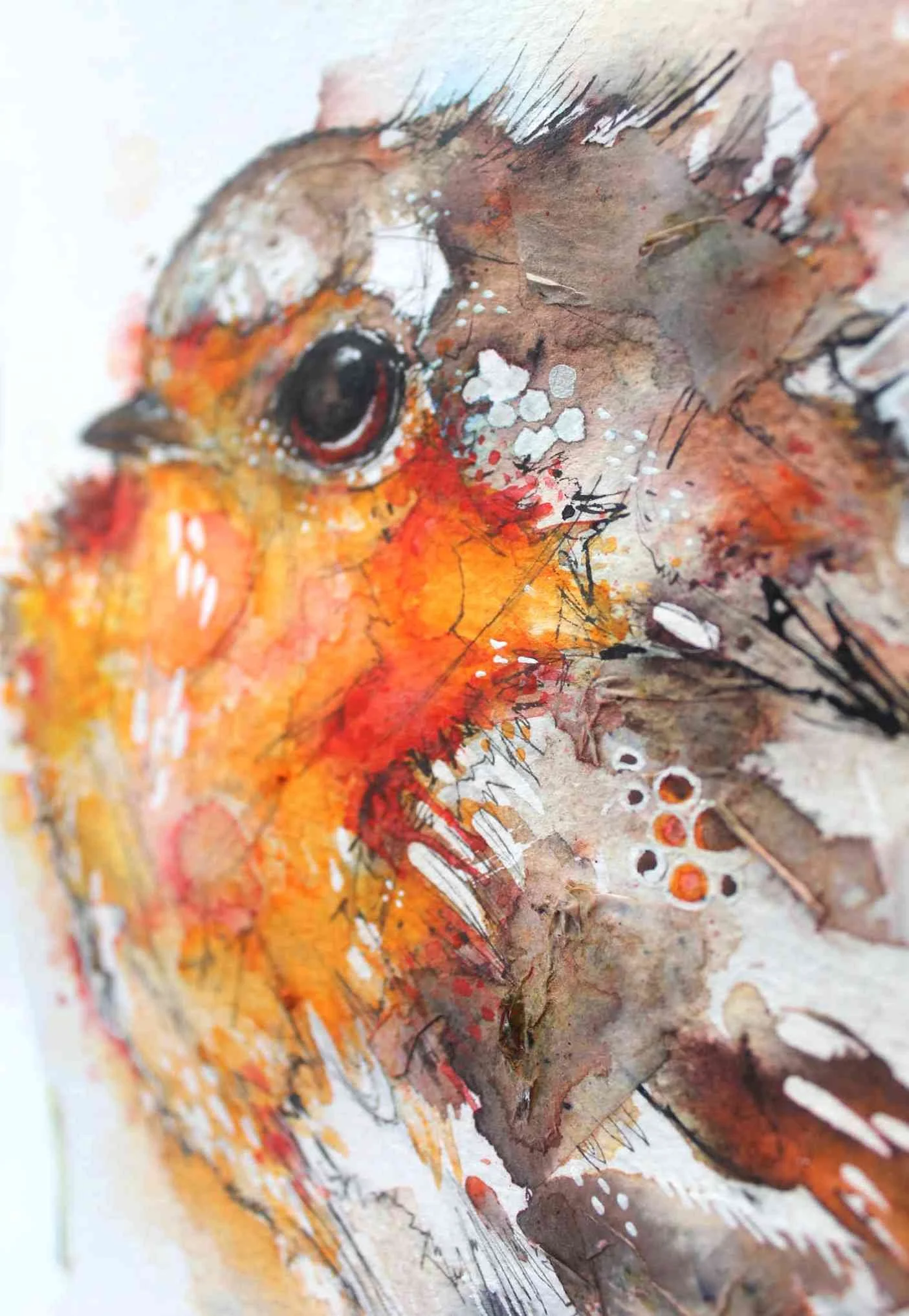
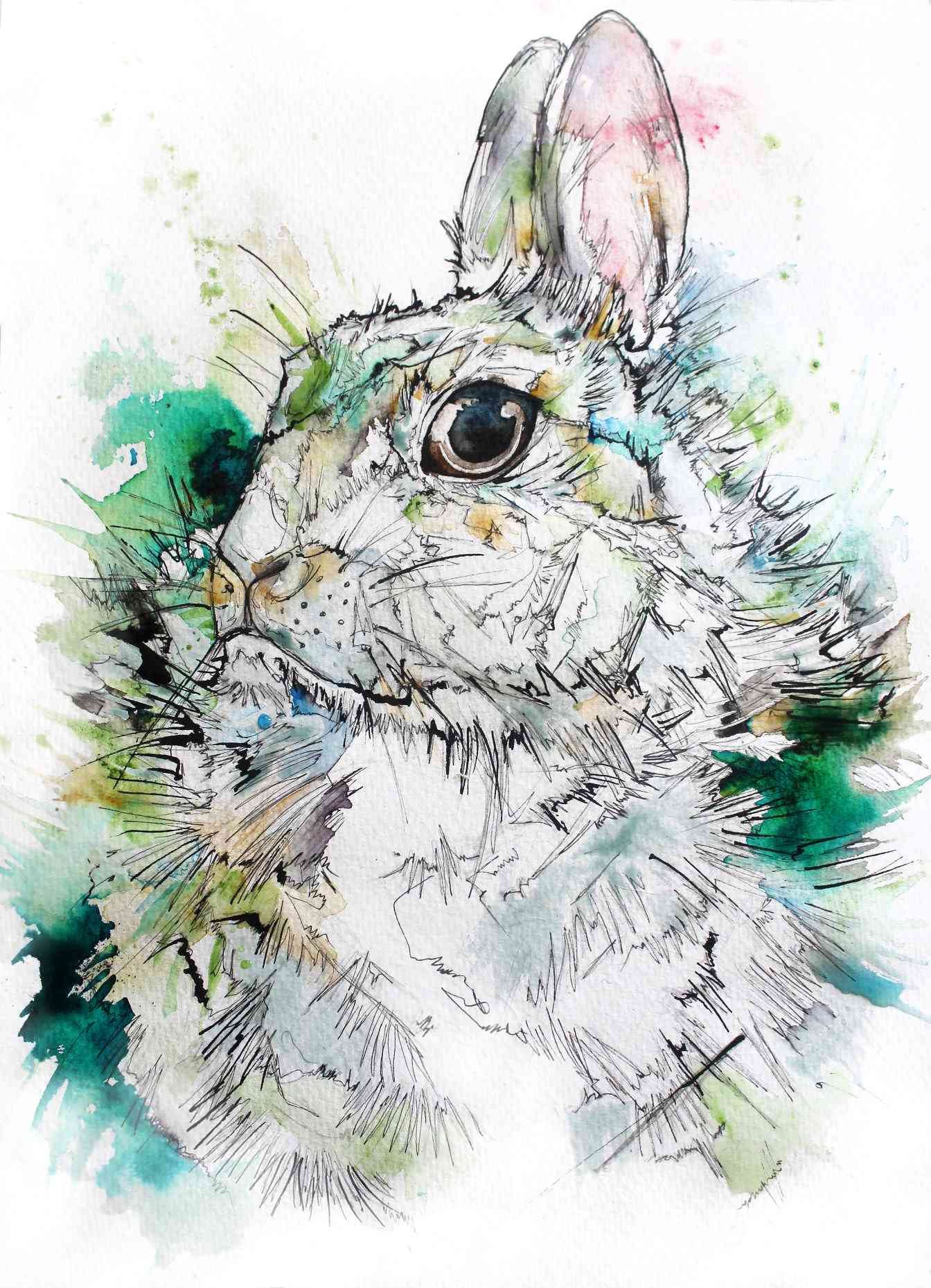
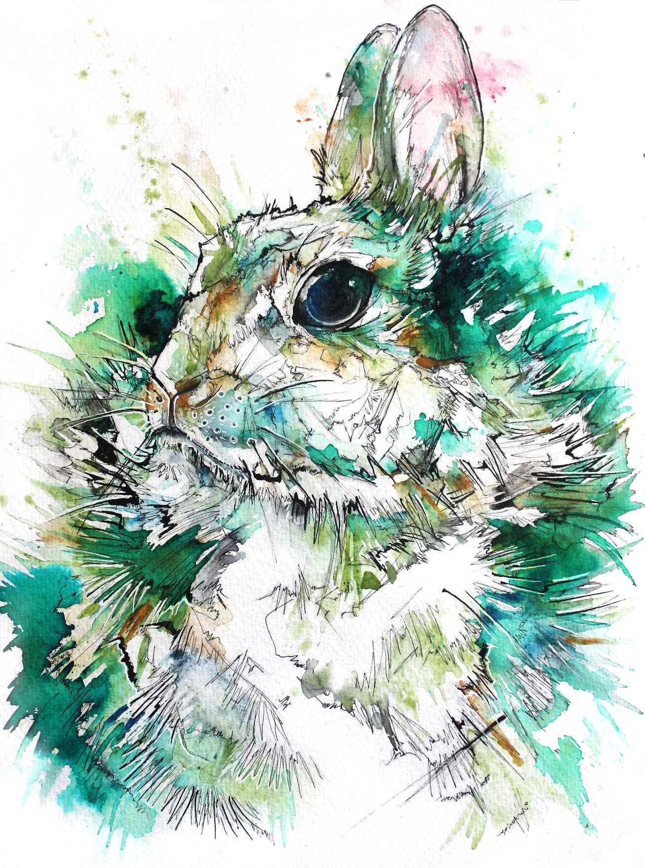
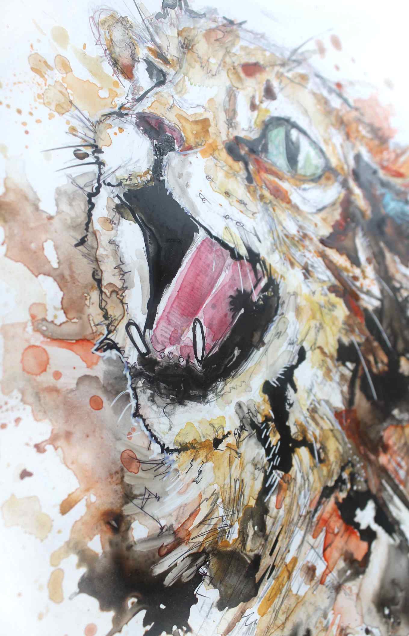
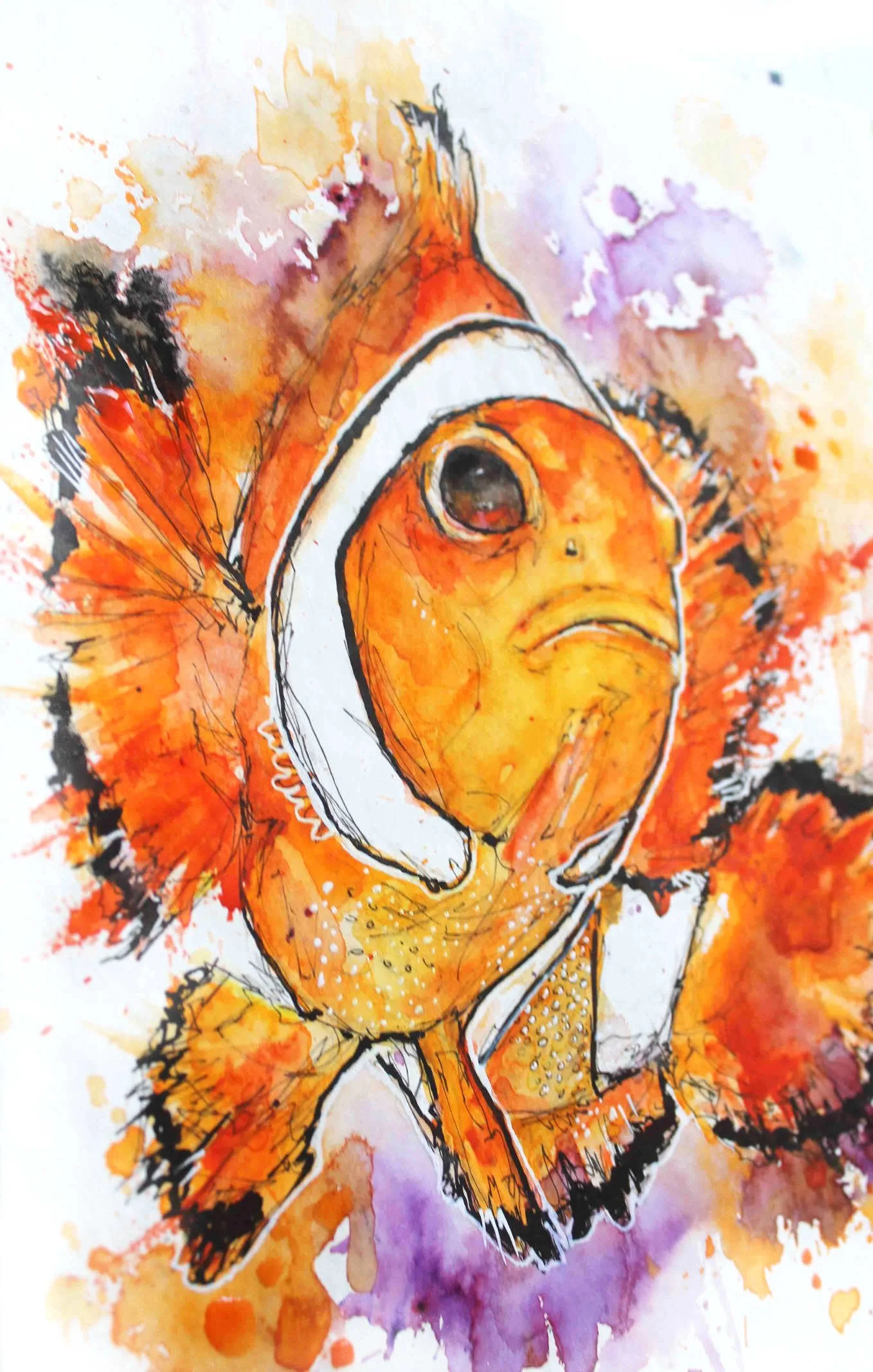
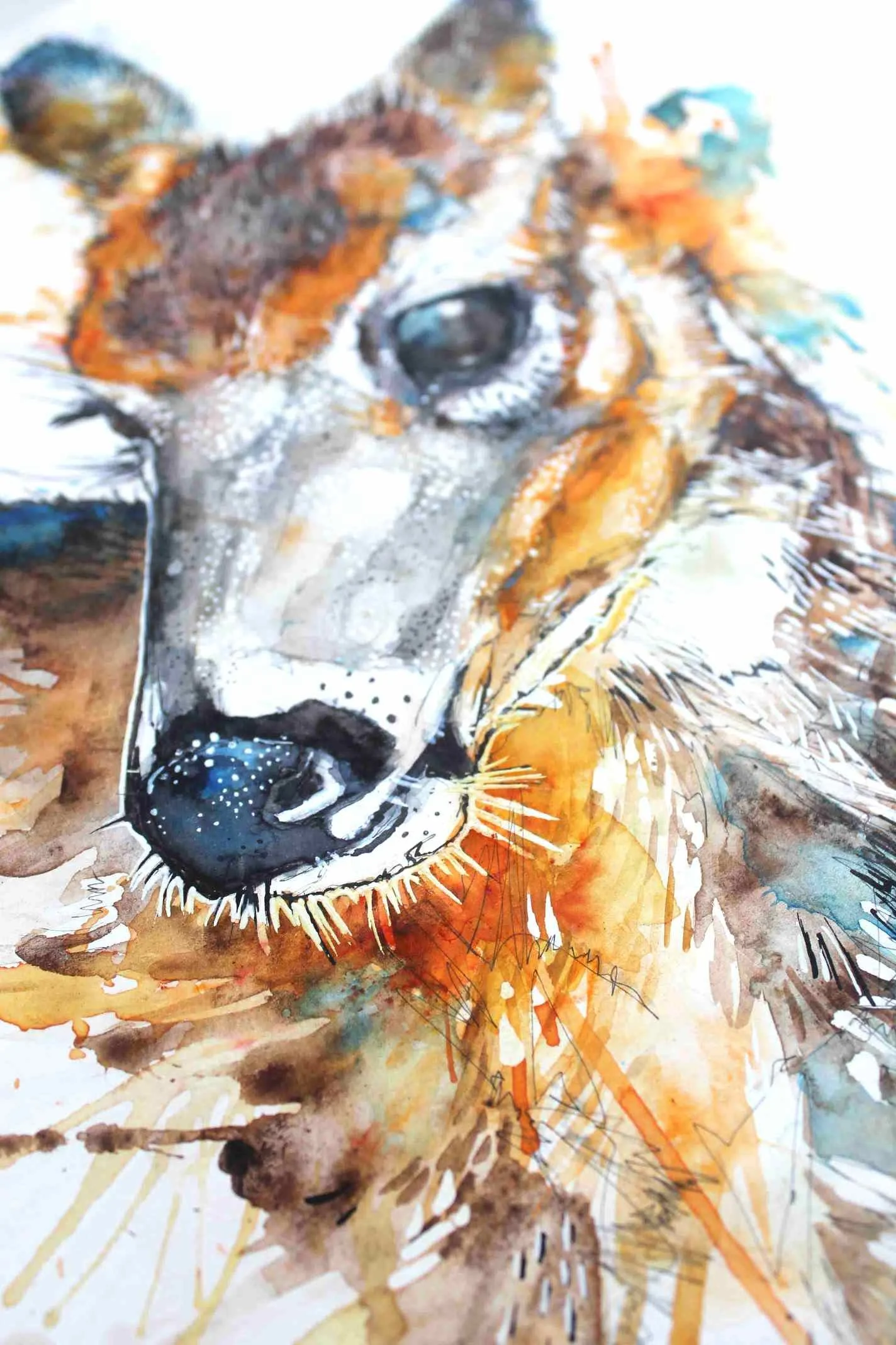
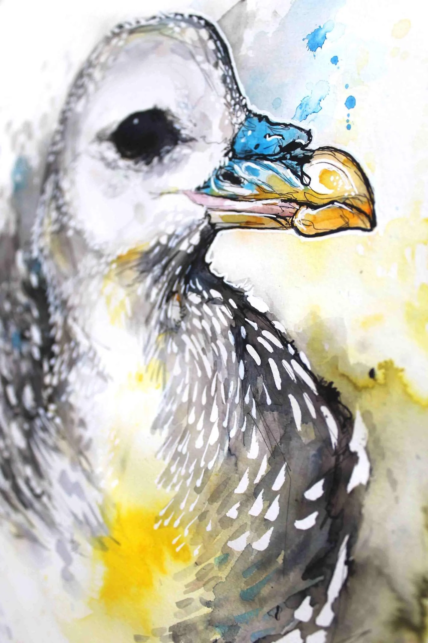
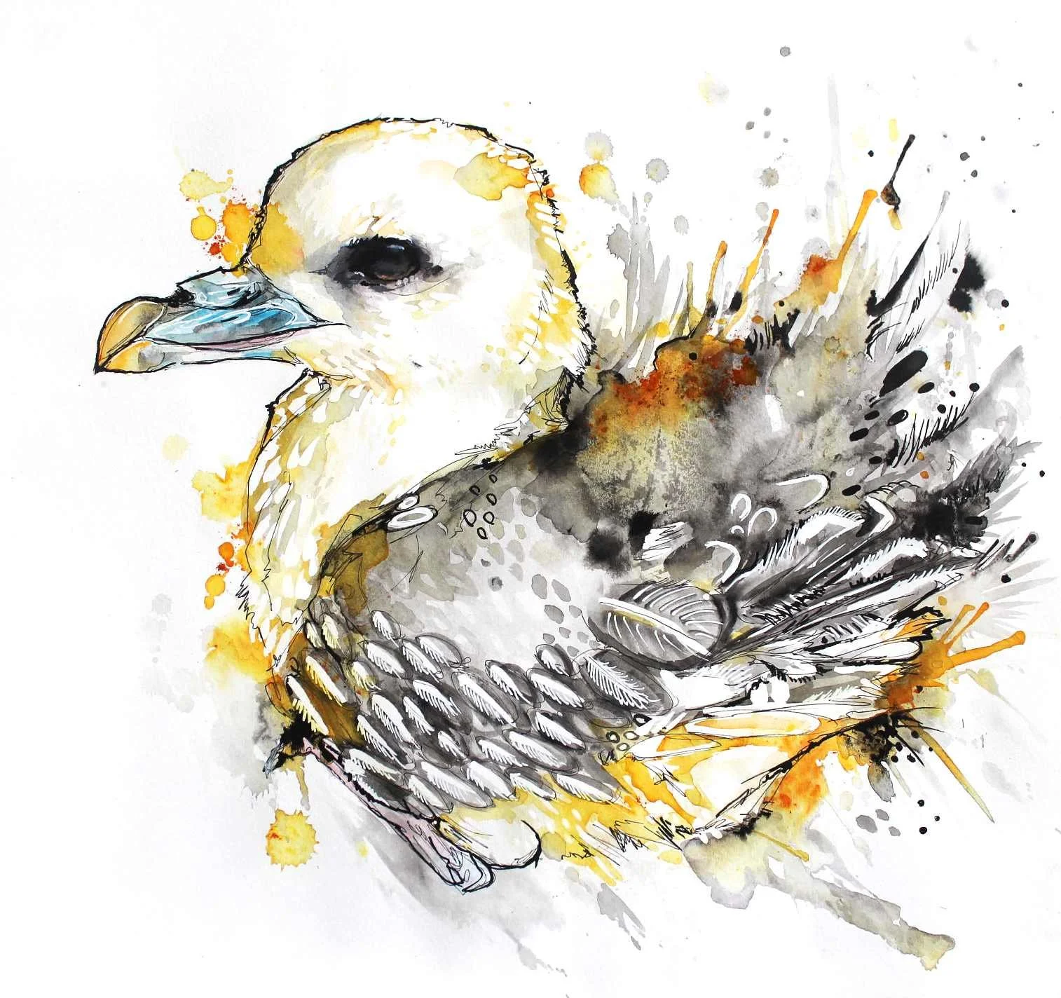
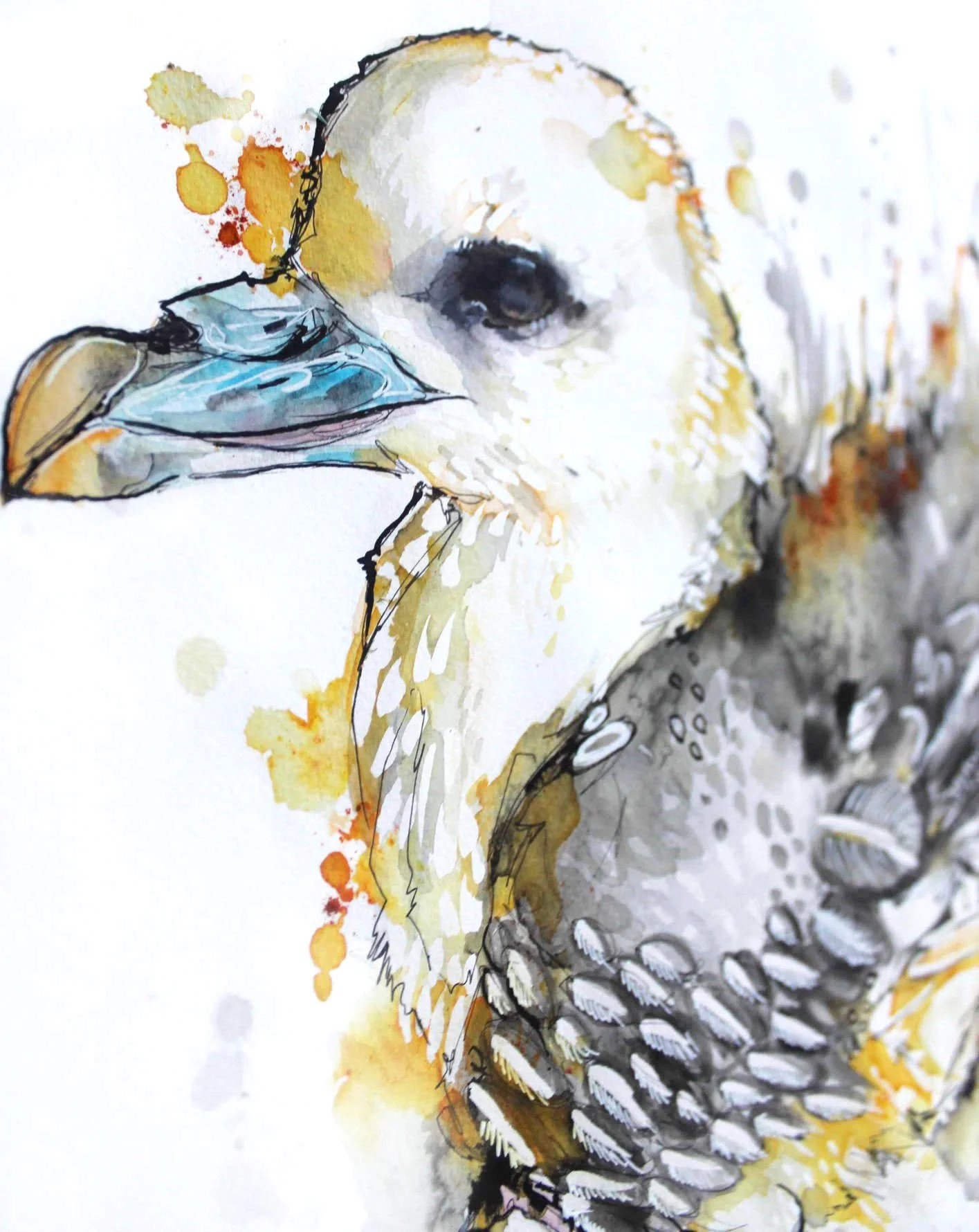
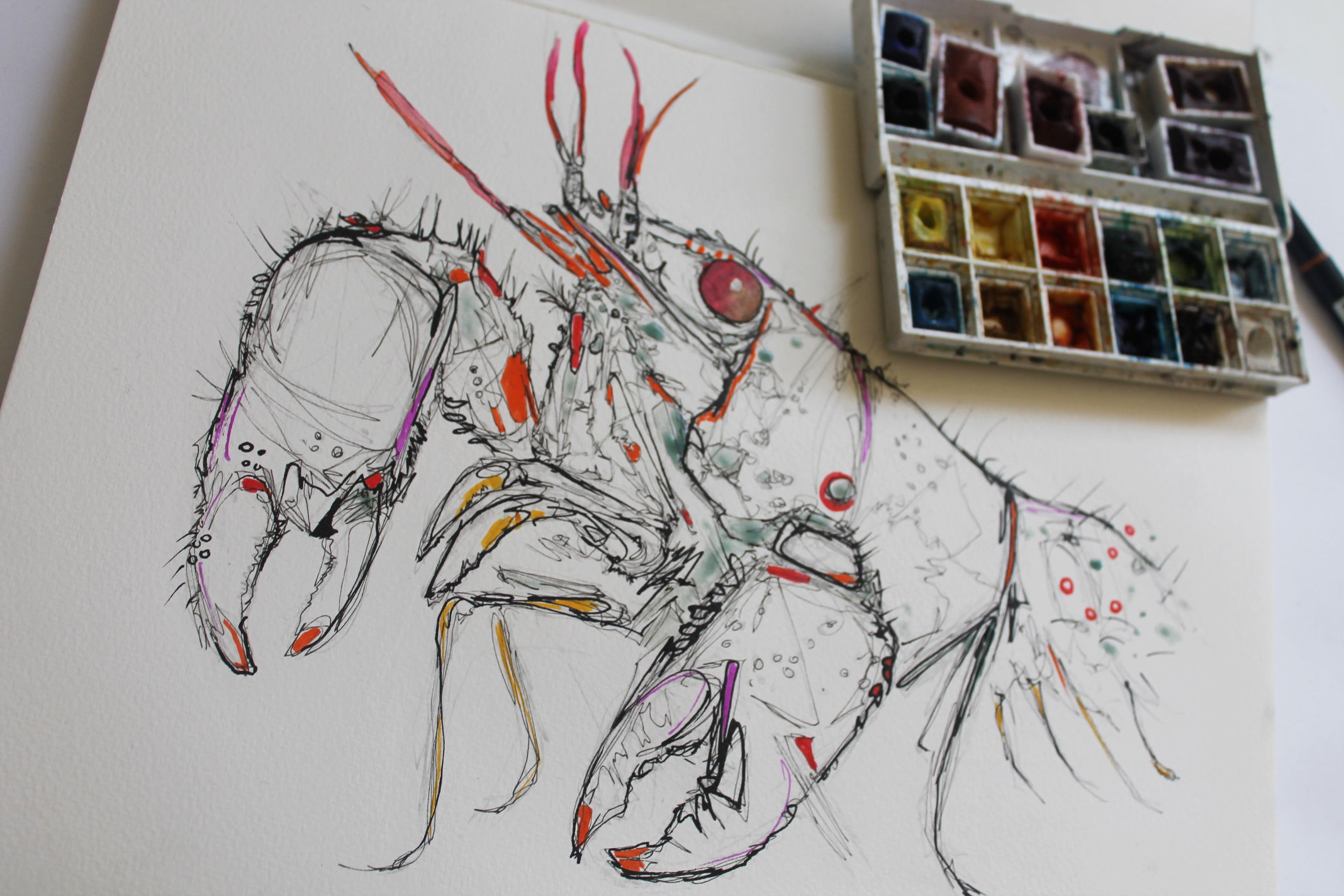
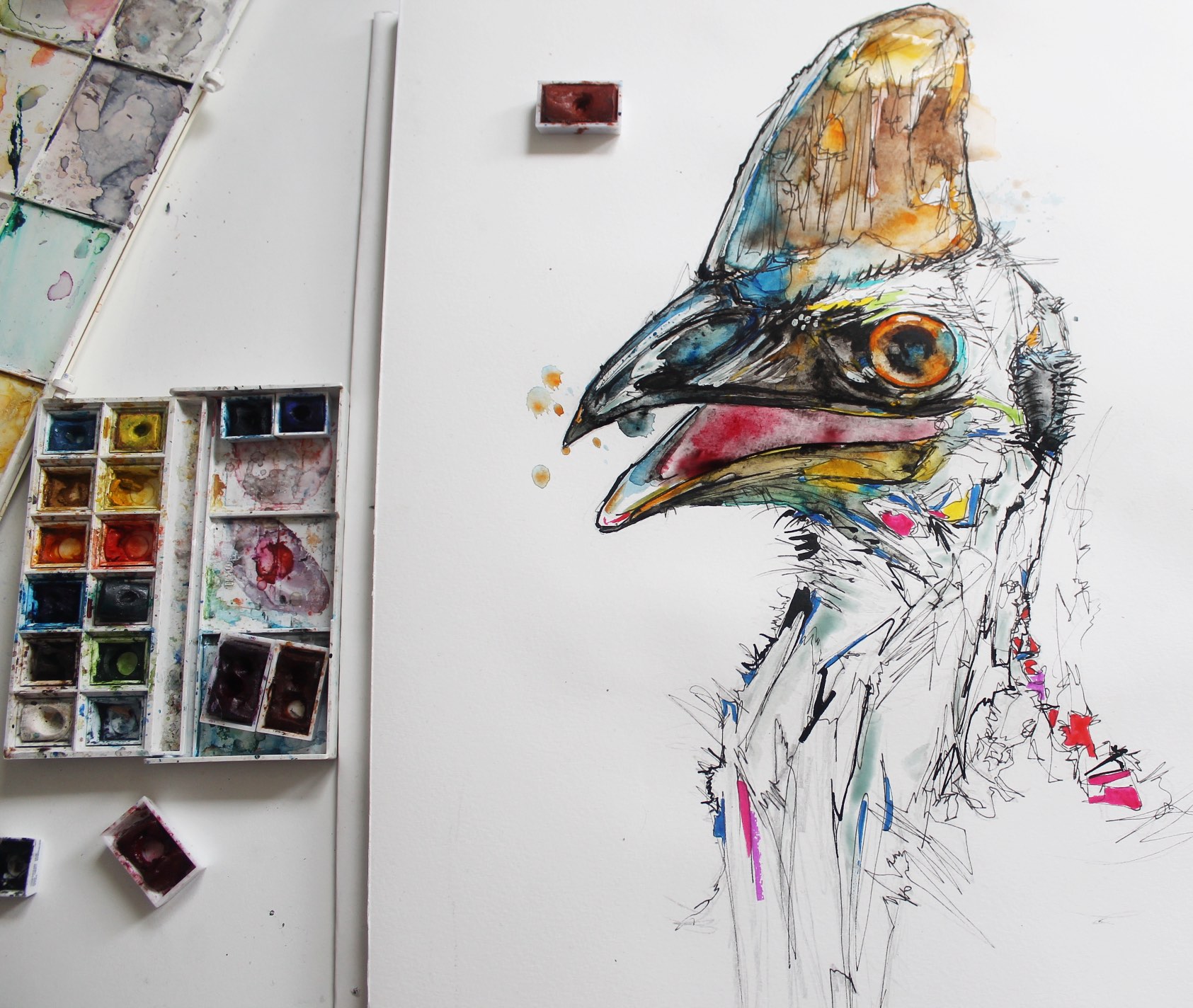
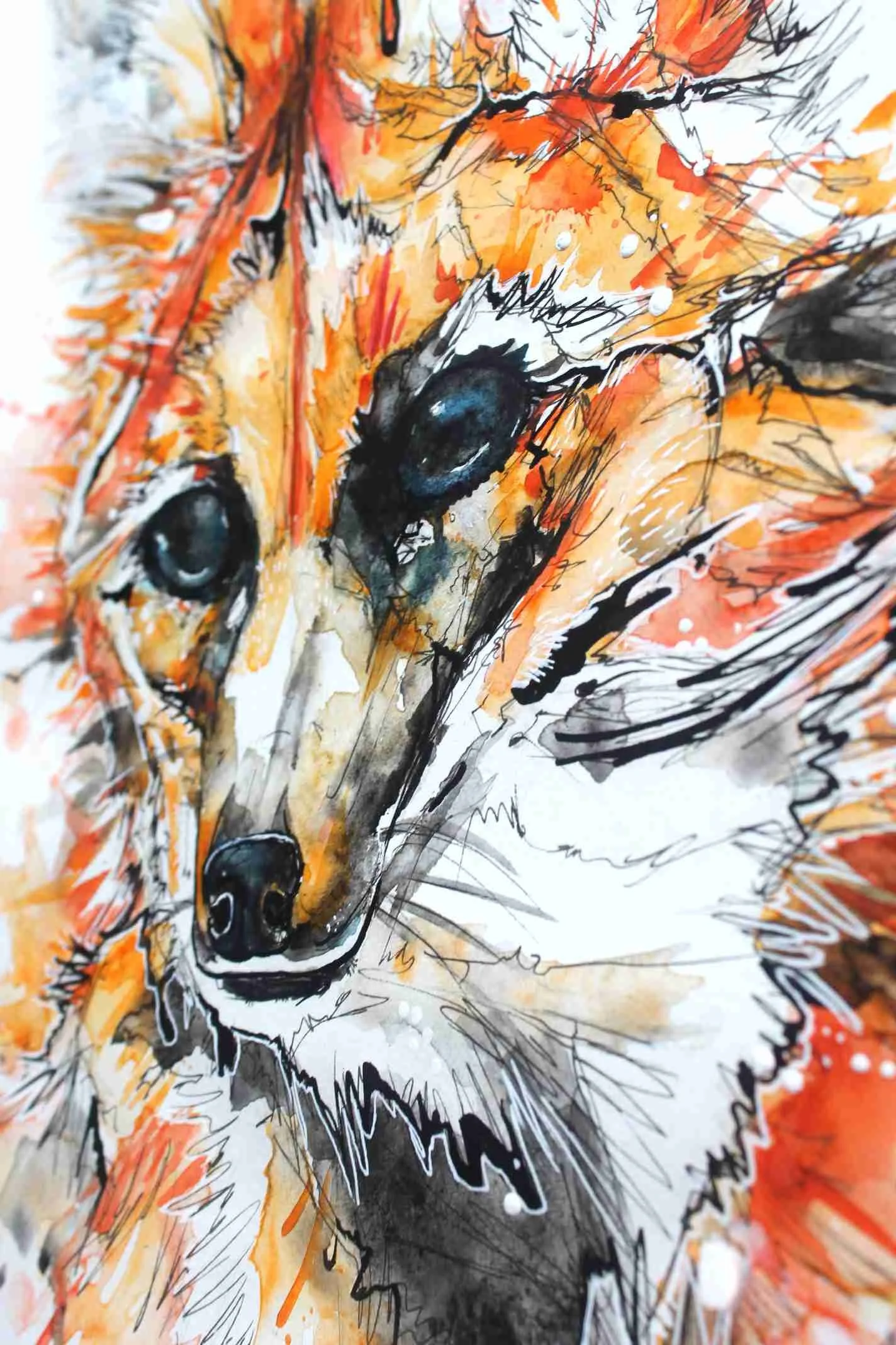
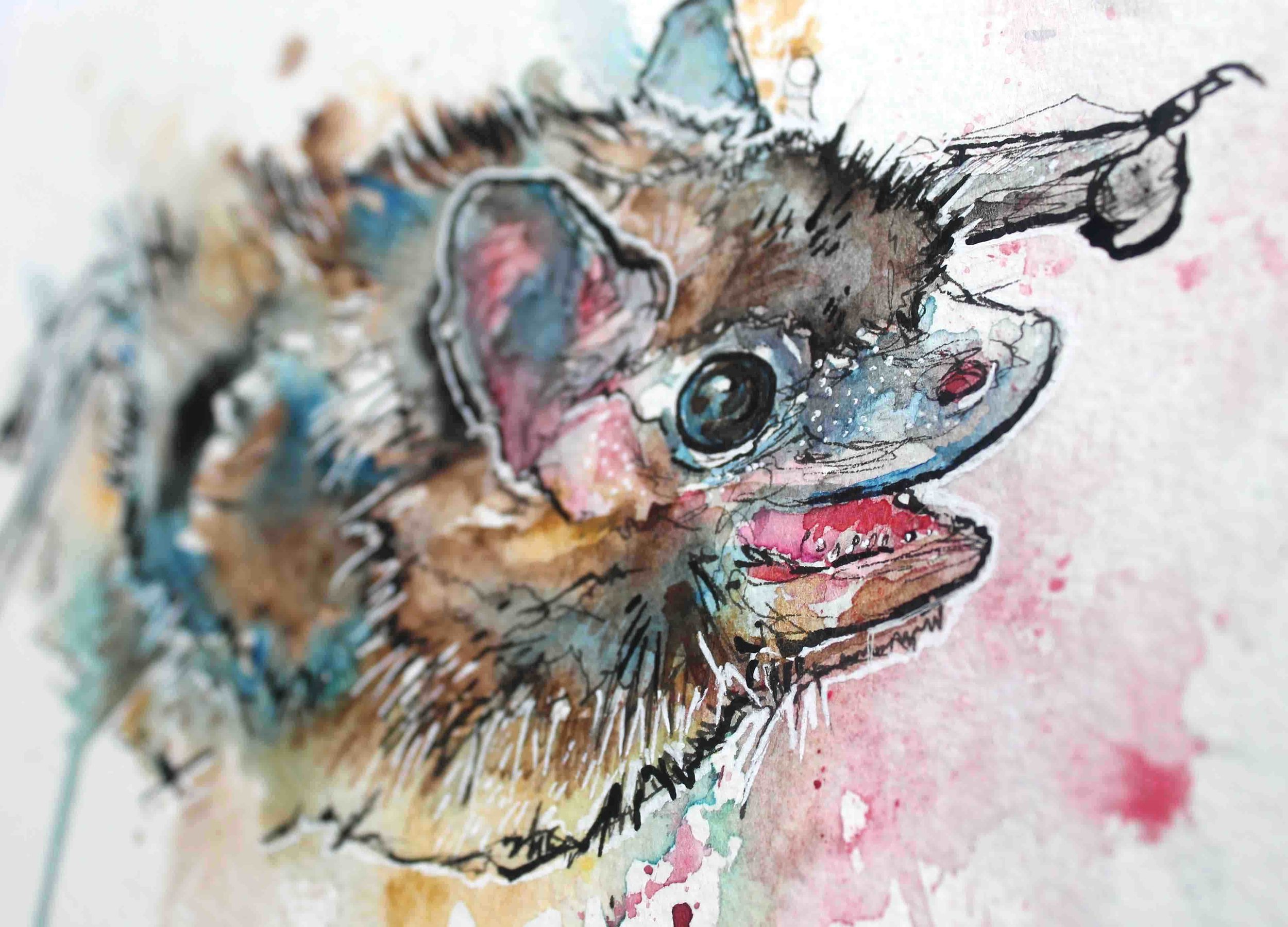
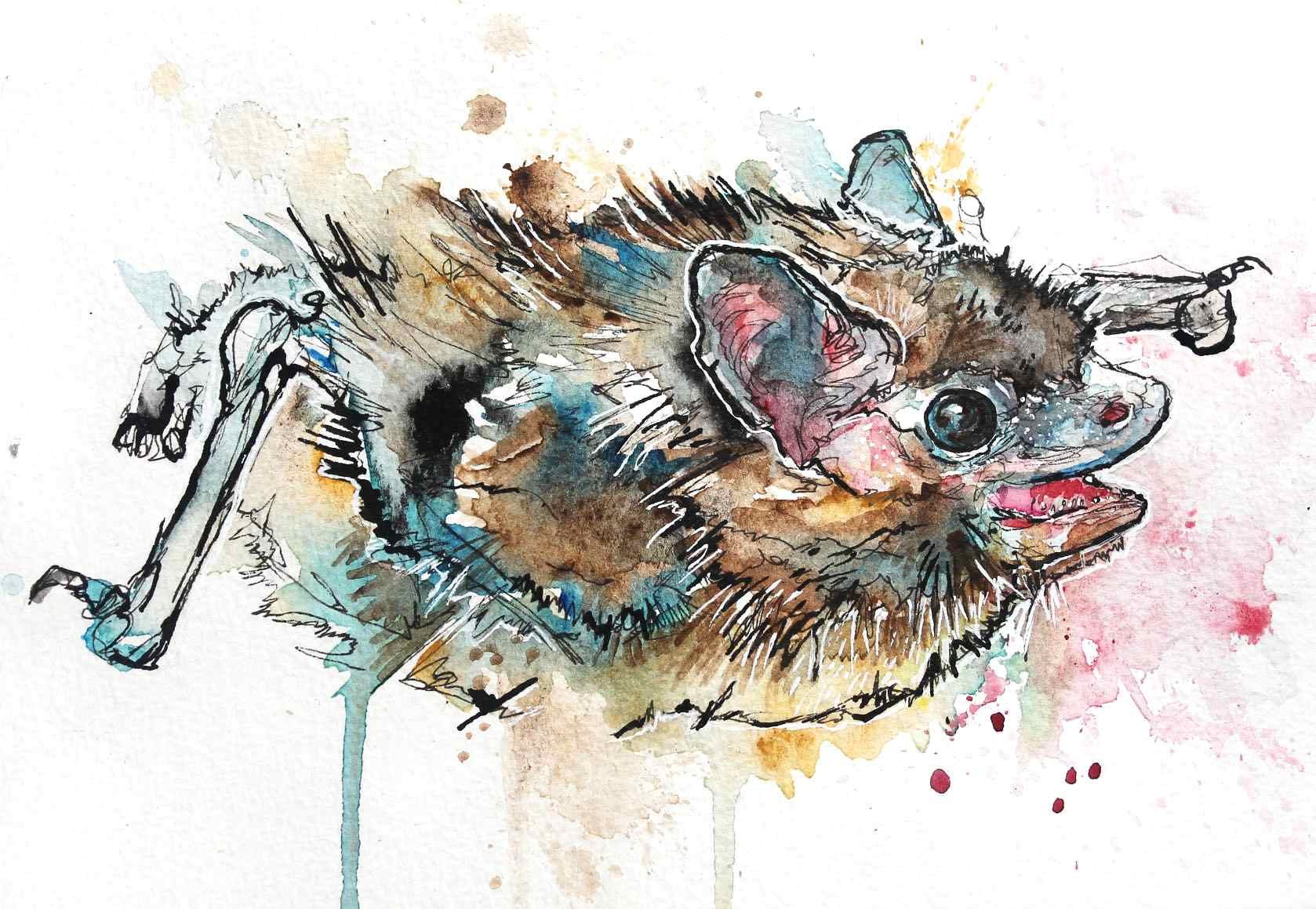
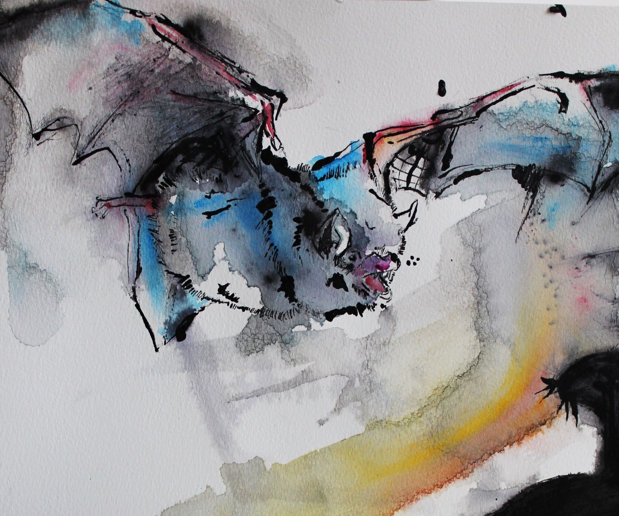
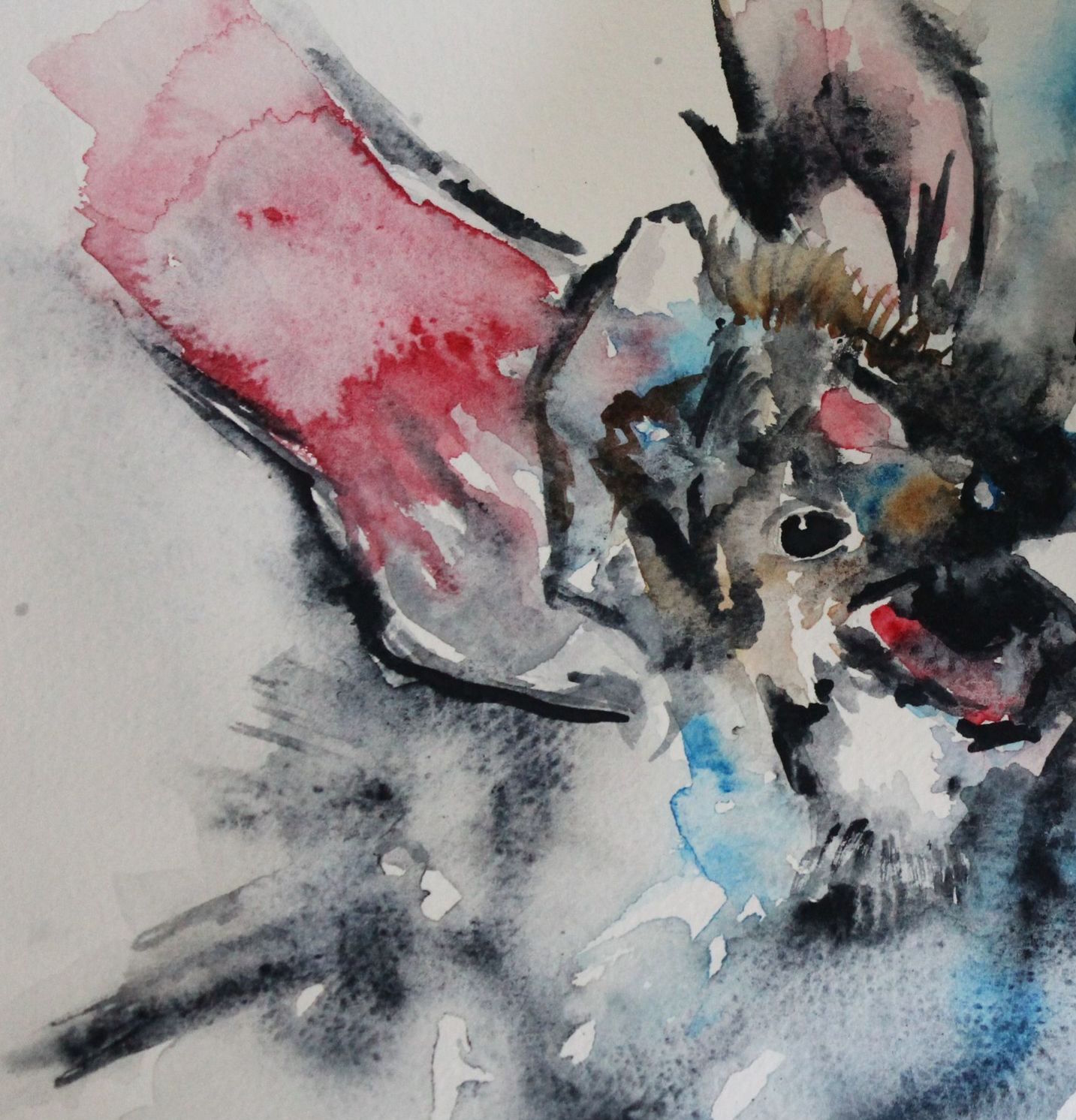
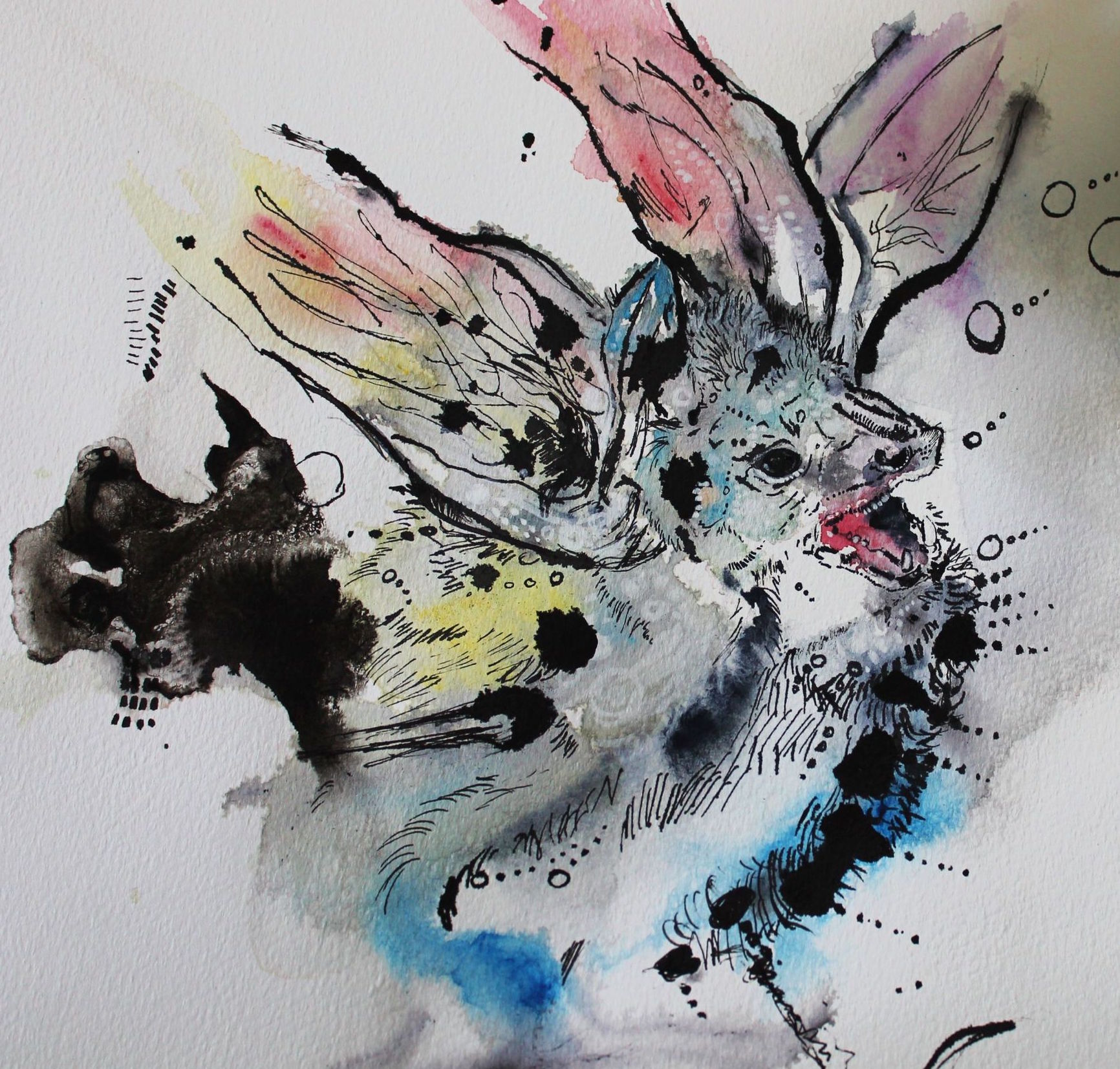
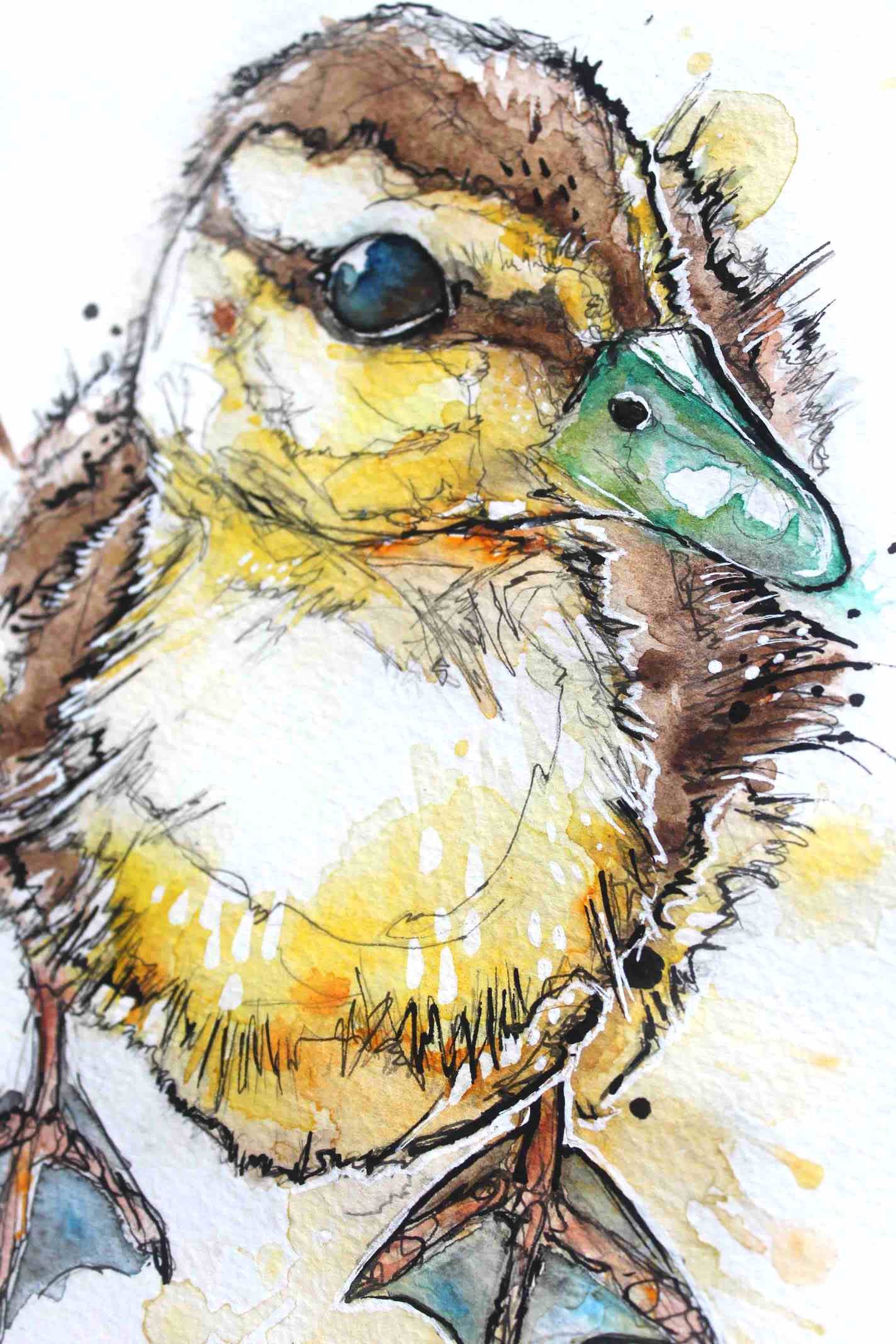
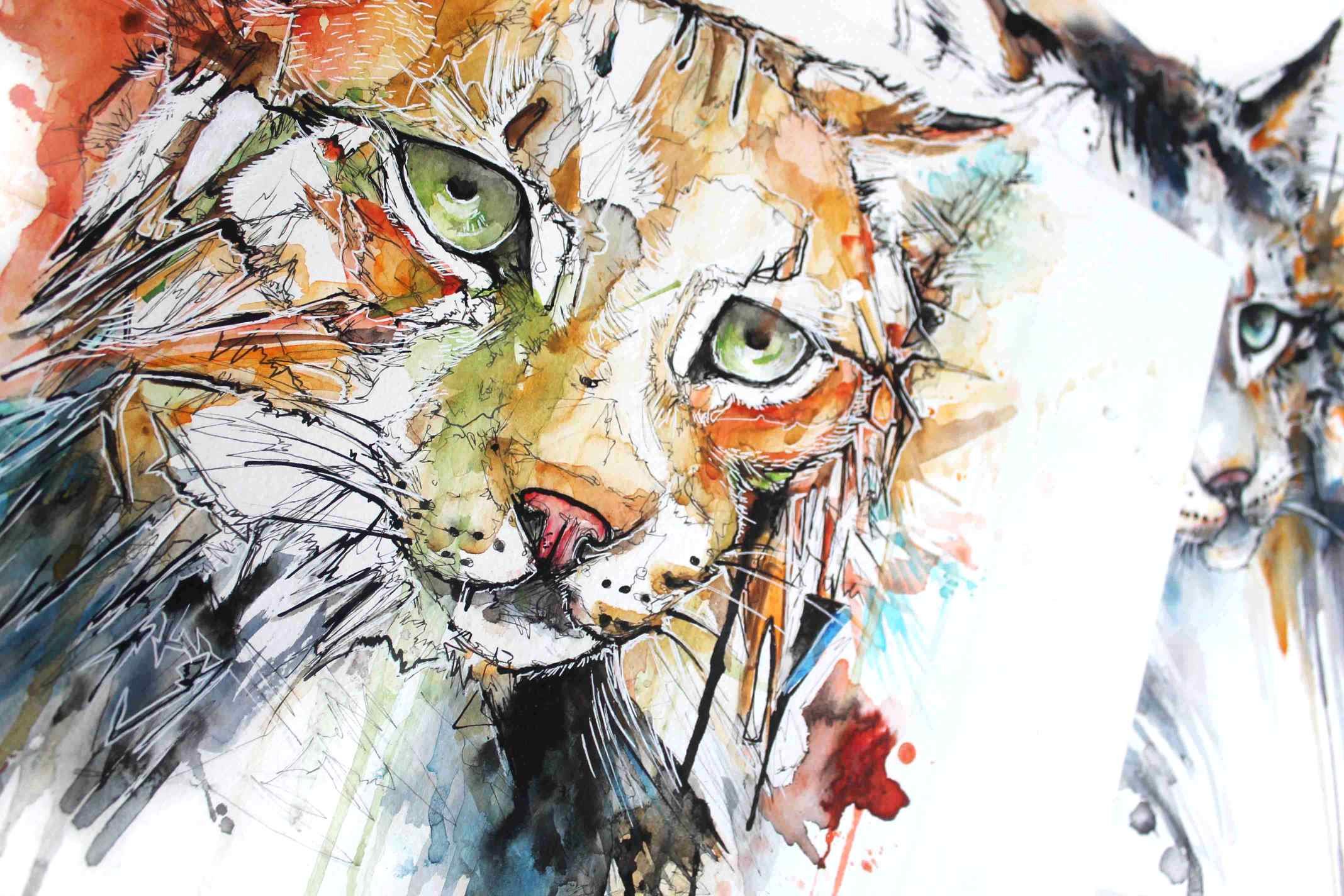
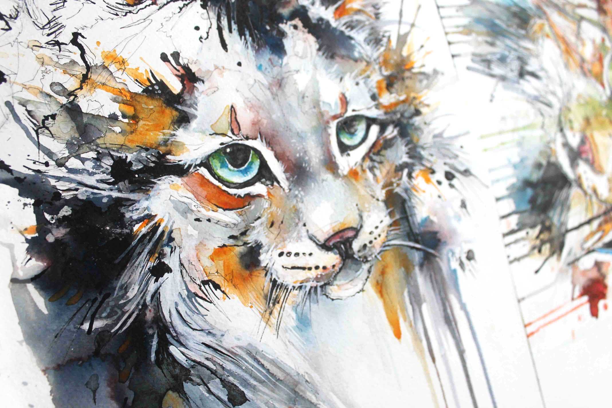
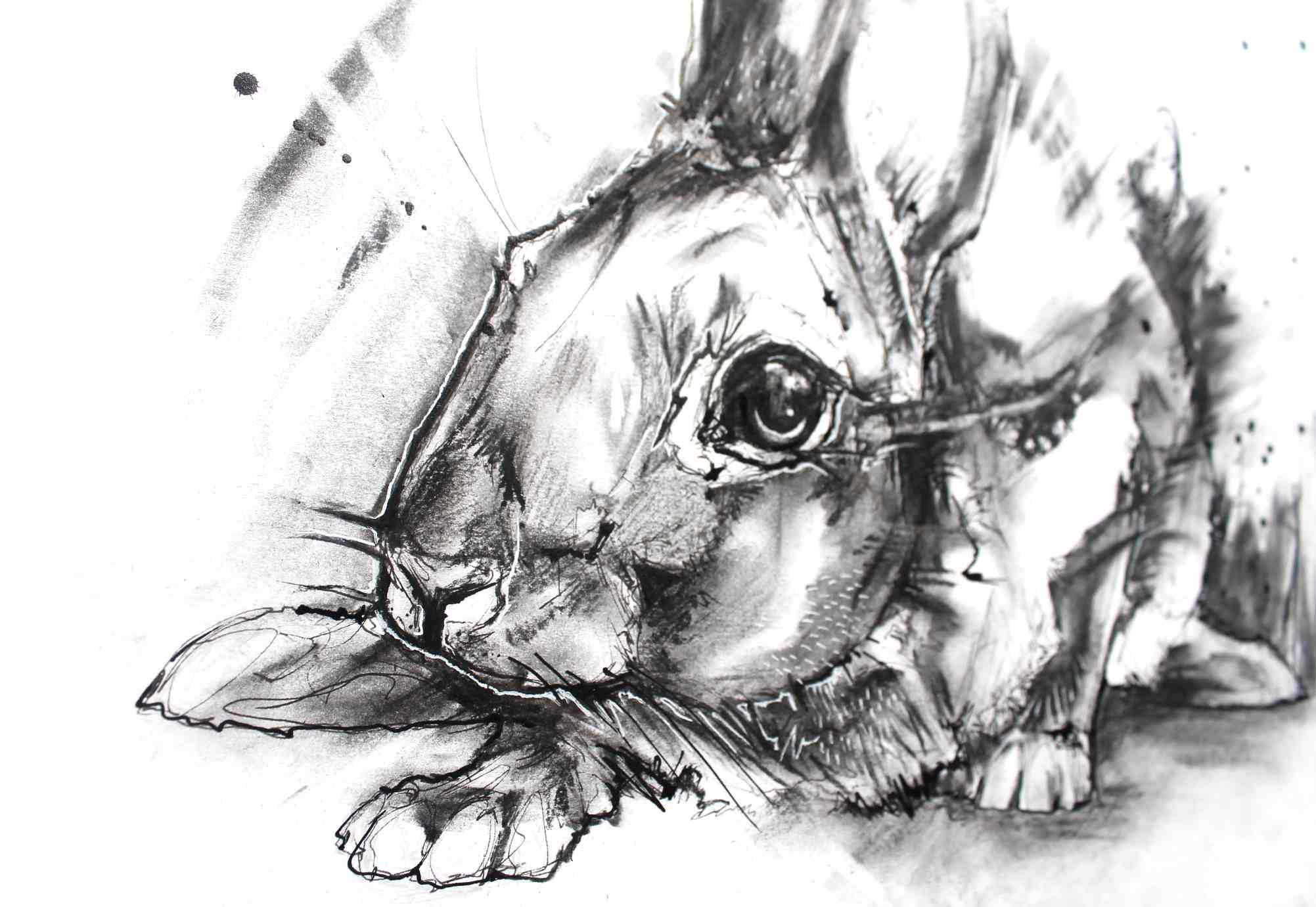
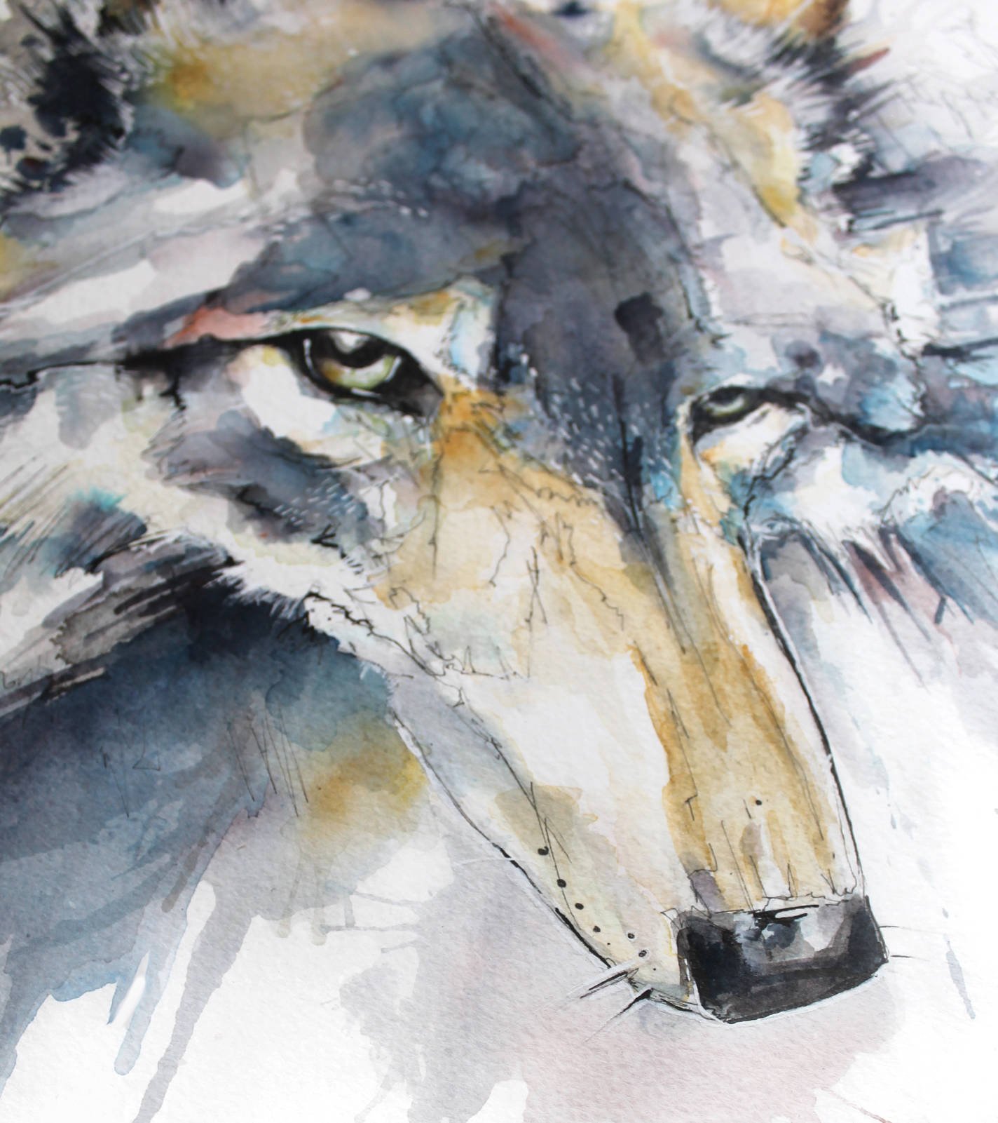
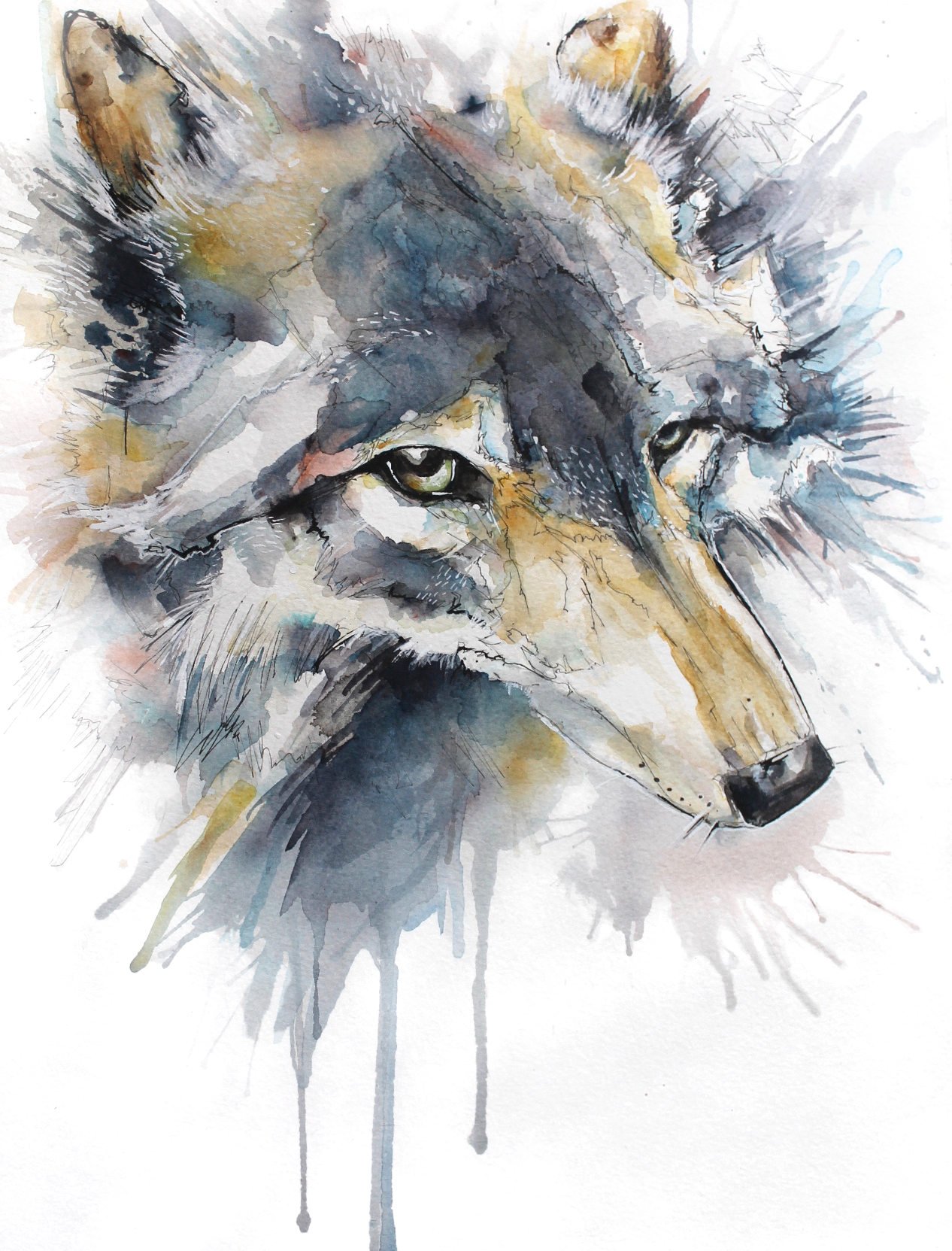
I’ve always found it more comfortable and natural to pen first and paint second, it gives me a structure to work from, one which I cannot easily manipulate which means design and drawing quality is very important.

Bridin asks: How exactly do you use ink and watercolour when you are making work?

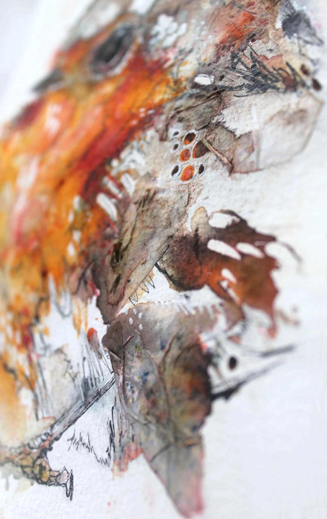
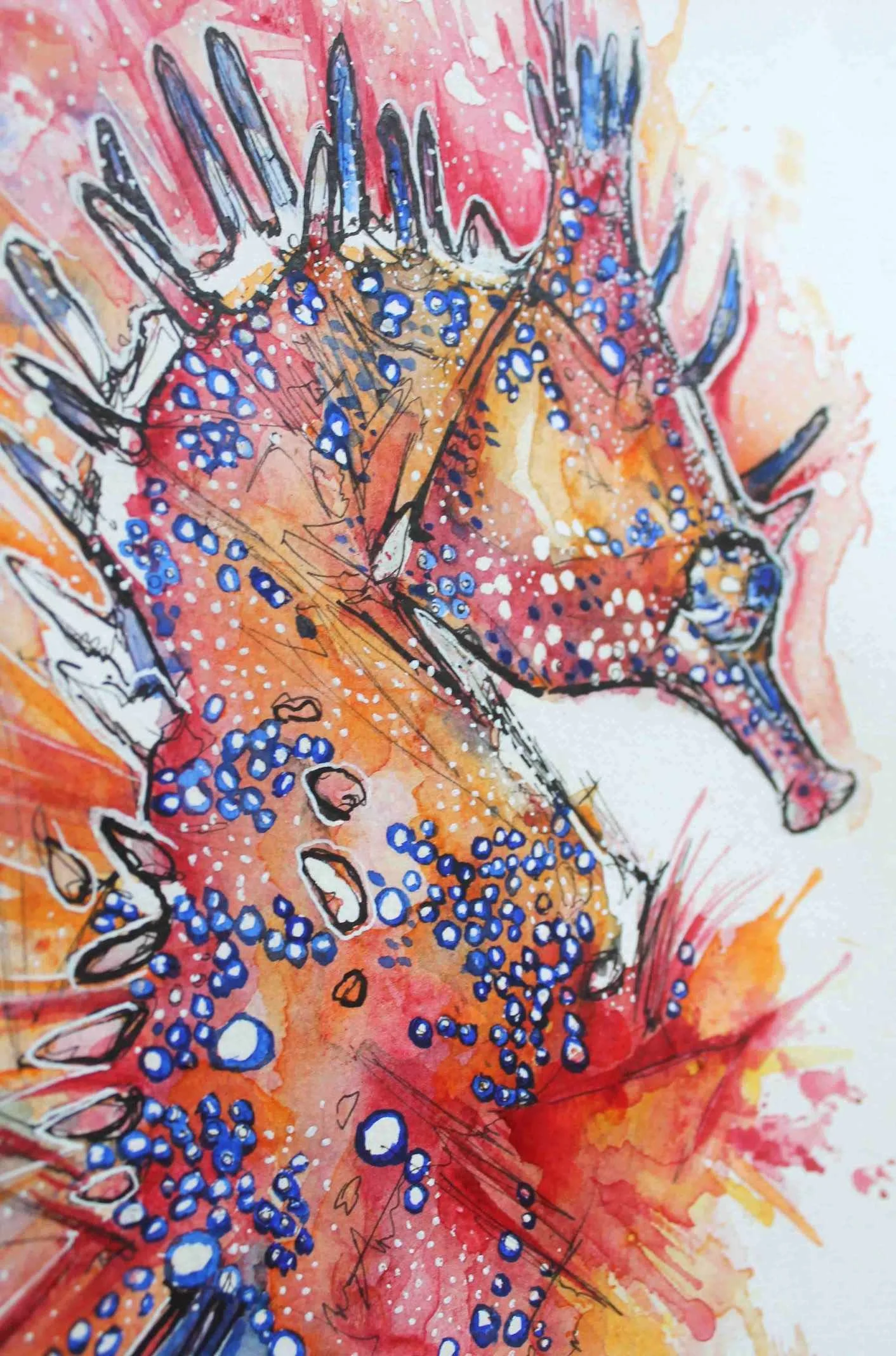
After establishing a drawing in pen and Indian ink, I apply faint layers of watercolour slowly and build them up when dry. After I’m happy with the applied colour, I identify areas I want to highlight and draw attention to by making large puddles or flecks of water on the paper which I then inject with strong ink colour.

Charlotte-Rose asks: What tools/mediums do you use?

I have found that watercolour, Brusho pigment, ink and Indian ink are my favoured media at the moment, something about the spontaneity and the risk of these mediums really appeal. I use paintbrushes, spray bottles, pipettes, straws and ink quills in my artwork, sometimes I may use a ruler to scrape off some pastel dust onto a piece if it’s screaming for a dusting  —  particularly if my work features insects.

Q: What is your best advice?

As boring as it might sound, don’t stress, be patient and PRACTICE! I can’t really save anyone any time. As long as you are enjoying the process, over time you’ll definitely improve, unimaginably so if you put the time and effort in.

The aim of my website was to share the progress of my artwork through the years with all the naivety and embarrassment to help illustrate to other budding artists that no one is great overnight — we all start rather crap.

Every mistake is a lesson, it used to take me 5-7 terrible pieces to make one I was somewhat happy with. But with three years of practice and perseverance I’ve been able to produce work of a reasonable and even good quality without wasting a single sheet of watercolour paper.

(And in spite of me religiously telling my art teachers at college I couldn’t paint!)

Mischievous Raccoon

Raccoons are found more commonly in North America, but thanks to deliberate introductions and escapees can also be found in places such as Japan and even Europe!

Common raccoons are black, grey and white from a distance, but I really ran with the browns and yellows which also exist in the raccoons fluffy coat, but I’ve manipulated the colours in photo editing software and produced a monochrome version.

I still prefer the original, I’ve painted my finger tips with white, brown and grey ink and pressed them into the painting to keep that thieving, sticky, grubby raccoon stereotype alive, as they are excellent opportunists!

Blue Tit

A blue tit sketch from 2014/15

A common sight in my garden - when the sparrows aren’t chasing them away from the fat balls! I’ve tried to paint a blue tit several times during my artistic journey, and I’ve never been able to make them pudgy, vibrant or cute enough but this time I feel like it is a better effort.

Painted using Brusho, fineliner, watercolours and Pen-White by Dr. Ph. Martin’s — which is the best white ink I’ve discovered after getting through copious amounts of other brands, not toothpastey or watery, just great white ink!

European Wildcat and Cheetah

I’ve been practicing painting cats as in the past I’ve felt they’ve been difficult to paint due to their flatter faces. The European wildcat I’ve painted on Yupo paper, and the cheetah I’ve painted on 100lb watercolour paper.

I wanted to paint the cheetah the same way as a fox I created in 2015, by leaving sections unpainted. I want to explore this much more in future paintings, I really like this style!

Siamese Fighting and Clownfish Commission

Whilst busy with commission work and big projects I had time to squeeze in a brightly coloured flowing fighting fish along with a clownfish commission I’ve been working on.

These fish were painted mainly in Brusho and inks to really capture the vibrancy that fish tend to radiate!

I used a ‘snow’ textured watercolour paper for the clownfish and I got a softer cloudier effect when it came to painting.

The texture of this paper also allowed the colours to pool and merge in interesting ways. 

White Tiger and Elephant Shrews

I painted this large white tiger head in watercolours, Indian ink and Brusho, in the process of finding the right tiger face to paint I found out that white tigers are so inbred that they all have crossed eyes — even if their eyes look normal!

I also painted some elephant shrews, the vibrant orange of their fur suckered me in so I have painted them boldly in brusho pigment and Indian ink.

White Tailed Deer

The paper I used to paint this white tailed deer had a little suprise pressed into it — a bug!

I didn’t want to waste the paper so this work is extra unique with its own little insect fossil on the far left side of the paper.

This piece was painted primarily with brusho pigment, I find brusho gives an intense colour which doesn’t fade as much as watercolour.

I used masking fluid to cover areas of the deers face to leave little white spots, and I used white pen for the odd whisker and hair.

I used a lot of orange watercolour (I couldn’t help myself) on an otherwise predominantly brown but gorgeous deer, white tailed deer are found throughout North and South America.

Fulmars

With their dark eye brows and vocal cackling these guys are my favourite coastal bird. I call them the penguins of the skies as they fly exactly the way a penguin swims underwater — stiff wing movement, which is great fun to watch!

I’ve used a fair bit of masking fluid to preserve the white of the paper to form the distinct white feathers.

I’ve used brusho pigment ink and watercolour to produce these paintings with white pigment.

Fighting Fish

Unfortunately sometimes I order watercolour paper and it comes through the post a bit bent up, so my answer to this is to splice up the creased up paper into strips where only small critters like these fish can fit — a happy ending!

These fighting fish were created using Indian ink, brusho pigment, white pen and watercolour and available to purchase in my shop.

The Lobster and Cassowary

Here are some working progresses, I’ve used a variety of water soluble markers to highlight where the colours will be strongest on the paper before adding water and fainter colours. These two are painted on 200gsm paper and hopefully I will update soon with the finished results!

Maned Wolf

I decided to try out a lighter weight paper 200gsm to practice on rather than the usual 300gsm, and surprisingly the paper buckling which I expected to be more dramatic — isn’t! I threw a lot of water at this piece but the paper stays relatively flat thankfully.

I love the colour orange so this omnivorous, leggy beast was perfect subject matter for me to paint, he has flecks of white ink in his ears and salt ground into his coat for texture. Maned wolves are found in South America and despite its name is neither a fox nor wolf.

Mallard Duckling and Lynx Experiments

After losing a little bit of confidence painting big cats, I decided to retreat to smaller A5 cold pressed paper to paint this Mallard Duckling. I used to have a real problem with making animal drawings cute enough, but with time and practice I think this piece worked out.

My Lynx's on the other hand, did not work out. Discovering my strengths in painting is still really tough and I have a major problem with planning, I often sit wondering with a near finished piece — now what? And then overwork the piece to death. But the colours are nice, so I've decided to embarrass myself by displaying the results!

The more successful mallard ducking painting is available in my shop.

Charcoal Hare

This large hare was created using lots of smudgy charcoal, I started with a simple scribbly hare drawing in which I defined more with charcoal before outlining in Indian ink. I then added white pigment to highlight the hares face and a few details.

I dragged a rubber across the lower back of the hare to get those distinct white streaks to come through.

Wispy Wolf

This is my wispy wolf painted in mainly Brusho pigment and watercolour on cold pressed paper. This A3 piece took eight attempts to get right — the other pieces I created had huge colour layering mistakes because patience isn't something I possess. Hopefully the mounting cost of watercolour paper will smart enough for me to slow down!