Oddish Sculpture

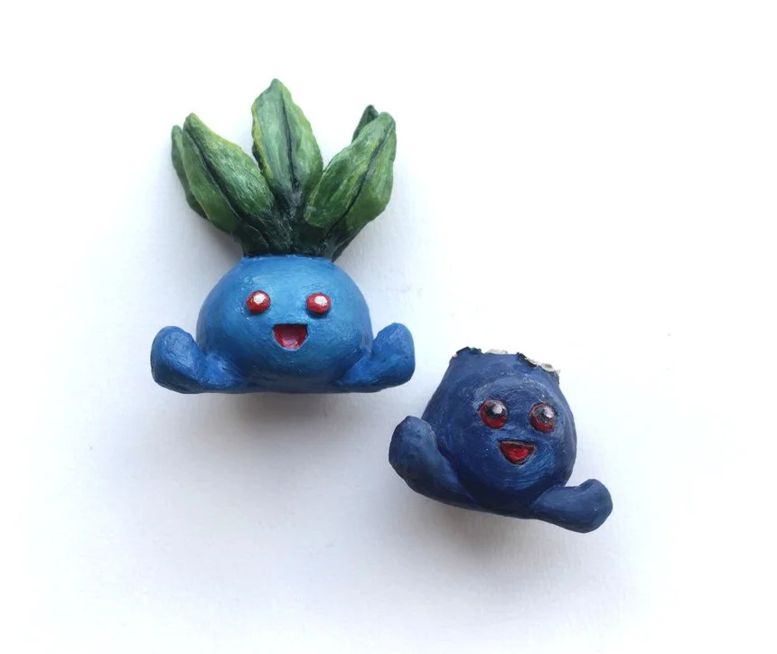
It’s my sisters birthday (again) and I’m expected to do something arty. She’s picked up my childhood interest in Pokémon, her favourite being “oddish”, so naturally I guilted myself into making her a small clay sculpture. How hard could it be?

I started with a wire armature which I enveloped in masking tape. I’m using air drying clay, the usual materials at this stage is wire and aluminium foil but I could use anything to bulk out the frame since I’m not putting this thing in the oven. Masking tape is also nice since you can trim and prune it into any shape you like without worrying about crumpling it into a hard mass you can’t unravel.


The tricky thing about air drying clay is the dreaded cracking. Cracks can appear everywhere if you leave your sculpture out to dry naturally. You’ll need a very slow drying process to stop this from happening. So every time I finished working with the sculpture I’d cover it in a light plastic bag to restrict the air flow, to really slow down that drying. 

If cracks did appear I mitigated against them by mixing the air drying clay with water to make a kind of slurry which is referred to as “slip” and fill in the cracks and smooth it over.

After it had dried, I wanted to sand the piece down to a nice smooth finish, I picked up some hobbyist sandpapers for this job since regular sandpaper is way too rough. After sanding the larger scratches away I continued using finer and finer grit. I went from 200, 400, 600, 800 to finally 1000 grit sandpaper.


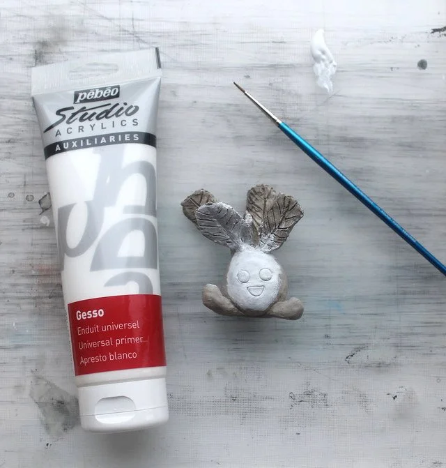
I had to get this sculpture done in little over a week, and made many mistakes. The first one being that after I finished sanding the sculpture, I applied a couple of base coats of gesso. I then made the big mistake of painting it without sealant. Gesso is not water resistant so what happened is the gesso undercoat started to sag, tear and bubble in a few areas.

Major disaster!

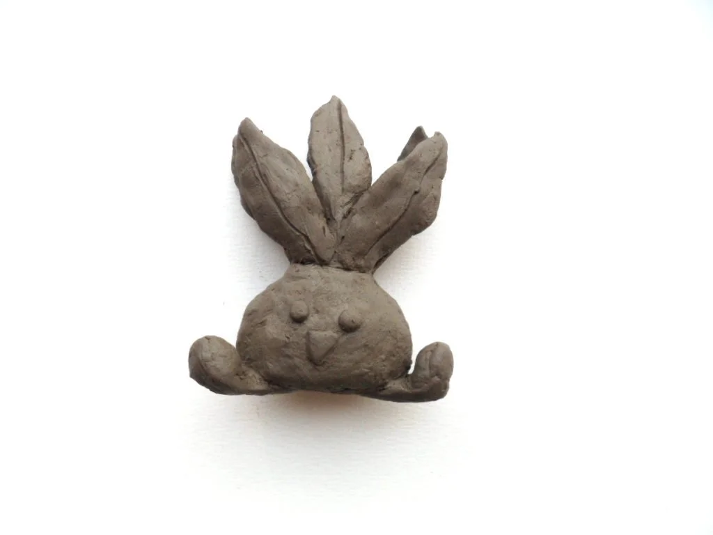
Ugly draft sculpture being gesso’d

I then had to meticulously remove all the paint and gesso undercoat with sandpaper and pliers. I really thought that was the end for dear oddish.

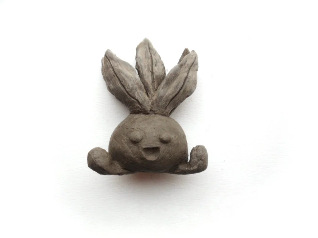
Ugly draft sculpture ready to be painted!

But I managed to remove all of the gesso somehow which is a testament to how strong and durable I made the sculpture, but after all that fussing I had to sand it down again, and reapplied the gesso primer and once dry, I then applied Mod Podge to seal the undercoat and finally move onto painting the thing!

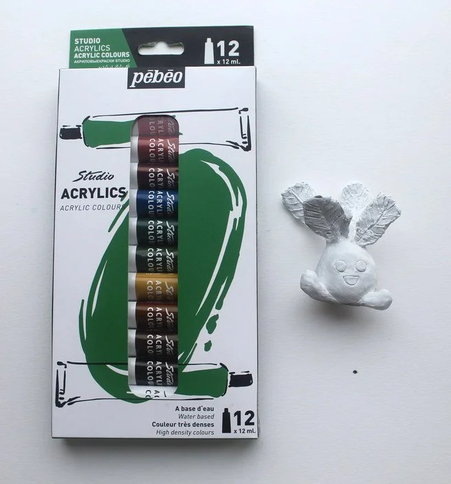
 I painted this sculpture in simple acrylics, but since acrylics are essentially plastics you can easily overpaint whilst trying to blend colours directly onto the sculpture and making an uneven, blobby mess of things.


Yes, I am guilty of that too … you cannot sand down acrylics unless you want a patchy, shredded mess which is what happened to my draft sculpture. So you have to be very careful and skilled at blending colours, and acrylics are not my bag at all! I think doing this again I would use airbrushes to apply even coats of colour, using acrylics for small detailing.

After the hellish drama of painting the sculpture, with hours to go, I gave it two coats of Mod Podge (being careful not to make it clumpy) which gave it an excellent glassy sheen and presented it to my sister who unceremoniously fumbled it for a moment, thought I bought it from a shop and set it down, because lets face it — it was kinda crap.

I was the selfish one for indulging in this for my own sake, but I learned a lot from this and am very grateful her favourite Pokémon isn’t anything more complicated than a ball on legs, that would have showed me up for sure!

Convolvulus Hawk-Moth

Is there anything better than a hefty caterpillar? But what about that spike on its behind, is that something to be worried about?

Thankfully not! I won’t lie though, I was a little bummed that this wasn’t the caterpillar of the large elephant hawk moth, but Convolvulus was something I didn’t even know existed until I found these brown-green logs in the garden in late summer last year.

What all the hawk-moth caterpillars have in common is that horn on the end, it’s not dangerous, it’s in fact quite soft. Did I touch it? Of course — anything in the name of science and … art?

Boston Terrier

This little piece is a commemorative commission that was a joy and an honour to paint. I used hot pressed watercolour paper which has a unique glossy quality to the surface. I’m so happy with how this tiny little A5 came out.

Something really important to how I develop a piece now, especially a commission is to create multiple preliminary paintings, which is how I really narrowed down and simplified what I wanted to do with little miss Olive here.

I remember when I first started painting, and maybe 1 in 15 paintings would have something going for it … I’ve narrowed that gap quite a bit in the decade I’ve been painting all under my own guidance for better/worse.

“One must spoil as many canvases as one succeeds with.” — was the quote from Vincent van Gogh, 1889 which makes me feel better about my own art making process!

Painted in watercolour, acrylic inks, Brusho and white pigment.

Alpine Newt

This little guy was one of three alpine newts that I presented for a commission. I’ve included a little of the “behind the curtain” typical evening scene.

I used Brusho which is appears as a dust of heavily pigmented colour. You can sprinkle it in water, or mix it to produce super saturated colour.

The grey I used on this newt is extremely strong, and I was asked to strip out some of the grey, specifically in the tail area to get in some blue accenting. I thought this was impossible, Brusho is very stubborn, but with freshly boiled kettle water I was able to lift the colour and get a decent amount of blue in.

What a revelation! And then I found you can use extremely hot water to lift quite a lot of colour from paper, including regular watercolours and ink. It’s not perfect but as you can see, I got a really good result removing a dark colour.

Colour Bomb Kitties

These three were a bit of a handful, and I still can’t believe I managed to squeeze all three onto an A4. They were a commission which I struggled with, the thing is when there is more than one kitty to go wrong, it means throwing the whole piece away, and that weighed pretty heavily on me.

Two of the cats were also mostly black, so I had an interesting colour challenge on my hands. There was no way I was painting two completely black cats … not when the commissioner said she “liked colour”.

Somehow though, all three pulled through - I even introduced chunky textural pastels into the mix as you know, the painting wasn’t chaotic enough!

If you’re interested in their names, Ms Green is Slinky, Mr Yellow is Pudding and Ms Purple is Kushkat! Lovingly painted in watercolour, Brusho, ink and pastels.

Birthday Hippos and Vegan Friendly Ink

My dad has a thing about hippos, I don’t really know why, and like most idolisations, I don’t think he can explain it either.

He wanted a handmade card for his birthday, so I was happy to hippo it up for him using these new inks I’m sweet on.

Since discovering my inks and in particular my beloved Indian ink wasn’t vegan friendly, I decided to find replacements. It thankfully didn’t take me long to find an almost identical alternative, Daler Rowney’s FW acrylic ink! It is silky smooth, glides across the paper, doesn’t clog my inking nibs and is literally a drop in replacement for Indian ink.

It even does that awesome texture when you apply it to soggy paper making grainy, spontaneous clouds just like Indian ink. I’m glad it wasn’t a time and purse consuming search. The FW white acrylic ink in the same range is very good too and would recommend it over using white gouache for “poppy” highlights.

I probably should add that I wasn’t sponsored by Daler Rowney or any brands on my entire website, it’s all my own fumbling on the internet to find products that I enjoy using.

Front and back covers of my dad’s birthday card, using Daler Rowney’s FW acrylic ink and Stuart Semple watercolours.