Hedgehog in Progress

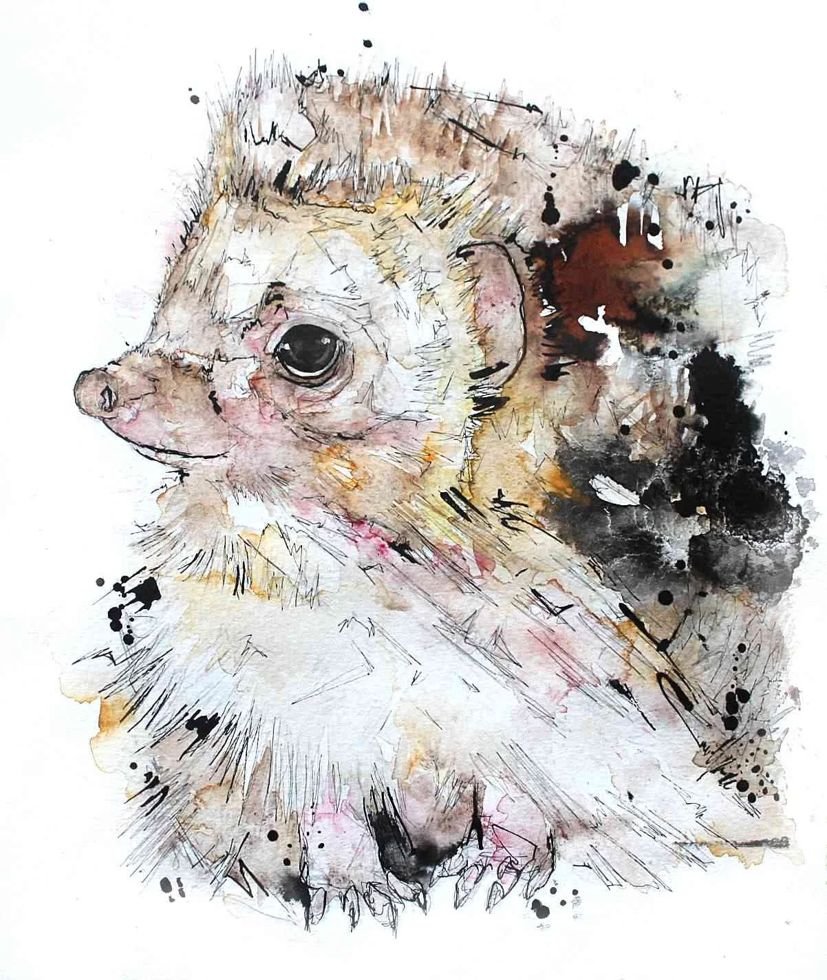
This young British hedgehog I am painting in contrast to a hedgehog I created in the past.

I painted the old hedgehog in 2013/14 for a online magazine which looked promising at the time, but sadly didn’t take off.

It makes me laugh how much more ill considered my work was, what’s with all the black dots and weird bars?

Anyway, my recent attempt says goodbye to eccentric colours in favour of a more natural hedgehog colouration. I am using Brusho and watercolour to create my softer, snufflier hedgehog, I shall post him again when he is complete!

Barn Owl 2017

This A3 owl was created on Vidalon Canson watercolour paper which has sadly been discontinued - I’ve finally found a paper I love … then they cancel the line. Such is life!

I wasn’t too happy with the water buckling you can make out on the right hand side, I think it’s best to stick with glued pads if like me are too scared to tape the paper to a board and hope you can cut straight.

This barn owl was created with an old piece I sold a while back in mind. I wanted to recreate a flowery whimsical feel without directly painting flowers into the puddles of colour.

It looks like I’ve learned to stop the colour madness a bit earlier, though I was tempted to just keep applying more flecks and pools of watercolour I’m glad I stopped when I did. The colours I used were mainly Brusho pigment and watercolour, with white pen and Indian ink touches.


Big Cat Contrast

Another compare and contrast from the past! I don’t have too many examples of artwork from the past unfortunately, but the pictures I do have are gold.

Embarrassingly again, the lynx I painted was created in 2012. I was 21 when I made work like this after my art education, you really can leave art school without any skills!

The puma I painted was using exactly the same materials as the lynx, except with a better understanding of watercolour practice —  although not amazing, it’s still very enlightening to see how progress can be made under self direction.

Harebrained

Going wild with the colour palette I’ve painted a green chunky rabbit and a fiery hare. I was aiming to focus on muted colours with a few bright eye catching highlights, but my patience got the better of me and I reached for the Brusho pigment too early, to the benefit of the hare but sadly to the detriment of the rabbit piece.

These A3 pair were created in watercolour, Indian ink, masking fluid, pen and Brusho.